Are you searching for the most attractive bedroom color that can also promote a good night’s sleep? Look no further, as we delve into the best bedroom color for sleep and the most popular bedroom paint color that experts recommend. Whether you’re repainting an existing bedroom or designing a new one from scratch, understanding the relationship between color and the human mind is the foundation of making a choice you’ll still love years from now.
The bedroom is unlike any other room in the home. It’s a private space — the one place where you’re completely off duty, where the demands of the day finally fall away. What happens in that room isn’t just sleep; it’s recovery, both physical and emotional. The environment you create there directly affects the quality of that recovery. And while most people spend a great deal of thought on the mattress, the bedding, and the lighting, the color of the walls is often chosen somewhat casually — based on a paint chip grabbed from a hardware store or a color that happened to look nice in a magazine photo. Given how much influence it has over how you actually feel in the space, that color decision deserves more careful consideration than it usually gets.
Why Bedroom Color Choice Affects Mood and Sleep
The color of your bedroom walls can significantly impact your mood and quality of sleep. Research suggests that certain most attractive bedroom colors can evoke feelings of calmness and relaxation, making them ideal choices for creating a restful sleep environment. Interior designers often recommend shades of blue, green, or lavender as the best bedroom color for sleep due to their soothing properties that can help you unwind after a long day.
The science behind this isn’t abstract — it’s grounded in how the human visual system and nervous system interact. Color perception triggers neurological and hormonal responses that are measurable and consistent across large populations. Cool tones — particularly blues and blue-greens — have been shown in multiple studies to lower heart rate and blood pressure, reduce the production of cortisol (the body’s primary stress hormone), and create the psychological conditions most conducive to sleep onset. These aren’t subtle effects; they’re significant enough that color psychology is now a standard consideration in the design of hospitals, schools, and therapeutic environments.
A landmark study by Travelodge, which surveyed thousands of participants about their sleep habits in relation to their bedroom colors, found that people who slept in blue rooms consistently reported getting more sleep than those in rooms of any other color — averaging nearly eight hours per night. Rooms decorated in warm reds and oranges, by contrast, were associated with significantly less sleep and higher reported levels of alertness and stimulation. The implications for bedroom design are direct and practical.
Beyond sleep specifically, color affects how we feel the moment we enter a room. Warm, saturated colors like deep reds and burnt oranges create a sense of energy and stimulation — wonderful in a kitchen or living room, but counterproductive in a space designed for rest. Cool, muted tones create a sense of deceleration — they signal to the brain that the pace of things is slowing down, that it’s safe to relax, that there’s nothing urgent requiring attention. That psychological signal, repeated every time you step into your bedroom, accumulates into a meaningful effect on your overall stress levels and sleep quality over time.
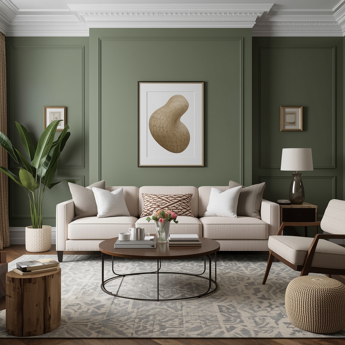
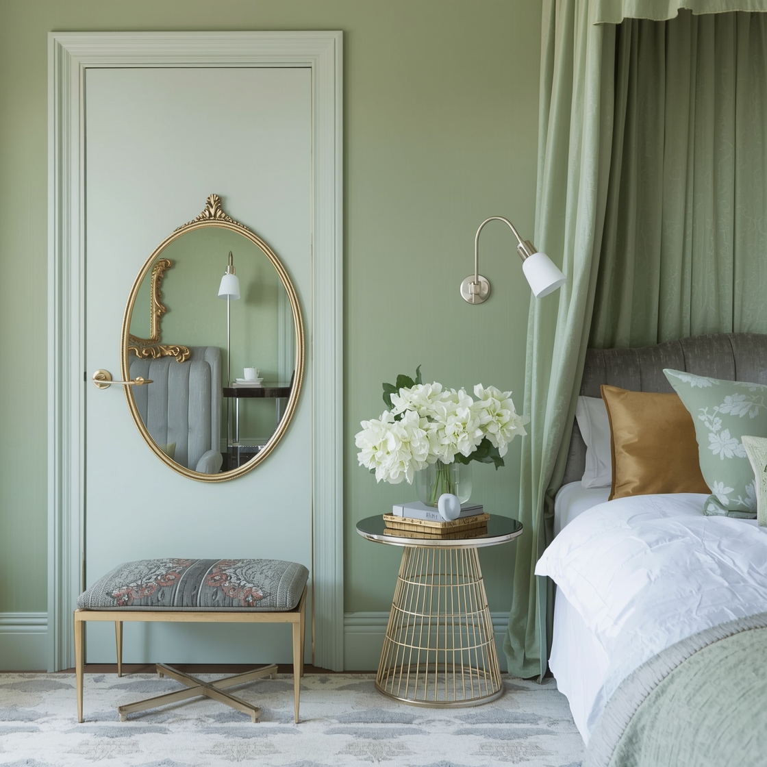
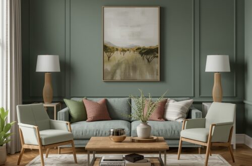
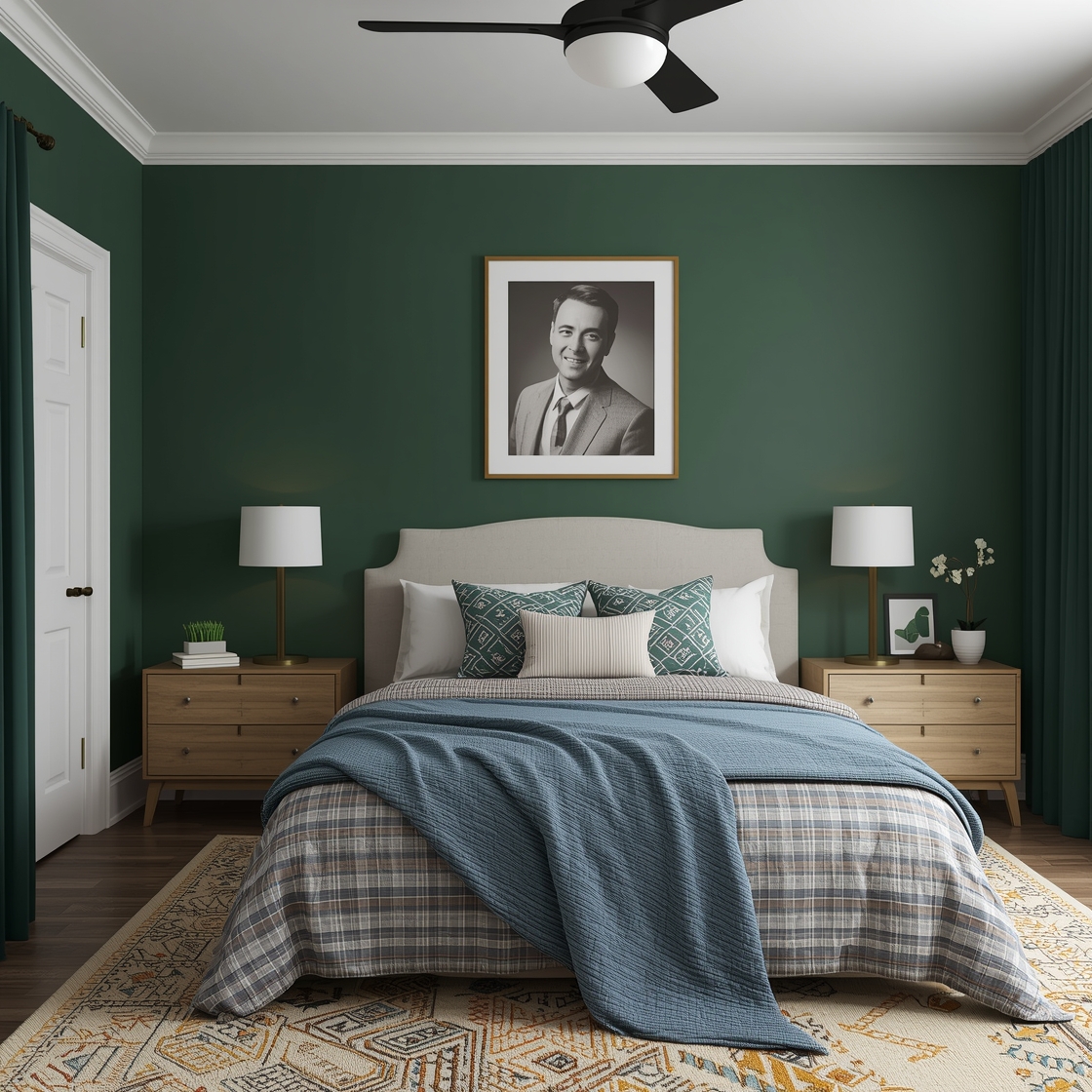
Greens deserve special mention in this context. Green occupies a unique position in the color spectrum — it’s simultaneously cool enough to be calming and warm enough to feel alive and organic. Psychologically, green is associated with nature, renewal, and safety, qualities that have deep evolutionary roots. Being surrounded by green signals, at some primitive level, that you are in a resource-rich, unthreatening environment — which is precisely the psychological state most conducive to deep, restorative sleep. Soft sage greens, muted olive tones, and dusty eucalyptus shades are consistently among the most recommended bedroom colors by interior designers and color psychologists alike.
Key Factors That Make a Bedroom Color Feel Attractive
When choosing the most popular bedroom paint color, consider factors such as personal preference, room size, and natural light. Lighter shades can make a room feel more spacious and airy, while darker tones can create a cozy and intimate atmosphere. Combining different hues and textures can add depth and visual interest to your bedroom, making it a welcoming and visually appealing space.
The single most influential factor in how a paint color looks in your specific bedroom — more influential than the color swatch itself — is the quality and quantity of natural light the room receives. The same shade of blue-gray can read as cool and calming in a north-facing room with limited direct sunlight, and as luminous and almost aqua in a south-facing room flooded with afternoon light. This is why the cardinal rule of paint selection is always to test colors in the actual space before committing, observing them at different times of day and under both natural and artificial light.
Room size and ceiling height play equally significant roles. In a small bedroom, very dark or highly saturated colors can feel oppressive — they advance visually, making the walls seem closer and the room feel tighter. Light, cool colors recede, creating the perception of more space. However, this doesn’t mean small bedrooms should always be painted white or pale neutral. A deep, moody color in a small bedroom can also feel deliberately intimate and cocooning — like a sleeping pod rather than a shoebox — and many people find that effect deeply comforting rather than claustrophobic. The key is intention: choose the effect you want rather than defaulting to convention.
The existing elements of the room — flooring material and color, furniture finishes, the color of bedding and textiles — must factor into the color decision as well. A pale blue wall looks entirely different paired with warm honey-toned wood floors and linen bedding than it does with cool gray floors and white furniture. The wall color is not a standalone decision; it’s one component of a complete visual composition, and it reads in relationship to everything else in the room. Before settling on a color, it’s worth taking photographs of the room as it currently is and experimenting with digital color overlays — a technique that’s now extremely accessible through various home design apps — to see how candidate colors will interact with your existing furnishings.
Personal temperament and lifestyle also matter more than most generic color guides acknowledge. Some people find that very serene, barely-there colors — soft whites, pale mist grays, the lightest whisper of sage — create the sense of calm they need in a bedroom. Others find those same colors flat and uninspiring, and actually sleep better surrounded by richness and depth — a deep inky navy, a warm forest green, a moody plum. There is no single universally correct answer, despite what many trend-driven articles would suggest. The best bedroom color is the one that makes you feel the way you want to feel in the most personal room of your home.
The Colors Interior Designers Recommend Most Often — and Why
While personal preference always has the final word, there are certain colors that appear consistently at the top of interior designers’ recommendation lists for bedrooms — and understanding why can help you make a more informed choice even if you ultimately select something different.
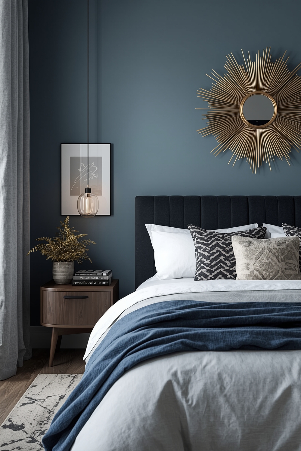
Soft blue in its many variations — dusty blue, French blue, pale slate, denim wash — is the perennial leader for good reason. It combines the calming physiological effects of cool tones with a versatility that works across a wide range of design styles, from Scandinavian minimalism to coastal casual to quietly traditional. Blue reads as both sophisticated and approachable, and it pairs beautifully with the whites, linens, and natural wood tones that dominate bedroom furnishings. It’s the color that most reliably produces the outcome people want from a bedroom: rest, peace, and a sense of stepping away from the world.
Warm whites and off-whites — creamy ivory, soft greige, warm stone — are another consistent recommendation, particularly for bedrooms that receive warm afternoon light. Pure brilliant white, while popular in photography and on social media, can feel stark and cold in the actual lived experience of a bedroom, especially in rooms without abundant natural light. The warm-undertoned whites add a similar sense of openness and airiness while bringing a softness that pure white lacks. They function as a neutral canvas that allows other elements — bedding, artwork, furniture — to take visual precedence without the walls competing.
Sage green has had a significant moment over the past several years and shows no signs of fading. Its appeal is broad: it works as well in contemporary interiors as it does in more traditional or rustic settings, it pairs naturally with a wide range of materials, and it carries the psychological benefits of green-family colors discussed earlier. The muted, slightly gray-toned versions of sage — as opposed to the brighter, more saturated greens — tend to be most successful in bedrooms, as the grayed quality adds sophistication and prevents the color from feeling too botanical or bright.
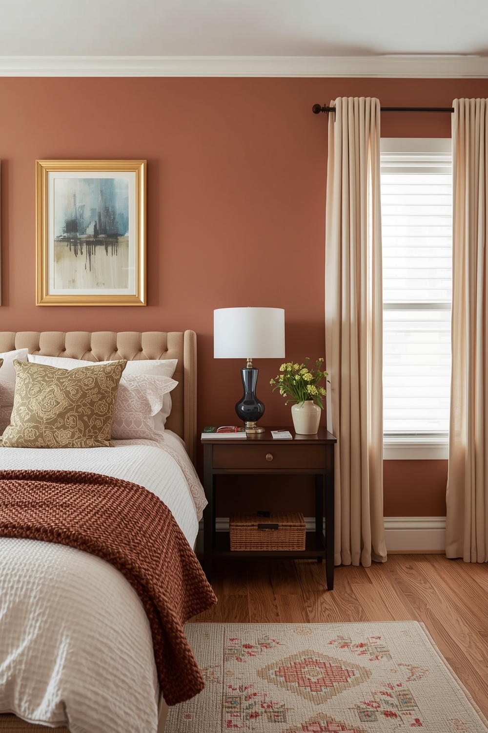
Warm terracotta and clay tones are increasingly recommended for bedrooms designed with a cozy, grounded aesthetic — particularly in rooms with low lighting or in climates where warmth is psychologically valued. These earth tones create an enveloping, womb-like quality that some people find profoundly comforting for sleep, and they photograph beautifully in the golden tones of candlelight and warm-bulb bedside lamps. They work especially well in bedrooms with natural wood furniture, rattan accents, and linen or cotton bedding in natural undyed tones.
How Bedroom Color Transforms Your Overall Space
By selecting the most attractive bedroom color for your space, you can transform your bedroom into a peaceful retreat that promotes relaxation and rejuvenation. To enhance the calming effect of your chosen color, consider incorporating soft lighting, cozy bedding, and natural elements like plants to create a cozy and inviting ambiance.
The transformation that a well-chosen paint color creates goes beyond the visual. It changes the way you inhabit the room. People who have repainted a bedroom in a more considered, intentional color consistently report that they spend more time in the room — reading, resting, simply being — because the space feels more genuinely inviting. A bedroom that you want to be in is one that does its job more effectively, encouraging the rest and recovery that the body and mind need.
Color also changes the perceived architecture of the space in ways that can feel almost physical. A bedroom painted in a warm, enveloping deep tone feels smaller in plan but more intimate in atmosphere — like a private chamber rather than a generic room. A bedroom in a soft, light, airy color feels more expansive, more connected to the light outside, more like a sanctuary open to the day. Neither effect is inherently superior; the right one depends entirely on what kind of bedroom experience you’re seeking to create. What matters is being conscious about that choice rather than making it by default.
Budget-Friendly Tips for Getting Bedroom Color Right
For those working within a tight budget, the full repaint of a bedroom can feel like a significant investment — but the cost of paint is actually one of the most affordable improvements available in interior design. A gallon of quality paint covers approximately 400 square feet, and even premium paints from reputable manufacturers rarely exceed the cost of a single piece of bedroom furniture. The return on that investment, in terms of daily quality of life and visual transformation, is extraordinary.
If you’re uncertain about committing to a full color, consider starting with a single accent wall — typically the wall behind the bed, which functions naturally as the focal point of a bedroom. An accent wall in a deeper or bolder version of your chosen color, with the remaining three walls in a lighter complementary tone, gives you a taste of the full effect without the commitment. Many people find that after living with the accent wall for a few weeks, they feel confident enough to extend the color throughout the room.
Sample pots are worth every penny when it comes to bedroom color decisions. Paint at least two or three large swatches on the actual walls — not just a small test patch — and observe them over the course of several days, in different lights, at different times of day. What looks perfect on a Saturday morning in full daylight might feel entirely different on a Tuesday evening under bedside lamplight, and it’s the evening experience that matters most for a bedroom. Take the time to make this observation before committing, and you’ll almost certainly end up happier with your final choice.
For those who want to refresh the feel of the room without any painting at all, color can be introduced through bedding, curtains, rugs, and cushions — a fully coordinated set of textiles in a particular color palette can shift the visual temperature of a room substantially without touching the walls. This approach works particularly well as a first step toward understanding what color family genuinely appeals to you in the bedroom environment, before investing in paint.
Final Thoughts: The Right Color Is the One That Makes You Feel at Home
The research is clear, the designer consensus is strong, and the experiential evidence from countless bedroom renovations all points in the same direction: color matters enormously in a bedroom, and it’s worth choosing with care. Cool, muted tones — particularly blues, greens, and lavenders — offer the most reliable path to a calm, sleep-friendly environment. But the most attractive bedroom color, ultimately, is the one that makes you feel genuinely at ease the moment you cross the threshold — the one that tells your nervous system to slow down, that tells your mind it’s safe to rest, and that greets you each morning with something that feels like quiet pleasure. Find that color for your specific room, your specific light, your specific sensibility, and you’ll have made one of the most impactful and lasting improvements a bedroom can receive.