When it comes to decorating your living room, choosing the right color scheme is crucial. The best color scheme for a living room can create a harmonious and inviting space for you and your guests. In this guide, we will explore how to select the perfect color combination for your living room, from cozy neutrals to bold and vibrant hues. Whether you are starting from scratch or refreshing an existing space, understanding how different shades work together will help you make decisions you will genuinely love for years to come.
Most people underestimate just how powerful color really is. Walk into a room painted in deep navy blue and you instantly feel something — calm, focused, a little introspective. Step into a space filled with warm terracotta and golden yellows, and suddenly everything feels alive and cozy. That reaction is not accidental. Color communicates before furniture, art, or lighting ever gets the chance to speak. So if your living room does not feel quite right despite all the effort you have put into it, the answer might be simpler than you think — it could all come down to color.
Why Choosing the Right Living Room Color Scheme Is Important
Selecting the best color scheme for a living room is important because it sets the tone for the entire space. The colors you choose deeply impact the mood and ambiance of the room, affecting how both you and your visitors feel the moment they walk through the door. From calming blues to energizing yellows, each color carries its own psychological weight and emotional resonance. By carefully selecting your color scheme, you can create a space that reflects your personal style and enhances your overall living experience every single day.
Think about how much time you actually spend in your living room. It is the place where you unwind after a long day, entertain friends, watch movies with your family, and sometimes even work or study. A poorly chosen color scheme can make a room feel draining or uncomfortable — even if you cannot immediately put your finger on why. On the flip side, when the colors are right, the room almost breathes with life. Everything just clicks. You feel at ease, your guests feel welcomed, and the space genuinely functions the way it should.
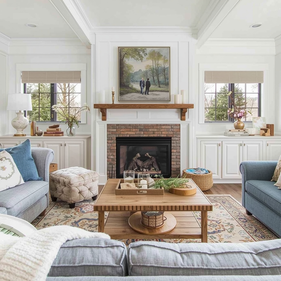
There is also a practical, long-term dimension to this decision. Repainting a room is not something most homeowners want to do every couple of years. Choosing a color scheme you will still love five or ten years from now requires strategic thinking. Timeless palettes — soft whites, warm greys, sage greens, and dusty blues — have earned their reputations for good reason. They age gracefully, adapt to changing décor trends, and remain visually restful without feeling dated.
Color also plays a significant role in how spacious your living room appears. Lighter, cooler shades tend to open up a space and make walls feel further apart — a game-changer in smaller apartments or rooms with limited natural light. Darker, warmer tones can make a large room feel more intimate and cocooning. Understanding this simple principle alone can save you from costly decorating mistakes.
Beyond the practical reasons, there is something deeply personal about color. It is one of the most direct ways we express ourselves at home. Your living room is not a showroom — it is where real life happens. The colors you surround yourself with every day will either quietly lift your spirits or subtly drag them down. Getting the color scheme right is one of the highest-impact decisions you can make for your home.
Key Factors That Influence Living Room Color Choices
Several important factors can influence your choice of living room color combinations and how to choose living room colors effectively. Understanding these factors before picking up a paint swatch will save you time, money, and frustration. Let us break them down one by one.
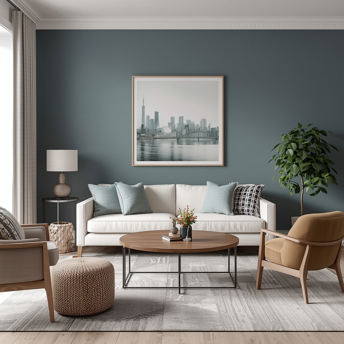
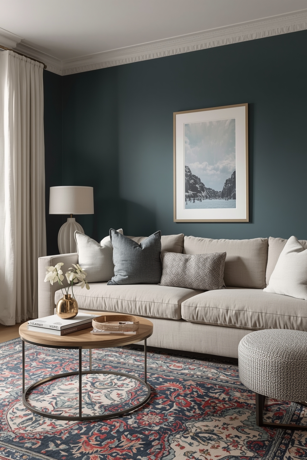
The Size of Your Living Room: The dimensions of your room should heavily influence the palette you choose. Compact spaces benefit from lighter shades — creamy whites, pale greys, blush pinks, or soft sage — which help the room feel larger and more open. Spacious rooms have far more freedom to experiment with deep jewel tones like emerald green, sapphire blue, or rich burgundy.
Natural Light and Room Orientation: The quality of natural light entering your living room is one of the most critical and most commonly overlooked factors. A north-facing room receives cooler, bluer light, so warm tones like terracotta or golden yellow can counterbalance that chill beautifully. A south-facing room floods with warm golden light, giving you more freedom to use cooler shades without the space feeling cold. Always test paint samples at different times of day — colors can look dramatically different under morning sunlight versus evening lamplight.
Your Existing Furniture and Décor: Before falling in love with a paint color on a sample card, take an honest look at what you already own. Your sofa, rugs, curtains, artwork, and wooden furniture all carry their own color undertones that need to harmonize with your wall color. If you are not ready to replace your furniture, build your color scheme around what you already have — this approach always delivers more cohesive results.
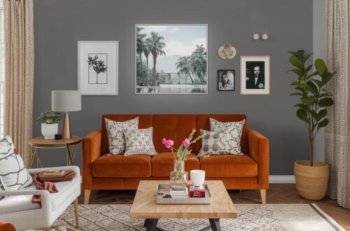
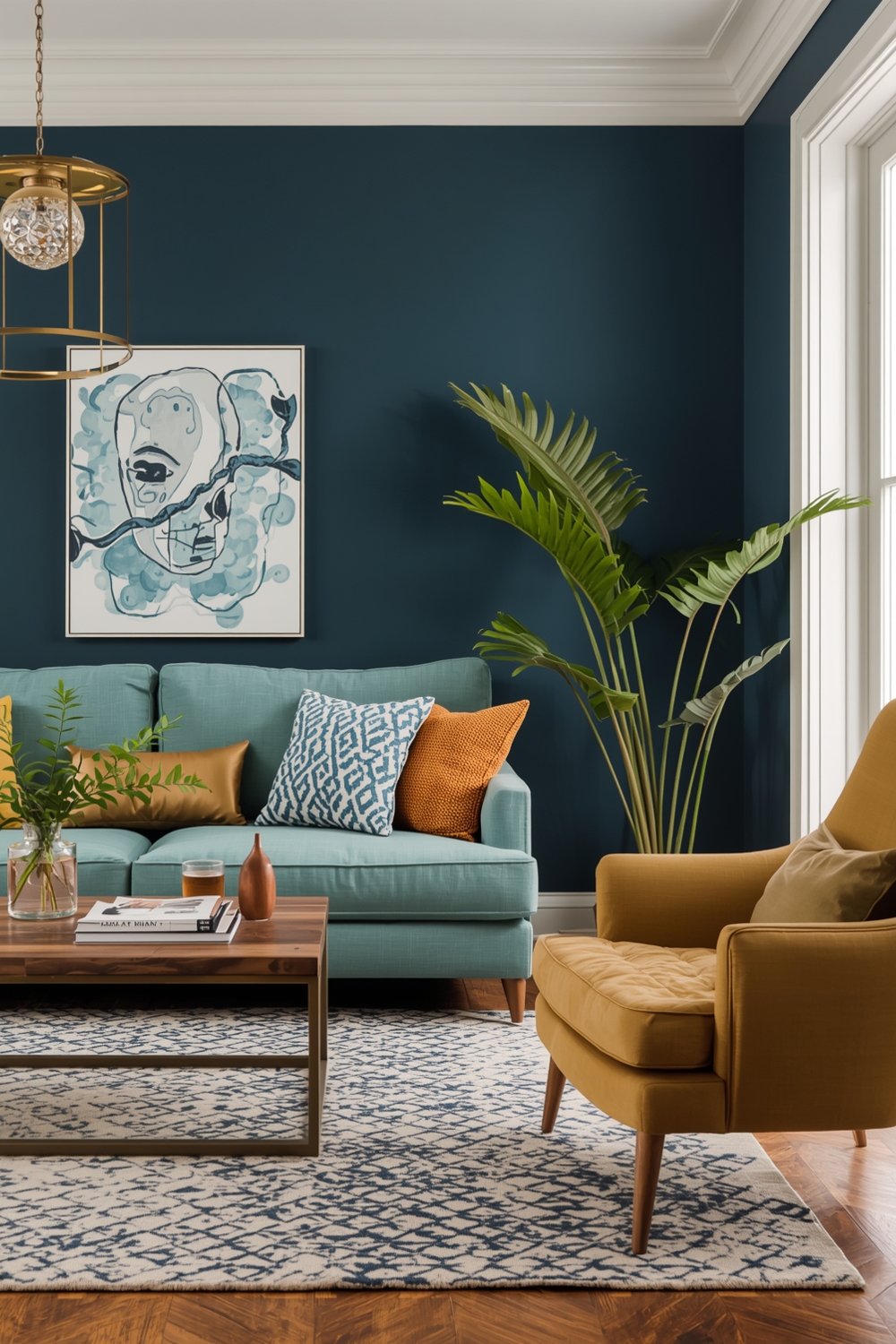
Your Personal Style and Lifestyle: Are you drawn to calm, minimalist spaces? Or do you love bold, layered, maximalist rooms full of personality? Minimalist aesthetics call for restrained palettes — monochromatic schemes in whites, beiges, and light taupes. A more eclectic or bohemian style might welcome earthy terracottas, rich mustards, and deep forest greens working together in layered harmony. Your living room should feel like a genuine expression of who you are.
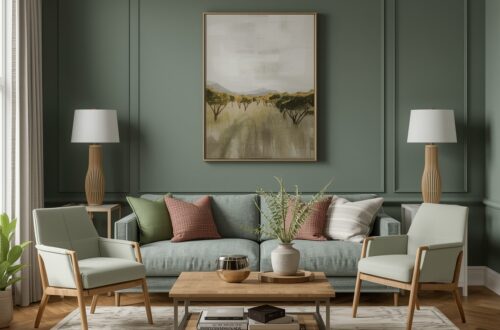
The Mood You Want to Create: Decide upfront what feeling you want your living room to project. Blues, greens, and soft neutrals create calm and restorative spaces. Warmer tones like coral, yellow, and amber excel in lively social settings. Deep charcoals or muted jewel shades with metallic accents bring quiet sophistication. Knowing your target mood narrows your palette choices enormously.
Trends vs. Timelessness: Many experienced decorators invest in timeless base colors for large surfaces — walls, floors, and major upholstered pieces — while bringing in trendier hues through easily swappable accessories like cushions, throws, vases, and artwork. This gives you a foundation that endures and accents that keep things feeling fresh and current season after season.
Understanding Basic Color Theory: Complementary colors — opposite on the color wheel, like blue and orange — create vibrant, high-contrast looks. Analogous colors — sitting side by side, like blue, blue-green, and green — create naturally harmonious, restful palettes that work especially well in living spaces. Neutral palettes built around whites, creams, greys, and beiges offer the most flexibility, especially when layered with varied textures to keep things from feeling flat.
Testing Before You Commit: Always test paint samples before making a final decision. Paint large swatches — at least 30 cm by 30 cm — directly on your walls and observe them at various times of day under both natural and artificial lighting. Live with your samples for at least 48 hours before deciding. Many leading paint brands also offer online room visualizer tools that let you digitally preview a color in your space before spending money on full tins — a feature genuinely worth using.
In the end, there is no single universally “correct” answer to what the best color scheme for a living room is — because the best color scheme is always the one that feels right for you, your space, and the life you live in it. With a solid understanding of the principles outlined in this guide, you are now far better equipped to make that choice with confidence and genuine creativity. Take your time, trust your instincts, and do not be afraid to be bold — after all, it is just paint, and you can always change it.