Are you looking to elevate the design of your home but not sure where to start? One of the most practical and immediately applicable principles in interior design is the 3-5-7 rule. It’s a simple concept, but understanding it — really understanding why it works and how to apply it beyond just arranging candles on a shelf — can completely change how you approach decorating any room in your home. Whether you’re styling a bookshelf, arranging furniture, or figuring out why your living room never quite looks finished, this principle offers a clear and reliable framework for creating spaces that feel balanced, dynamic, and genuinely well-designed.
Most people who walk into a beautifully decorated room can tell that something is working, even if they can’t articulate exactly what it is. The room feels complete. The eye moves around naturally without getting stuck or confused. There’s a sense of rhythm — a kind of visual music happening across the surfaces and objects in the space. Very often, what they’re responding to is the deliberate use of odd-number groupings throughout the room. It’s not magic. It’s a principle that professional designers have been applying for generations, and once you understand it, you start seeing it everywhere — and seeing where its absence is creating the subtle sense of “almost right” that plagues so many otherwise attractive rooms.
Let’s break down exactly what the 3-5-7 rule is, why it works from a perceptual standpoint, and how you can start applying it room by room in your own home today.
Why Odd Numbers Create Better Visual Balance in Design
The 3-5-7 rule is built on a simple but powerful observation: odd-numbered groupings of objects are more visually interesting and harmonious than even-numbered ones. When you arrange three items together, or five, or seven, the eye naturally moves between them in a way that feels fluid and engaging. When you arrange two items, or four, or six, the eye tends to split them into pairs, which creates a sense of symmetry that — while not inherently bad — can feel rigid, static, and less dynamic than its odd-numbered counterpart.
The reason for this goes back to how human visual perception works. Our brains are pattern-recognition machines. When we see a group of objects, we instinctively try to find the center, the balance point, and the relationship between the individual items. With an even number of objects, the eye quickly resolves that relationship into two equal halves, finds the pattern, and moves on. There’s a finality to it — a sense of closure that, while comfortable, doesn’t invite the eye to keep exploring. With an odd number, the resolution is less immediate. The eye has to work slightly harder to find the balance, and that slight effort keeps the visual experience active and engaging.
Think about it in musical terms. An even beat pattern — two, four, six — is predictable and metronomic. It’s steady, but it doesn’t surprise you. A three- or five-beat rhythm feels more complex and interesting, even when it’s still structured. The same principle applies to visual composition. Odd numbers introduce a slight asymmetry that keeps the composition alive.
The numbers 3, 5, and 7 specifically are the most commonly used in interior design because they represent increasing levels of complexity and scale. A group of three is intimate and compact — ideal for a small vignette on a side table or a cluster of items on a bathroom shelf. A group of five is more expansive and works well for coffee table arrangements, mantelpiece displays, or gallery wall clusters. A group of seven starts to suggest abundance and is typically used for larger surfaces like long console tables, wide bookshelves, or entire gallery walls where multiple items need to read as a unified composition.
Importantly, the rule isn’t about literal counting in every single case — it’s about the underlying principle of compositional asymmetry and its effect on visual interest. Designers who understand the rule well sometimes work with groups of nine or eleven in large-scale arrangements, holding to the odd-number logic even as the scale increases. The number itself matters less than the effect it produces: a composition that has a clear visual hierarchy, a sense of movement, and enough complexity to hold the eye without confusing it.
The 3-5-7 rule also interacts powerfully with variation in size and height. Odd-numbered groupings work best when the items within them vary in scale — a tall element, a medium element, and a low element in a group of three, for instance. This vertical variation reinforces the asymmetry that makes odd groupings visually dynamic, and it prevents the arrangement from reading as a flat row of objects rather than a composed vignette. When all the items in a grouping are the same height and size, even three of them can look static and repetitive. When they vary — in height, in shape, in texture — they create a sense of relationship and conversation that makes the arrangement feel curated rather than arbitrary.
Key Ways the 3-5-7 Rule Is Used in Home Decorating
Incorporating the 3-5-7 rule into your home decorating can be done across virtually every surface, room, and design context. Once you start looking for opportunities to apply it, you’ll find that it offers guidance in situations you might not have expected — not just for shelf styling and decorative objects, but for furniture arrangement, color blocking, pattern layering, and even lighting design. Here’s how it plays out in practice across the most common decorating challenges homeowners face.
Vignettes and Surface Styling
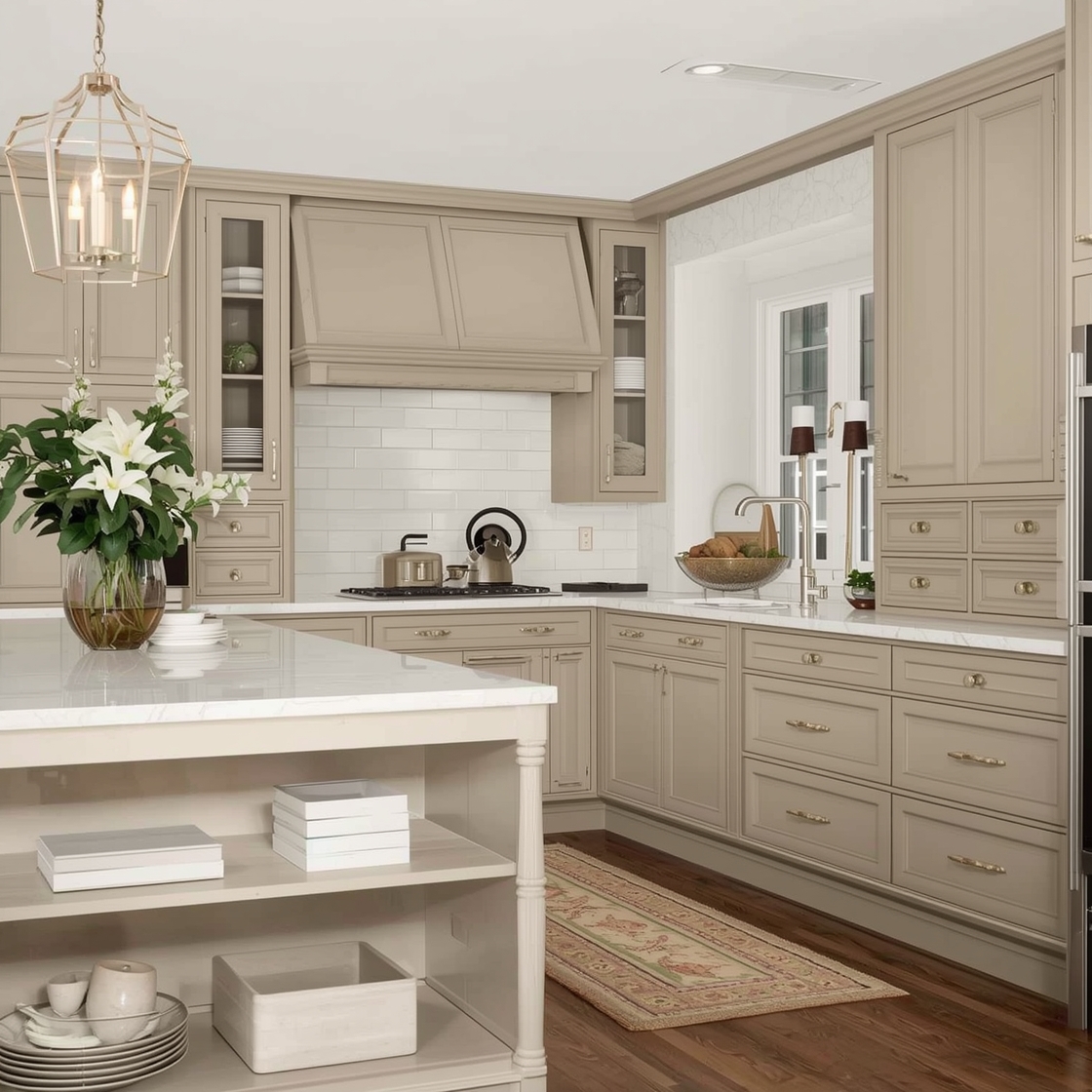
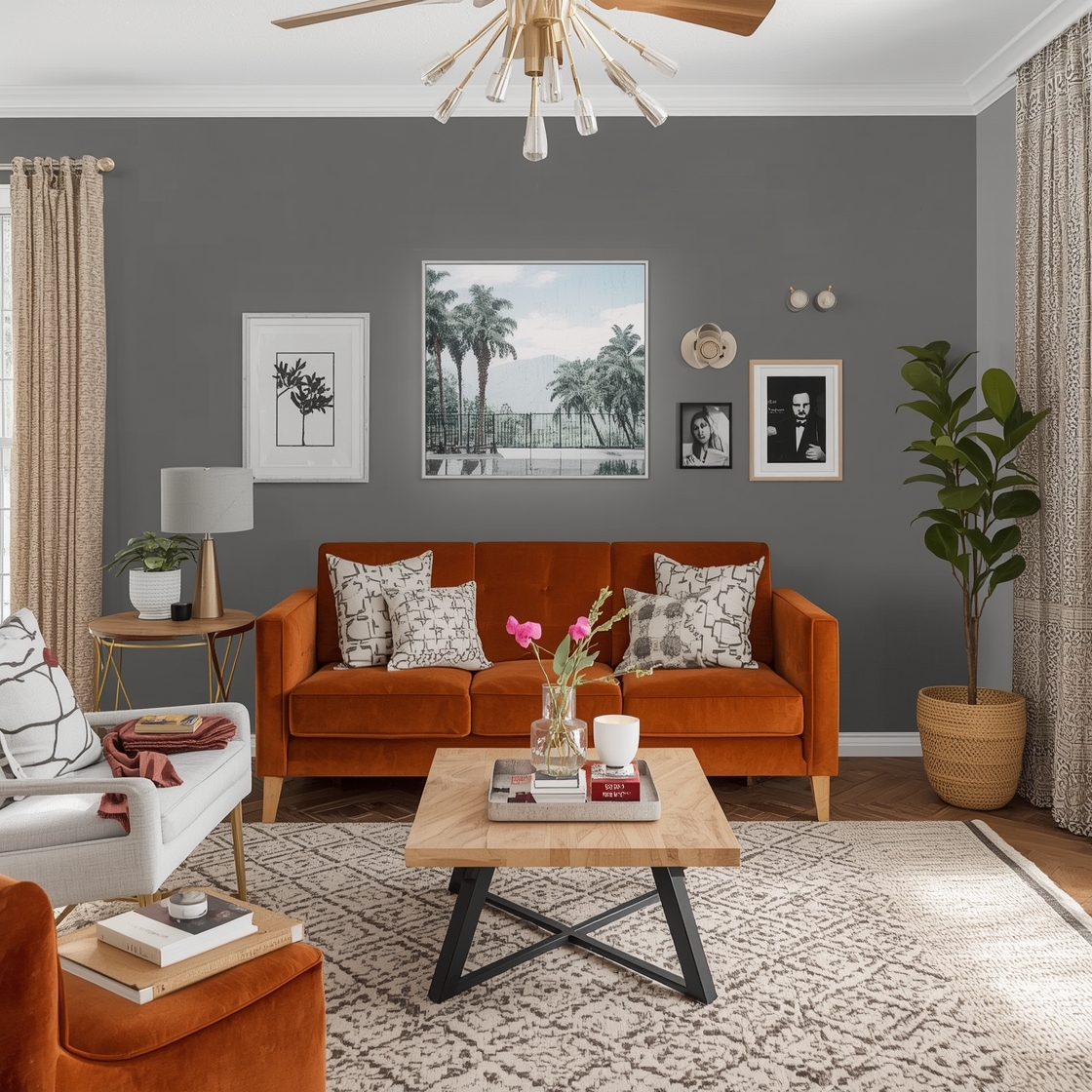
This is the most immediately obvious application of the rule, and it’s where most people first encounter it. A vignette is a small, composed arrangement of objects on a surface — a side table, a mantelpiece, a console table, a windowsill. The goal of a vignette is to look intentional and interesting without looking cluttered or random, and the 3-5-7 principle is the most reliable framework for achieving that goal.
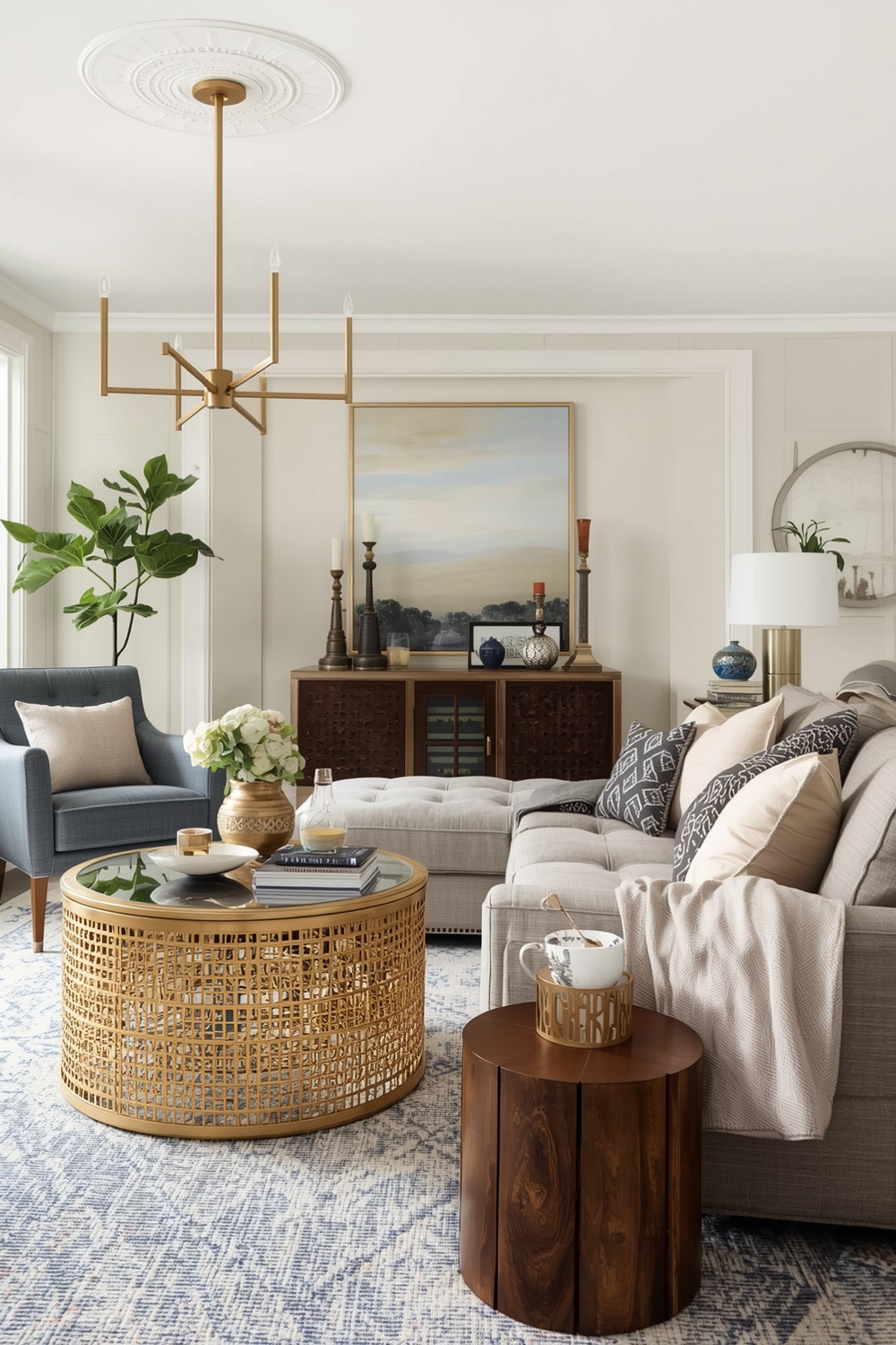
For a simple side table vignette, think in threes: a table lamp (the tallest element and the anchor), a medium-height item like a small plant or a stack of books, and a low item like a small decorative object or a candle. These three elements create a triangular composition — your eye moves from the tall element down to the medium one and across to the low one, completing a visual journey that feels satisfying and complete. Now introduce a fourth element and notice what happens: the eye immediately tries to pair them up, and the easy, fluid triangular movement is replaced by something more static.
On a longer surface like a mantelpiece or a console table, scale up to five or seven items, keeping the same principle of height variation in mind. Anchor one end with a taller element — a piece of art, a large vase, a sculptural object — and let the arrangement step down in height as it moves across the surface, with occasional variations that prevent it from feeling like a simple descending staircase. The overall silhouette of the arrangement should have an organic, irregular quality — peaks and valleys rather than a smooth slope.
Throw Pillows and Soft Furnishings
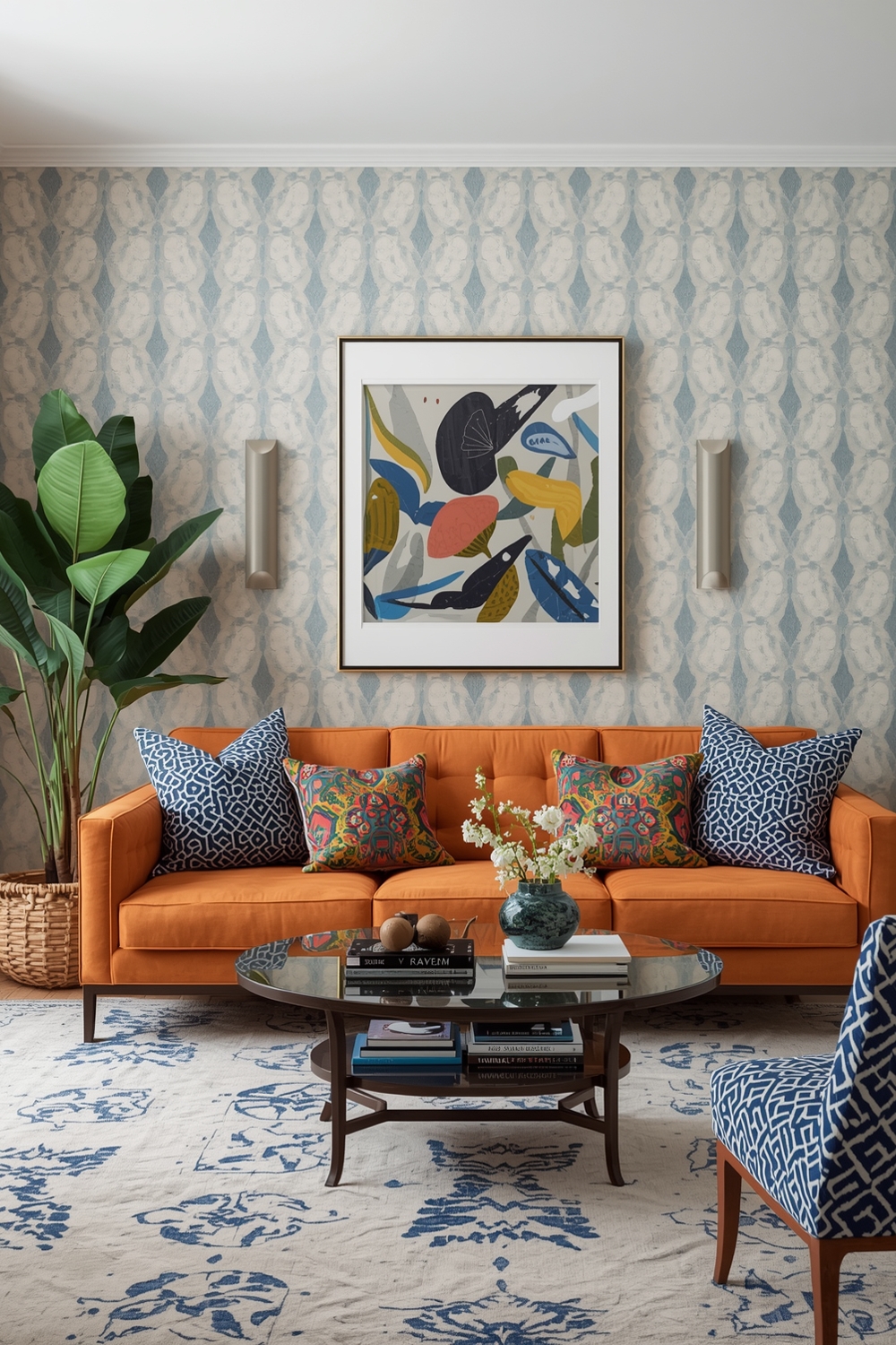
Throw pillows are one of the most common places where the even-versus-odd principle reveals itself in living rooms. Two pillows on each end of a sofa is the default arrangement for most people — and it’s perfectly fine, but it’s also a little flat and predictable. Try three pillows instead: two on one side and one on the other, in varying sizes. Or five pillows across a larger sofa — two on each end and one in the center, or a cluster of three on one side and two on the other. Both arrangements have a relaxed, organic quality that two-by-two symmetry simply doesn’t achieve.
The same principle applies to cushions on a bed. Two European square pillows behind two standard pillows behind two king pillows is very orderly and symmetrical, but it can feel like a hotel bed rather than a personal, lived-in space. Introduce a single accent pillow in the center — making the front row three rather than two — and the whole arrangement immediately feels warmer and more intentional.
Gallery Walls and Artwork Arrangements
Gallery walls are one of the most satisfying applications of the 3-5-7 rule because the effect of odd-number groupings is so visually apparent at this scale. A wall with three framed pieces arranged in a considered triangular composition feels curated and deliberate. A wall with four pieces in a grid feels orderly but slightly corporate. A wall with five or seven pieces, varying in size and spaced with intention, creates a sense of abundance and personality that’s very hard to achieve with even numbers.
When planning a gallery wall using this principle, start by identifying the anchor piece — the largest, most visually dominant item in the grouping. Build the arrangement around that anchor, using the remaining pieces to create a composition that has visual movement without feeling chaotic. Step back frequently to assess the overall silhouette of the grouping. You’re looking for an arrangement that has a clear center of gravity (usually around or just above eye level) but an organic, irregular outline that makes the wall feel lived-in rather than installed.
Furniture Arrangement and Grouping
The 3-5-7 rule applies at the furniture scale too, though it’s applied somewhat differently here. In a living room seating arrangement, three pieces of upholstered furniture — a sofa and two armchairs, or a large sectional treated as one piece alongside two side chairs — creates a more dynamic and conversation-friendly grouping than two sofas facing each other, which tends to feel confrontational and rigid. The odd-number arrangement has a natural focal point (usually the main sofa) and two supporting elements that respond to it without simply mirroring it.
In open-plan spaces, grouping furniture into arrangements of three distinct zones — a seating area, a dining area, and a work or reading area, for example — creates a more interesting and navigable floor plan than a layout that tries to divide the space into two equal halves. The principle of visual asymmetry operates at every scale, from a group of three candles on a shelf to three functional zones in an open-plan living space.
Color Blocking and Pattern Layering
The 3-5-7 rule can also be applied to how colors and patterns are distributed throughout a room. Rather than using exactly two colors in equal proportions — which can make a room feel visually split — try distributing three colors across a room in a deliberate hierarchy. One dominant color (walls, large furniture, flooring) takes up roughly sixty percent of the visual field. A second color (upholstery, rugs, curtains) contributes around thirty percent. A third color (accessories, throw pillows, plants, artwork) provides the remaining ten percent as an accent. This three-color hierarchy has the same underlying logic as the 3-5-7 rule: it uses an odd number of elements arranged in a deliberate hierarchy to create visual harmony with just enough variation to stay interesting.
When styling a surface using the 3-5-7 rule, vary not just the number of items but their textures and materials. Mixing a ceramic object with a wooden one and a metallic one in a group of three adds tactile and visual variety that makes the arrangement feel more considered. Groupings of identical materials, even in the right number, can feel repetitive — the interplay between different textures is what gives a well-styled vignette its depth and richness.
When to Break the Rule — and Why That’s Part of Understanding It
Like all design principles, the 3-5-7 rule is a guideline, not a law. There are contexts in which deliberate symmetry and even numbers are exactly right — a pair of matching lamps on either side of a bed, for instance, or two identical sconces flanking a mirror. Symmetrical arrangements have their own kind of elegance, particularly in more formal or classical design contexts. The rule isn’t about rejecting symmetry entirely; it’s about understanding when asymmetry will serve the space better, and applying it with intention rather than by accident.
The best-designed rooms often combine both approaches — using the stability of symmetrical elements as anchors, and odd-number groupings as the decorative layer on top of that structure. A bedroom with matching nightstands and lamps (symmetrical) might have a gallery wall above the headboard arranged in a cluster of seven (odd). A living room with two matching sofas facing each other (symmetrical) might have a coffee table styled with a group of five objects (odd). The discipline and the dynamism work together, and the result is a room that feels both ordered and alive.
Once you start seeing the 3-5-7 rule in action — in showrooms, in design magazines, in the homes you admire most — you’ll find it hard to unsee. It shows up everywhere that good design has been intentionally practiced, and its consistent presence across styles and contexts is a testament to how fundamental the principle is. Apply it thoughtfully in your own home, and you’ll start to notice a quality of cohesion and visual ease in your rooms that, once you experience it, becomes the standard you hold every space to.
Design doesn’t have to be complicated to be effective. Sometimes the most powerful principles are also the simplest ones — and the 3-5-7 rule is a perfect example of a simple idea with an outsized impact on how a room looks and feels.