Introduction
Are you looking to decorate with sage green but unsure of which colors to pair it with? You are certainly not alone. Sage green has become one of the most beloved and widely used interior colors of recent years, and for very good reason — it is soft, sophisticated, rooted in nature, and genuinely flattering in almost any room of the house. But despite its reputation for being an easy, forgiving color to work with, sage green does have its limits. Combine it with the wrong shades and you can inadvertently undermine everything that makes it so appealing in the first place. In this guide, we will explore exactly what colors not to combine with sage green, explain why those particular combinations tend to go wrong, and offer some beautiful alternative color suggestions that work harmoniously alongside it instead. If you want to get the most out of sage green in your home, keep reading — this is everything you need to know.
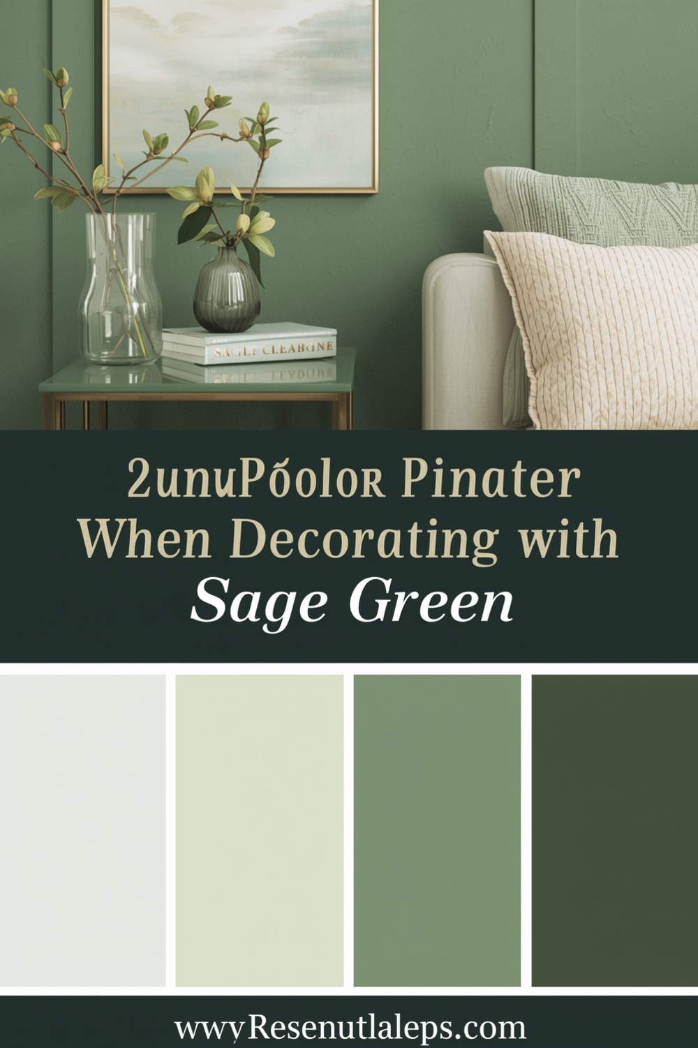
Before we dive into the specific clashes and combinations, it helps to understand what sage green actually is as a color, because not everyone who uses the term means quite the same thing. Sage green sits in a unique and somewhat complex position on the color spectrum. It is a grey-green — a muted, desaturated tone that sits closer to the grey and silver end of the green family than the vivid, leafy greens you might find in a garden. It carries subtle undertones that can shift depending on the light and the surrounding colors: sometimes it leans slightly blue-grey, sometimes it tips toward a warmer yellow-grey, and occasionally it can read as almost silvery in bright natural light. This complexity is part of what makes sage green so versatile and endlessly interesting to live with — but it is also what makes it slightly tricky to pair well. Because sage green is neither a pure grey nor a pure green, it can react unexpectedly to colors that work perfectly well alongside straightforward versions of either.
Why Some Colors Clash With Sage Green
When it comes to sage green, not all colors are created equal. Some shades can clash with sage green in ways that are immediately jarring, while others create a subtler but equally damaging sense of discord that drains the life out of a room without you quite being able to identify the cause. For example, pairing sage green with bright, highly saturated colors like neon yellow or hot pink can completely overwhelm the space and create visual chaos. The core problem here is one of energy levels — sage green is by nature a quiet, restrained, low-saturation color. It works precisely because it does not shout. When you place it next to a color that shouts very loudly indeed, the contrast is not interesting or dynamic — it is simply discordant, like playing a soft acoustic guitar alongside a blaring electric amplifier.
Vivid, high-saturation reds are another problematic pairing. True red and sage green sit in a complementary position on the color wheel, which might suggest they should work well together — and in theory, complementary colors can create striking, high-energy combinations. But the key word there is “energy.” Complementary pairings work best when both colors are operating at a similar saturation level. A vivid, pure red against the muted gentleness of sage green does not create exciting contrast — it creates a visual collision where the red overwhelms and dominates, stripping sage green of all its nuance and sophistication and leaving the room feeling unbalanced and uncomfortable.
Mixing sage green with certain earthy tones can also cause problems, though this one surprises people more often because earthy colors are generally considered natural allies of green. The issue arises specifically with muddy browns and very deep, heavy oranges — shades that carry a lot of warm yellow-brown pigment. When placed alongside sage green’s cooler grey undertones, these heavily warm, muddy tones can make the green appear dull, flat, and slightly sickly, as though it has been drained of all its freshness. The combination can end up feeling oppressive and strangely dated — not in a charming vintage way, but in a way that simply feels tired and unresolved. The earthy richness that makes those warm browns and deep oranges so beautiful in the right context becomes a liability when the cooler, quieter energy of sage green is involved.
Very cool, icy tones like stark cool white, bright icy blue, or electric lilac also tend to struggle alongside sage green, though for different reasons. These colors carry an intensity and crispness that can make sage green look washed out and indistinct by comparison. Sage green needs warmth and softness around it to look its best — the presence of very cold, sharp, high-contrast tones tends to rob it of exactly those qualities, leaving it looking neither confidently green nor elegantly grey, but simply uncertain and unresolved.
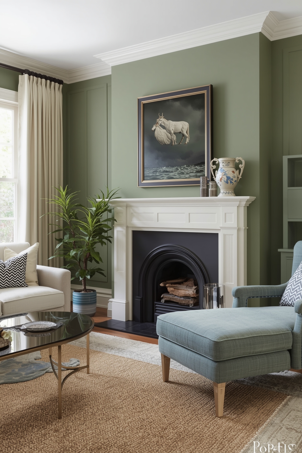
Jet black is another color to use with extreme caution around sage green. While black can work as an accent in a sage green room — think thin black picture frames, a black-framed window, or black ironmongery on cabinetry — using black as a primary or secondary color alongside sage green tends to feel heavy-handed and oppressive. The lightness and organic, airy quality that make sage green so appealing in the first place get completely swallowed up by too much black in the same space. The result often feels gloomy rather than sophisticated, and it strips sage green of its most important characteristic — that quality of bringing gentle, natural calm into a room.
Key Color Pairing Principles When Decorating With Sage Green
To create a truly harmonious color palette with sage green, the single most important principle is to match its energy. Sage green is a soft, muted, low-saturation color — and it is happiest alongside other soft, muted, low-saturation colors. This does not mean your palette has to be boring or lacking in contrast. It simply means that the way you introduce contrast should be through differences in tone, texture, and depth rather than through dramatic shifts in color saturation.
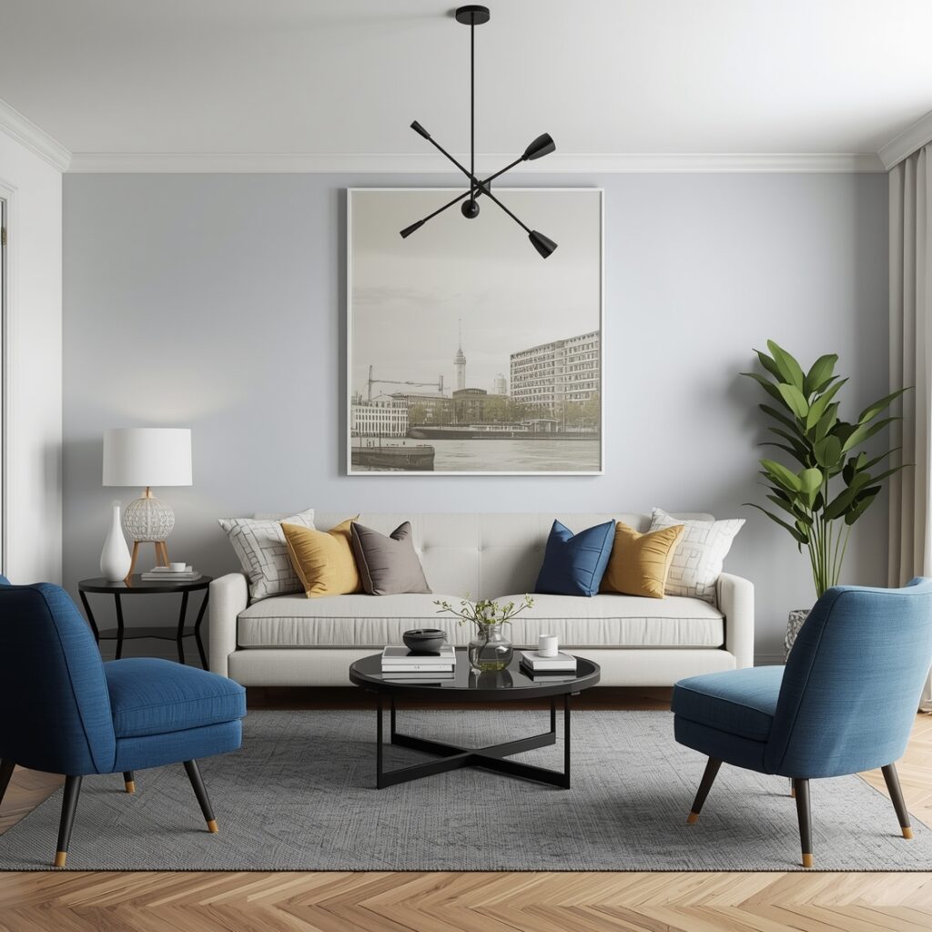
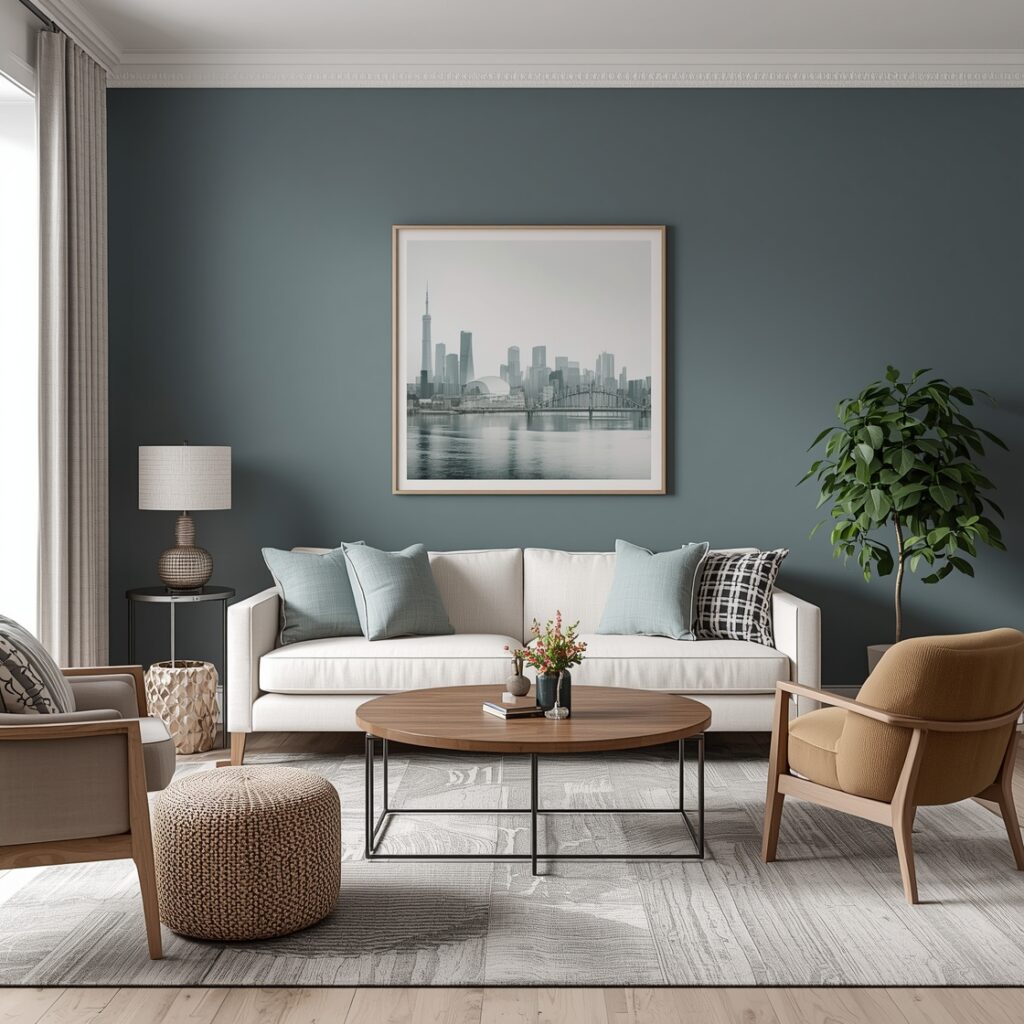
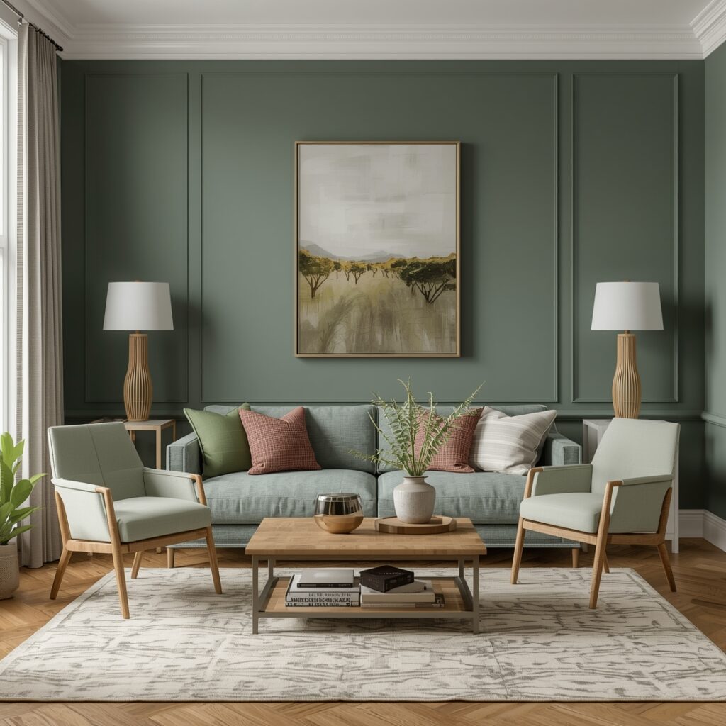
Consider pairing sage green with soft, muted tones like blush pink, dusty blue, or creamy white. These subtle, sophisticated colors complement sage green’s calming, organic vibe beautifully and create a serene, elegant atmosphere that feels cohesive and intentionally designed. Blush pink is a particularly magical pairing — the warmth of the pink balances the cooler grey undertones of the sage, creating a combination that feels simultaneously fresh and deeply cozy. Dusty blue brings a similarly gentle, harmonious quality, its muted coolness echoing the grey in sage green and creating a palette that feels almost like a perfectly composed watercolor painting.
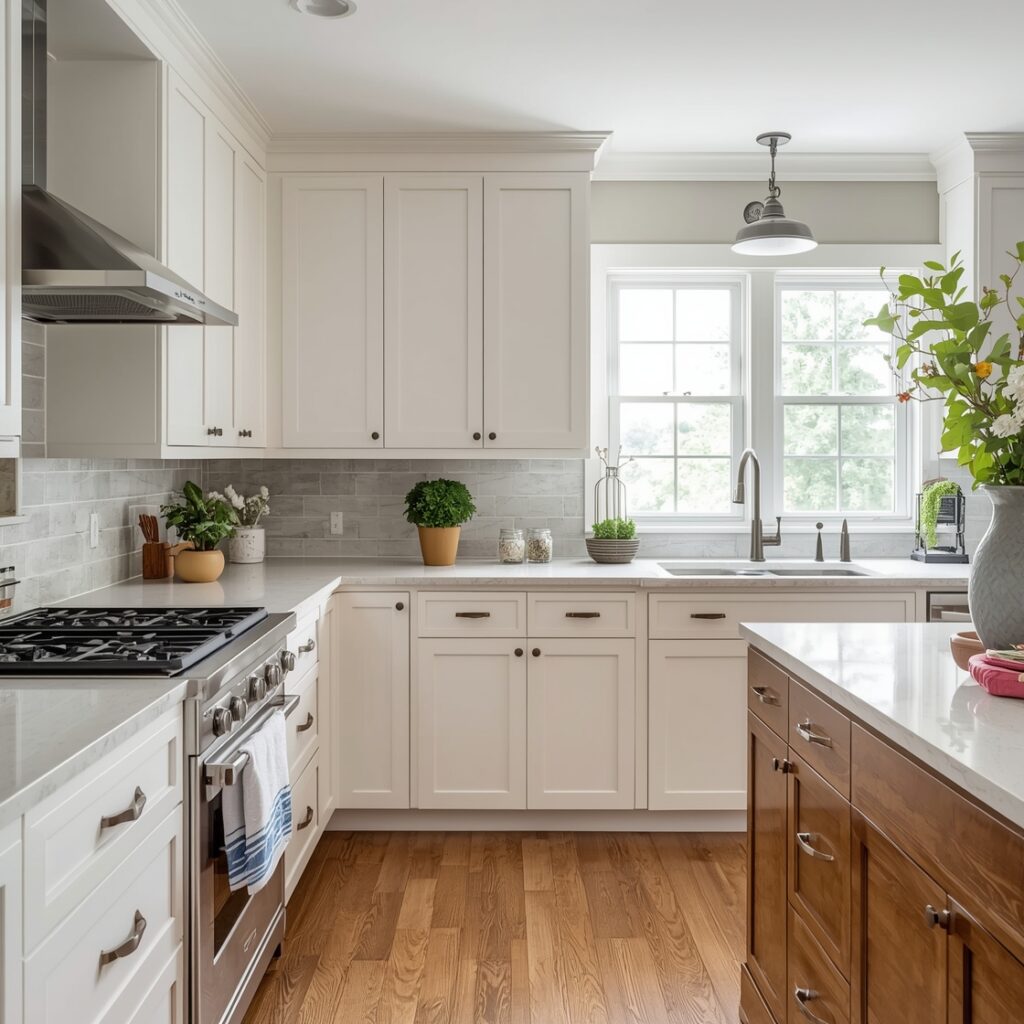
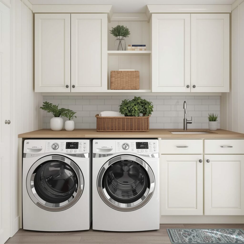
Warm, creamy whites are perhaps sage green’s single most reliable companion. A true warm white — one with yellow or pink undertones rather than blue — sits alongside sage green in a way that feels completely natural and unforced, like colors that belong together because they are both ultimately rooted in the same organic world. Warm whites also have the practical advantage of brightening a sage green room without introducing any of the harshness or coldness that stark, bright whites can bring.
Natural wood tones are an absolute gift when it comes to decorating with sage green. Light to medium warm woods — oak, ash, walnut, and pine all work beautifully — bring a warmth and organic richness to a sage green room that feels entirely natural and effortless. The combination of sage green walls or upholstery with warm wooden furniture, flooring, or shelving is one of those pairings that rarely fails, precisely because both elements are drawing from the same natural source of inspiration. It is essentially the color palette of a walk through a mixed woodland on a bright autumn morning — and very few things feel more instinctively right than that.
For a more dramatic and luxurious look, carefully chosen jewel tones can work beautifully alongside sage green — but the key word here is carefully. Emerald green, used as an accent rather than a dominant color, creates a rich tonal layering that feels lush and botanical. Sapphire blue brings depth and drama without the harshness of brighter blues. Amethyst purple, particularly in its dustier, more muted incarnations, can create a surprisingly sophisticated and unexpected combination with sage green that feels both artistic and warm. The success of these jewel tone pairings depends entirely on keeping the jewel tones as accents — in cushions, throws, vases, and artwork — rather than allowing them to compete with sage green for dominance.
Soft, warm terracotta and clay tones can also work well with sage green when chosen carefully. The key is to avoid the very deep, dark, muddy versions of these tones and instead opt for lighter, more washed-out, sun-baked terracottas that have plenty of warmth without the heaviness. These softer terracottas echo the earthy origins of both colors, creating a palette that feels like a Mediterranean courtyard or a Tuscan farmhouse — warm, natural, and deeply inviting.
How This Idea Improves Your Space
Understanding what colors not to combine with sage green — and knowing which pairings genuinely bring out the best in it — can transform the way your rooms look and feel in a remarkably profound way. Sage green is a color with enormous potential. Used thoughtfully, it has the power to make a living room feel like a genuine sanctuary, a bedroom feel like a restful retreat, and a kitchen feel like the warm, welcoming heart of a home. But that potential is only fully realized when the surrounding palette is working in harmony with it rather than against it.
When you remove the colors that clash — the overly saturated brights, the heavy muddy earths, the stark cold whites, the dominating blacks — and replace them with the colors that complement — the blush pinks, the warm creams, the dusty blues, the natural woods, the carefully chosen jewel tone accents — something remarkable happens to a sage green room. It begins to breathe. The green deepens and becomes richer. The grey undertones resolve into something that reads as sophisticated rather than indecisive. The whole space acquires a quality of calm, natural elegance that is very difficult to achieve by any other means.
Practically speaking, the easiest way to start building a sage green palette in your own home is to begin with the largest surfaces first. If sage green is your wall color, your next decision — the color of your largest upholstered piece, whether that is a sofa, an armchair, or a bed frame — is the most consequential pairing choice you will make. Get that relationship right using the principles outlined here, and the rest of the room’s palette will fall into place far more easily than you might expect.
From there, layer in texture and tone rather than color contrast. A sage green room that incorporates a rich variety of materials — linen, velvet, natural wood, ceramic, stone, woven baskets, dried botanicals — will feel endlessly interesting and alive without ever requiring the risky addition of clashing or competing colors. The tonal and textural complexity does all the work that saturated color contrast does in bolder, more high-risk palettes, but it does it in a way that is far more forgiving, far more livable, and far more likely to make you feel genuinely good every single day that you spend in the space.
In short, sage green is one of the most rewarding colors you can choose for your home — but like all truly great things, it rewards a thoughtful and considered approach. Know what to avoid, know what to embrace, and you will find that sage green consistently delivers the kind of quiet, sophisticated, deeply natural beauty that so many homeowners are searching for. It is a color worth getting right, and now you have everything you need to do exactly that.