When it comes to designing your home, choosing the right colors is one of the most exciting and, let’s be honest, most stressful decisions you’ll face. Most people focus almost entirely on finding the perfect individual color — the ideal shade of blue for the bedroom, the exact right green for the living room. But here’s what experienced designers will tell you: the single color you choose matters far less than how all the colors in a room work together. That relationship between colors — the way they support, contrast, and communicate with each other — is what we call color harmony, and it’s the foundation of every truly beautiful interior.
You’ve probably walked into a room at some point and felt immediately at ease, without being able to explain exactly why. The furniture wasn’t extraordinary. The art wasn’t particularly striking. But something about the space just felt right — calm, balanced, inviting. Chances are, what you were responding to was color harmony. Conversely, you’ve probably also walked into a room that felt vaguely unsettling or visually exhausting, even when each individual element seemed fine on its own. That discomfort is almost always the result of colors that aren’t working in relationship with each other, even if none of them are objectively “bad” colors.
Color harmony is the discipline of making colors work together rather than simply alongside each other, and it’s arguably the most powerful tool in the entire interior design toolkit. Understanding it — really understanding it, beyond just knowing what a color wheel looks like — can transform the way you approach every room in your home.
Why Color Harmony Is Essential in Interior Design
Color harmony, at its core, refers to the pleasing combination of colors in a room that creates a unified sense of cohesion and balance. It’s not about picking colors you personally love, though personal preference absolutely plays a role. It’s about selecting colors that have a meaningful relationship to each other — colors that, when placed together, feel like they belong to the same visual family and tell the same story about the space.
The reason color harmony matters more than any individual color choice is simple: no color exists in isolation. Every color you put on a wall, a sofa, a rug, or a piece of artwork is immediately in conversation with every other color in the room. Those conversations can be harmonious or discordant, subtle or dramatic, calming or energizing — but they’re always happening, whether you’ve planned for them or not. When you plan for them deliberately, when you make those color relationships intentional, the result is a room that feels complete and considered. When you don’t, the result is a room that always feels like something is slightly off, even if you can’t put your finger on what.
This is why interior designers spend so much time thinking about palettes rather than individual colors. A color palette is a curated set of colors that have been specifically chosen for how they interact — not just for how each one looks on its own. Building a palette requires thinking about proportion (how much of each color is present in the room), temperature (are the colors predominantly warm, cool, or a deliberate mix?), value (the relative lightness and darkness of the colors), and saturation (how vivid or muted each color is). When all of those elements are balanced thoughtfully, color harmony is the natural result.
There’s also a deeply psychological dimension to color harmony that’s worth understanding. Our brains are wired to find pattern and coherence in our visual environment — it’s one of the ways we assess whether a space is safe, comfortable, and worth spending time in. When colors in a room are harmonious, our brains read the space as intentional and ordered, and we feel relaxed and at ease in it. When colors are discordant or arbitrary, our brains register something unresolved, and we feel a low-level tension that can make a room feel draining to spend time in, even without consciously identifying why. Getting color harmony right isn’t just an aesthetic consideration — it directly affects how people feel in your home.
For those wanting to go deeper into the foundational principles behind this, the theory of color harmony has been studied and documented extensively, offering a rigorous framework for understanding how and why certain color combinations create the visual effects they do. But you don’t need to memorize color theory to apply its principles intuitively once you understand the basic logic behind it.
Key Principles That Define Color Harmony in a Room
There are several foundational principles that define color harmony in interior spaces. These aren’t rigid rules so much as frameworks for thinking — tools that help you make decisions with more confidence and more predictable results. Whether you prefer a monochromatic palette or a richly layered mix of hues, these principles apply universally.
Understanding Color Schemes as a Starting Framework
A color scheme is a structured approach to selecting colors that are known to work well together based on their position on the color wheel. The most commonly referenced schemes are monochromatic (variations of a single color), analogous (colors that sit adjacent to each other on the color wheel), complementary (colors directly opposite each other), and triadic (three colors equally spaced around the wheel). Each scheme produces a different emotional and visual effect, and choosing the right one for a given room is often the first major decision in building a harmonious palette.
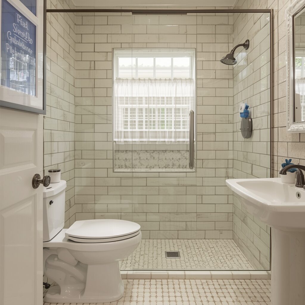
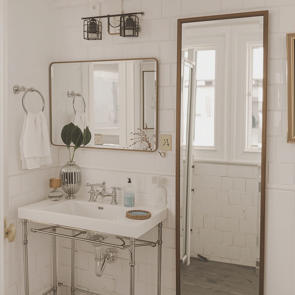
Monochromatic schemes — using multiple shades, tints, and tones of a single color — tend to feel very calm and cohesive. They’re an excellent choice for bedrooms and bathrooms, where a sense of visual rest is desirable. The risk is that they can feel flat if there isn’t enough variation in value and texture to keep things interesting. Layering different materials and finishes is essential in a monochromatic room.
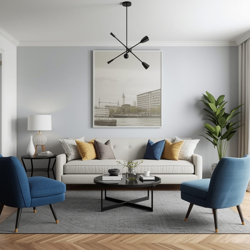
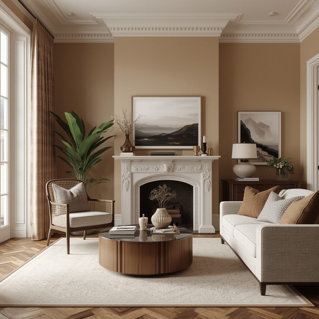
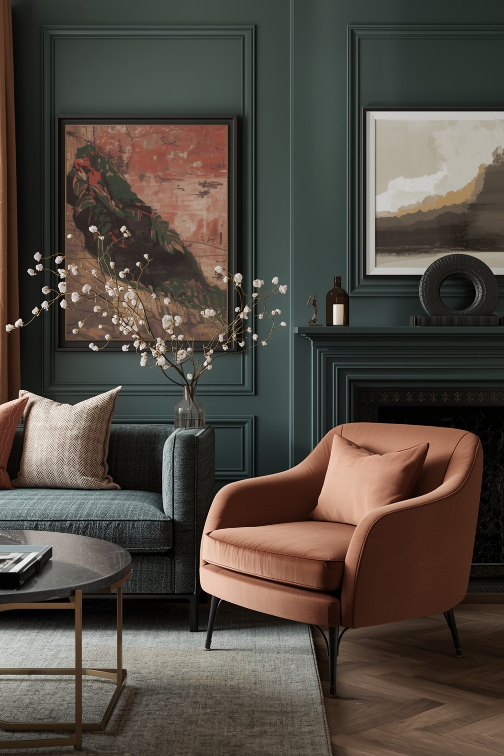
Analogous schemes, which draw from a connected group of neighboring colors on the wheel, are perhaps the most naturally harmonious of all approaches because the colors share underlying hue relationships. A palette of soft sage, warm olive, and muted terracotta is an analogous scheme, and it works beautifully in interior spaces because the shared warmth in those colors creates an immediate sense of cohesion. Most successful interior palettes are analogous at their core, even when they also incorporate a complementary accent.
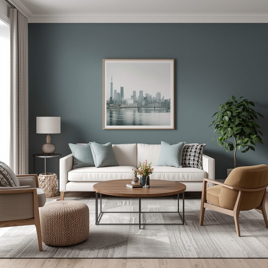
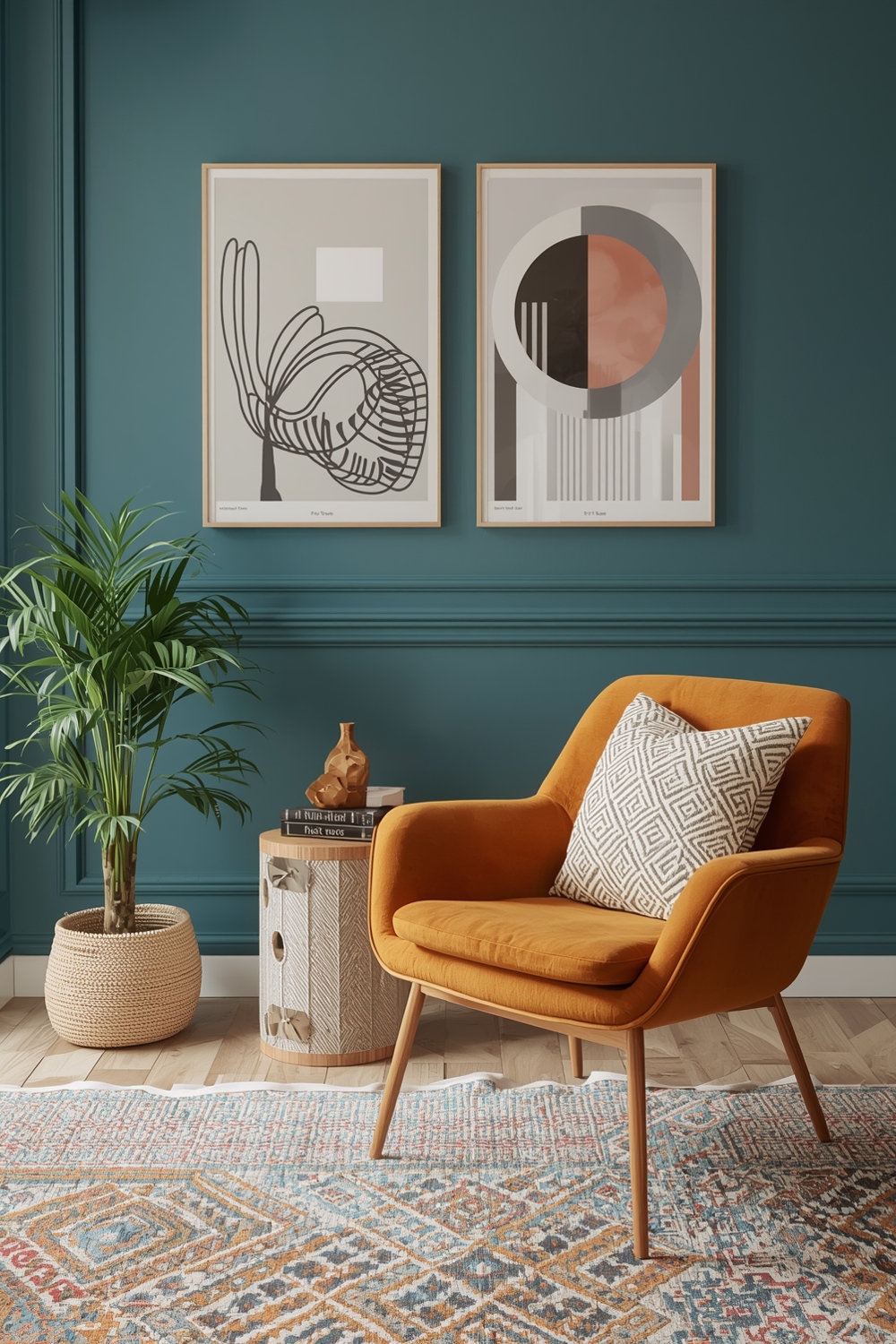
Complementary schemes use colors from opposite sides of the color wheel — blue and orange, red and green, purple and yellow — to create contrast and visual energy. Used well, a complementary palette is dynamic and vibrant without being jarring. The key is managing the proportions carefully: you typically don’t want equal amounts of both complementary colors, but rather a dominant tone with the complementary color appearing as an accent. A room that’s largely deep teal with touches of warm rust will feel sophisticated and intentional; a room that’s fifty percent teal and fifty percent rust will feel visually exhausting.
Color Temperature and How It Shapes a Room
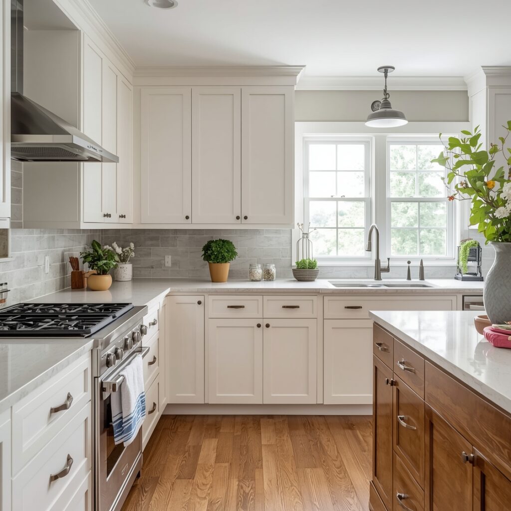
Every color has a temperature — it reads as either warm (reds, oranges, yellows, and their derivatives) or cool (blues, greens, purples, and their derivatives). Managing the overall temperature of a room’s palette is one of the most important and most underappreciated aspects of color harmony. A room that mixes warm and cool colors without intention can feel chaotic and unsettled. A room where the temperature has been managed deliberately — even if it mixes warm and cool tones — feels balanced and considered.
In general, warm-toned rooms feel cozier and more intimate, which makes them well-suited to living areas, dining rooms, and kitchens where social connection is the goal. Cool-toned rooms feel more expansive, calm, and focused, making them a natural choice for home offices, bathrooms, and bedrooms. But these aren’t rigid rules — a primarily warm room with a few carefully chosen cool accents can feel more sophisticated than one that’s all warm tones, because the cool touches give the eye a moment of relief and make the warmth feel more intentional by contrast.
The Role of Value and Saturation in Balance
Beyond hue and temperature, two other dimensions of color have an enormous impact on harmony: value (the relative lightness or darkness of a color) and saturation (how vivid or muted it is). A room in which all the colors are similarly light will feel washed out. A room in which all the colors are equally dark will feel heavy and enclosed. A room in which all the colors are highly saturated will feel overwhelming after a short time. Balance across these dimensions — some light, some dark, some vivid, some muted — is what creates the kind of visual richness that makes a room feel genuinely layered and alive.
The 60-30-10 rule is a useful guideline here: roughly sixty percent of the room should be a dominant color (usually a relatively neutral, mid-value tone), thirty percent a secondary color that complements the dominant, and ten percent an accent that provides energy and contrast. This ratio isn’t law, but it reflects a natural visual hierarchy that most well-designed rooms observe in one form or another.
Lighting and Its Impact on Color Relationships
No discussion of color harmony is complete without acknowledging the role of light. Lighting — both natural and artificial — changes how every color in a room reads, and those changes affect how the colors relate to each other. A palette that feels perfectly harmonious in natural daylight might look slightly off under warm incandescent bulbs, or cooler and more clinical under bright LED lighting. This is one of the most common sources of color disappointment among homeowners: a palette they tested and loved in one context behaves completely differently in the actual room.
The practical implication is that you should always evaluate your color choices under the lighting conditions that will actually be present in the room — not just in the paint store or in a well-lit showroom. Observe how the colors interact with each other at different times of day, in both natural and artificial light, before making final decisions. What you’re looking for isn’t just how each color looks on its own, but how the relationships between the colors hold up across different lighting scenarios.
When building a color palette for a room, start by identifying the one element you can’t change — an existing piece of furniture, a fixed tile floor, a built-in shelving unit — and use it as your anchor color. Build the rest of the palette in response to that anchor, choosing colors that share its temperature or create a deliberate and intentional contrast with it. This approach almost always produces more harmonious results than starting from scratch with colors you love in the abstract.
Putting Color Harmony Into Practice in Your Own Home
Understanding color harmony as a concept is one thing — applying it in a real room, with real constraints and a real budget, is another. But the good news is that you don’t need to be a trained designer to use these principles effectively. What you do need is patience, a willingness to test before you commit, and a shift in perspective from “what color do I love?” to “what colors work together in this specific space?”
Start every color decision by asking not just how a color looks on its own, but how it will behave in relationship with everything else in the room. Think about the temperature it’s introducing and whether that temperature is consistent with the existing palette. Consider whether it adds contrast in a place where contrast is needed, or coherence where coherence is lacking. Ask whether it belongs to the same visual family as the other colors in the room, or whether it’s going to create a discordant note in an otherwise harmonious chord.
When you start thinking about color this way — relationally rather than individually — something shifts in how you see rooms. You start to notice what’s working and why, what’s not working and why, and what could be adjusted to make a space feel more resolved. That’s the perspective of a designer, and it’s available to anyone who understands the principles of color harmony.
Color is one of the most immediately powerful tools you have in shaping how your home feels. Used with intention and an understanding of how colors interact, it can transform ordinary rooms into spaces that feel genuinely beautiful, deeply personal, and exactly right. That’s the promise of color harmony — and it’s one of the most rewarding things you can learn about your own home.