When it comes to designing your kitchen, choosing the right color scheme for your cabinets is one of the most important decisions you’ll make. Beige kitchen cabinets create a warm, welcoming atmosphere that feels grounded and livable — but pairing them with the wrong colors can leave the room looking flat, unfinished, or stuck in a time warp. In this guide, we’ll explore the best color combinations that genuinely work with beige cabinets, giving you the tools and confidence to make choices you’ll be happy with for years to come.
Beige has had a complicated reputation in design circles. For a while, it was dismissed as the default choice of the unadventurous — the color you picked when you couldn’t decide on anything else. But that perception has shifted significantly over the past few years. Designers and homeowners alike have rediscovered beige as what it actually is: a deeply versatile, inherently warm, and genuinely beautiful color that can anchor a kitchen in a way that more assertive hues sometimes can’t.
The key to making beige cabinets look intentional and current rather than safe and forgettable lies almost entirely in the supporting palette. The wall color, countertop material, backsplash tile, flooring, and hardware you choose around your beige cabinets will determine whether the kitchen looks designed or merely decorated. Get those choices right, and beige becomes one of the most sophisticated cabinet colors in your repertoire. Get them wrong, and even beautiful, well-crafted cabinets can look underwhelming.
So let’s talk about what works — and why.
Why Beige Kitchen Cabinets Need the Right Color Pairing
Beige cabinets are a versatile option for nearly any kitchen style, but that versatility cuts both ways. Because beige doesn’t assert itself the way a deep navy or a forest green would, it relies heavily on its surroundings to define the tone of the room. The colors and materials you place alongside beige will shape whether the kitchen reads as rustic or refined, cozy or contemporary, timeless or tired.
The challenge is that beige itself isn’t a single, unified color — it exists across a wide spectrum, and where your particular cabinets sit on that spectrum will change what works alongside them. Some beiges are warm and golden, leaning almost toward honey or caramel. Others are cooler and more neutral, sitting closer to taupe or greige. A few have distinctly peachy or pinkish undertones, and others pull toward a pale ochre. Before you choose a single supporting color, you need to understand what your specific beige is actually doing.
A simple but effective trick: hold a piece of plain white paper next to your cabinet doors and look carefully at what the beige looks like by comparison. Does it look warm and amber-toned? Is there a subtle blush or pink in it? Does it read more grayish and cool? That reading will tell you which direction to take the rest of your palette.
When you pair a warm, golden beige with a cool-toned wall color — a bright gray, a stark white, an icy blue — there’s often a quiet tension in the room that’s hard to identify but impossible to ignore. Nothing looks obviously wrong, but nothing quite clicks either. That’s the cost of mismatched undertones. When the supporting palette shares the same temperature as the beige, though, the whole room settles into a sense of coherence that makes the kitchen feel genuinely well-designed.
There’s also the question of contrast. Beige cabinets benefit from at least one moment of clear contrast in the room — whether that comes through a deeper wall color, darker countertops, bolder hardware, or a patterned backsplash. Without contrast, a beige kitchen can feel flat and one-dimensional, as though the whole room was painted in the same slightly dusty hue. Contrast gives the beige a point of reference, something to define itself against, and that’s where the color starts to look genuinely rich rather than just neutral.
Key Factors to Consider When Choosing Colors for Beige Cabinets
When deciding what to pair with beige kitchen cabinets, there are several factors worth thinking through carefully before you commit to anything. These considerations aren’t complicated, but taking the time to address each one will save you from costly mistakes and return visits to the hardware store.
Look for Colors That Complement Without Competing
The most successful beige kitchen palettes share a common characteristic: every element in the room feels like it belongs to the same family. That doesn’t mean everything needs to be warm, or earthy, or neutral — it means the colors have been chosen with an awareness of how they relate to each other, and to the beige specifically. Soft pastels, earthy tones, and muted shades tend to work particularly well because they have enough warmth or subtlety to harmonize with beige without drowning it out.
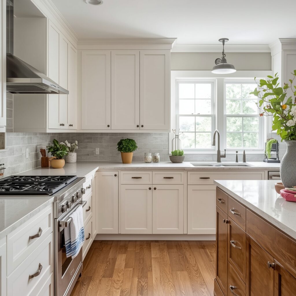
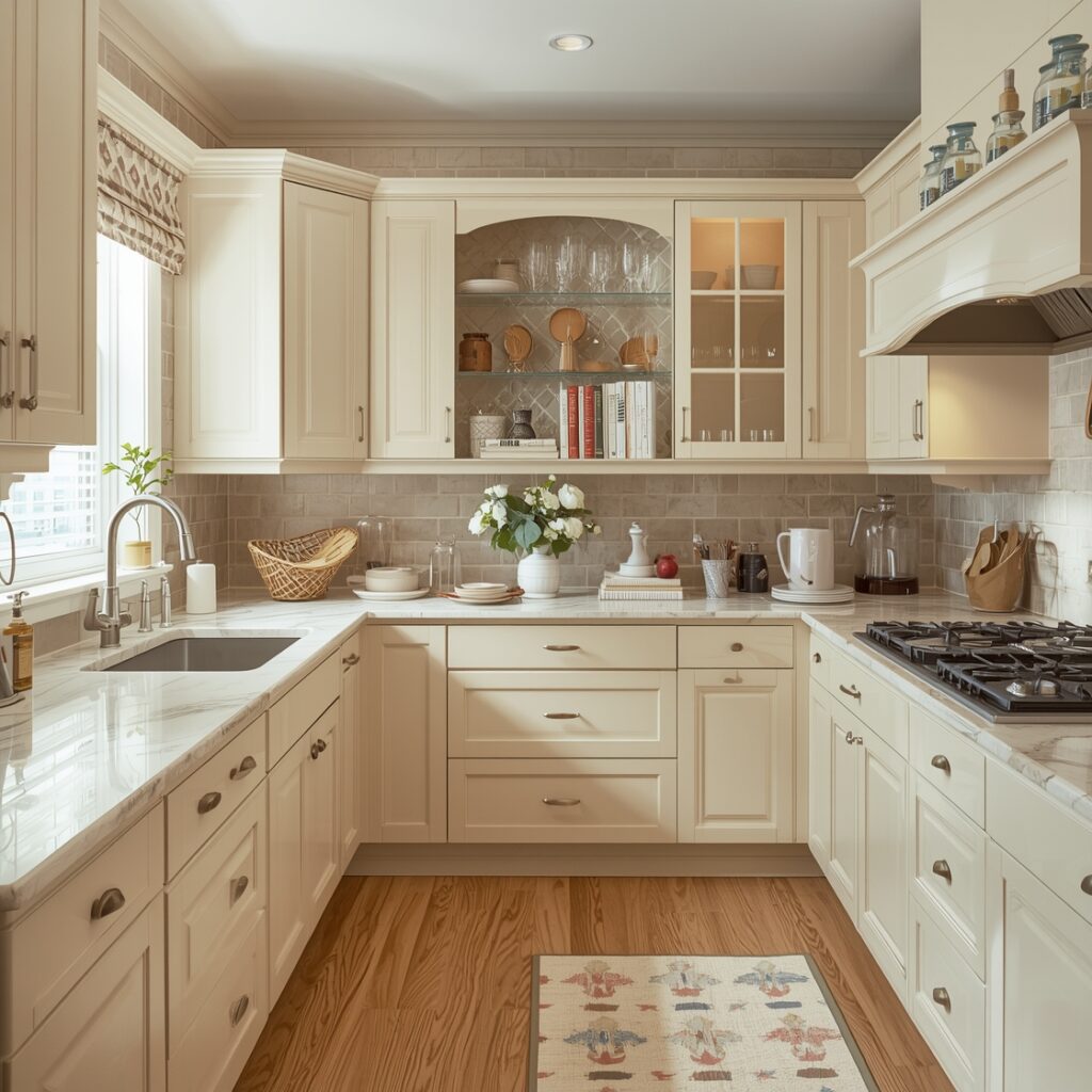
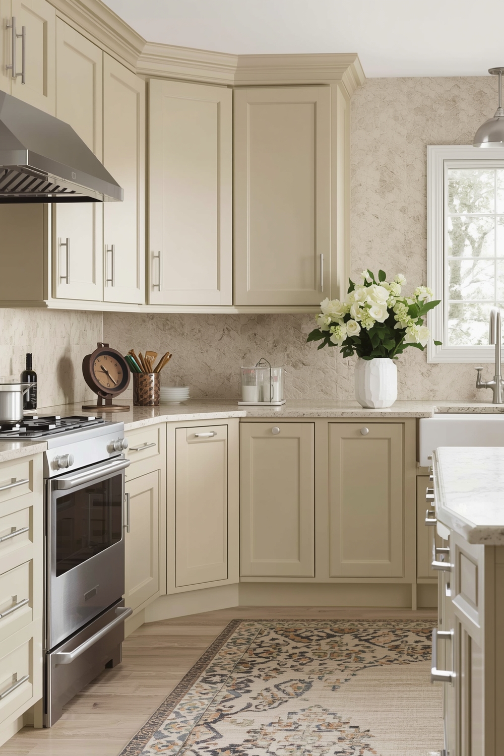
Sage green is probably the single most reliably successful wall color for warm beige cabinets. The earthy, slightly gray quality of sage sits comfortably alongside beige’s warmth without feeling matchy, and together the two colors evoke a sense of natural, organic ease that feels completely current. Dusty rose or muted terracotta can also work beautifully in the right kitchen, particularly when balanced with natural materials like wood and stone that prevent things from feeling overly feminine or precious.
For cooler, grayer beiges, the palette can shift toward softer blues, pale slate, or even a muted teal — colors that have enough warmth in their undertones to feel cohesive rather than conflicting. A soft linen or warm cream on the walls is almost universally flattering for any beige cabinet, as long as it’s chosen with enough warmth to avoid looking stark.
Countertops: The Anchor of the Palette
Your countertops carry an enormous amount of visual weight in a kitchen, which makes them one of the most important color decisions you’ll make in relation to your beige cabinets. The good news is that beige is genuinely accommodating — it works with a wider range of countertop materials and tones than most other cabinet colors.
Natural wood or butcher block countertops are a beautiful, organic pairing with beige cabinetry. The grain and warmth of the wood reinforces the natural quality of the beige, and together they create a kitchen that feels grounded and authentic rather than showroom-polished. If you want the warmth of wood with a little more durability, look for warm-toned engineered wood surfaces or sealed hardwoods designed for kitchen use.
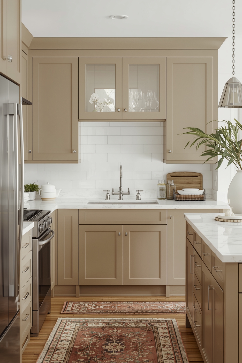
For stone countertops, look for marble, quartzite, or granite with warm veining in cream, gold, or soft amber tones. These will feel completely at home with beige cabinets. If you prefer a more dramatic effect, dark countertops — honed soapstone, deep charcoal quartz, or black granite — can create a stunning contrast against beige that feels bold and contemporary without being aggressive.
Backsplash Tile: Where Character Comes In
The backsplash is one area where you can afford to take a risk with beige cabinets, because beige is forgiving enough to absorb a moment of pattern or color without the kitchen becoming overwhelming. Handmade or artisan-style ceramic tiles in warm earthy tones are an exceptional choice — their slight irregularity and organic character play beautifully against the quieter warmth of beige cabinetry. Moroccan zellige tile, with its subtle variations in glaze and color, has become extremely popular precisely because it adds depth and life to kitchens built on neutral palettes.
A simple white or off-white subway tile in a warm, slightly creamy shade is a reliable workhorse if you want the backsplash to recede rather than assert itself. The key is making sure the white has enough warmth to feel cohesive with the beige — a very cool, bright white tile can clash unexpectedly with warm-toned cabinets in a way that feels slightly jarring under certain lighting conditions.
Natural stone slabs or large-format stone-look porcelain tiles are another increasingly popular option, particularly in kitchens that want a more seamless, elevated feel. When the countertop and backsplash are cut from the same material or very closely matched, it creates a sense of quiet luxury that makes beige cabinets look more intentional and sophisticated than almost any other combination.
Hardware and Fixtures: The Details That Define the Look
Hardware choices can completely transform how beige cabinets read in a room, and they deserve far more thought than they typically receive. The finish and style of your pulls, knobs, and fixtures are effectively the punctuation of your kitchen’s visual language — they tell you where to look and what to feel about what you’re seeing.
Brass and unlacquered aged brass are the most natural hardware partners for warm beige cabinetry. The golden warmth of brass echoes the underlying tones in the beige without looking matchy, and it has the added benefit of developing a natural patina over time that only makes it more beautiful. Paired with beige cabinets, aged brass hardware signals a kind of relaxed, confident sophistication that feels genuinely timeless.
Matte black hardware offers a different but equally compelling effect — it provides a clean, sharp contrast against the softness of beige, creating a visual tension that feels contemporary and purposeful. This works especially well when other elements of the kitchen (like the countertops or window frames) also carry dark tones, because the hardware then becomes part of a cohesive dark accent thread running through the room rather than a standalone contrast element.
Where beige cabinets tend to struggle is with cool-toned silver finishes — brushed nickel and polished chrome can introduce a temperature conflict with warm beige that subtly undermines the whole palette. If you want a metallic that’s not gold or black, look for brushed champagne or warm pewter, which have the silvery quality without the cool temperature.
Always test your color and material selections together in your actual kitchen before finalizing anything. Lay paint samples, tile samples, and countertop swatches directly next to the cabinet doors and observe them in multiple lighting conditions — morning natural light, afternoon sun, and evening artificial light. Colors and materials that look perfect on a showroom table can behave very differently in the specific light and spatial context of your kitchen.
Bringing It All Together: A Palette That Works as a Whole
The secret to a beautiful beige kitchen isn’t finding a single perfect color to pair with the cabinets — it’s building a palette in which every element is speaking the same visual language. Wall color, countertops, backsplash, hardware, flooring, and even the textiles and accessories you bring in should all feel like they belong to the same conversation, one that has beige as its starting point but builds something richer and more layered from there.
Adding texture is one of the most powerful moves you can make in a beige kitchen. Because the color palette itself is relatively quiet, texture becomes the vehicle for visual interest — the roughness of a handmade ceramic tile, the grain of a wood countertop, the slight sheen of a glazed backsplash, the weight of a linen window treatment. These tactile variations give the eye something to travel across and make the room feel rich even without strong color contrast.
Plants and organic accessories are another natural ally for beige kitchens. The green of fresh herbs on a windowsill, a cluster of woven baskets on open shelving, a ceramic bowl in a warm earthy glaze — all of these things feel completely at home alongside beige cabinetry in a way that would look more forced against a starker or more saturated backdrop. Beige invites the organic, and that’s a quality worth leaning into.
In the end, what makes a beige kitchen truly memorable isn’t the beige itself — it’s the confidence and care with which the surrounding palette was assembled. When every element has been chosen thoughtfully, the whole room comes alive in a way that feels effortless precisely because the effort was so considered. That’s the promise of beige, and it’s absolutely achievable when you approach it with the right mindset.