Introduction
Choosing the right Color Harmony Palettes can transform any space from ordinary to extraordinary. Whether you’re redesigning your living room or refreshing your bedroom, understanding color palette combinations is essential for creating visually stunning interiors.
This comprehensive guide explores 15 modern color harmony palettes that will inspire your next design project. From bold contrasts to subtle neutrals, these carefully curated combinations offer something for every style preference and design aesthetic.
Color Harmony Palette Combination Boards
Creating beautiful interiors starts with selecting the perfect Color Harmony Palettes that reflect your personality and style. Color combination boards serve as visual blueprints for your design journey, helping you visualize how different hues work together before committing to paint or décor purchases.
These boards typically feature 3-5 colors that complement each other through temperature, value, and saturation. By experimenting with various color palette combinations, you can discover unexpected pairings that bring fresh energy to your home. Digital tools and physical swatches both offer excellent ways to test your chosen palettes against your existing furniture and lighting conditions.
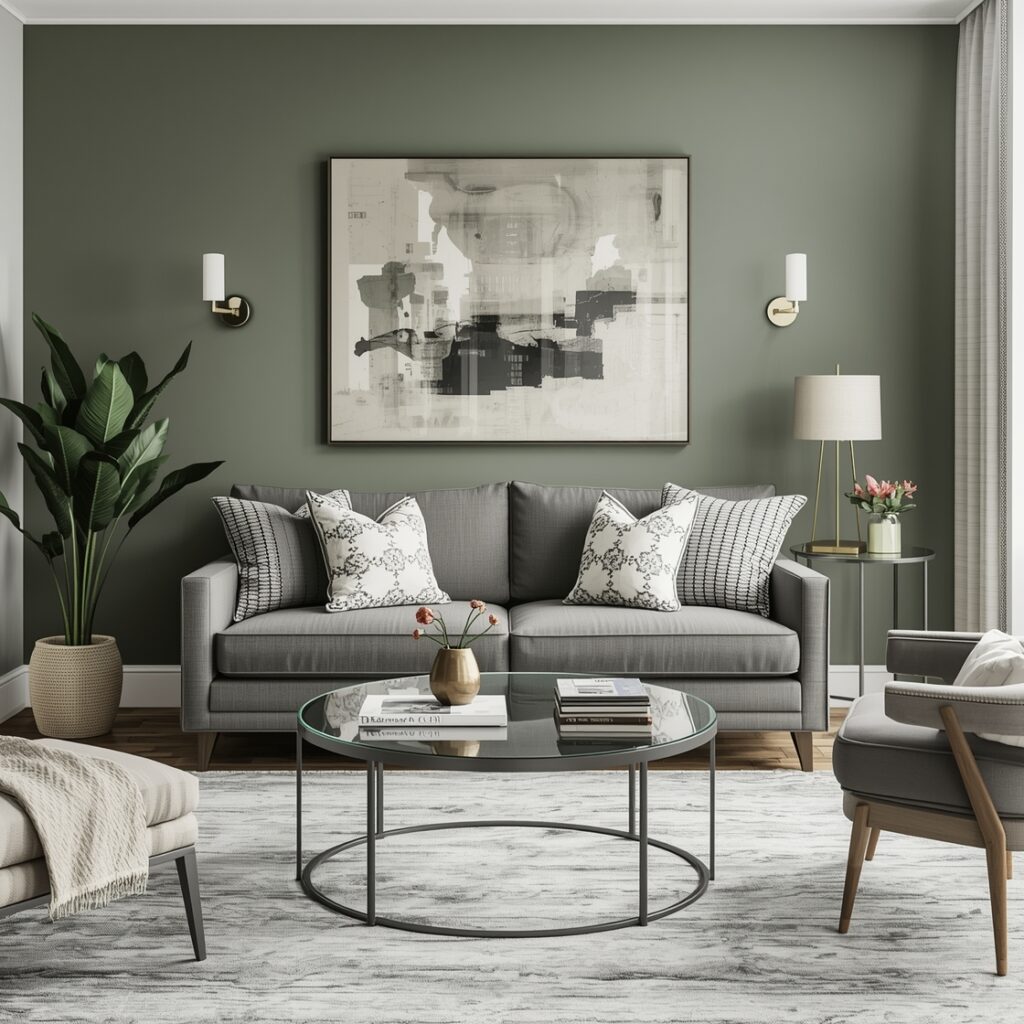
Modern Color Harmony Pairings
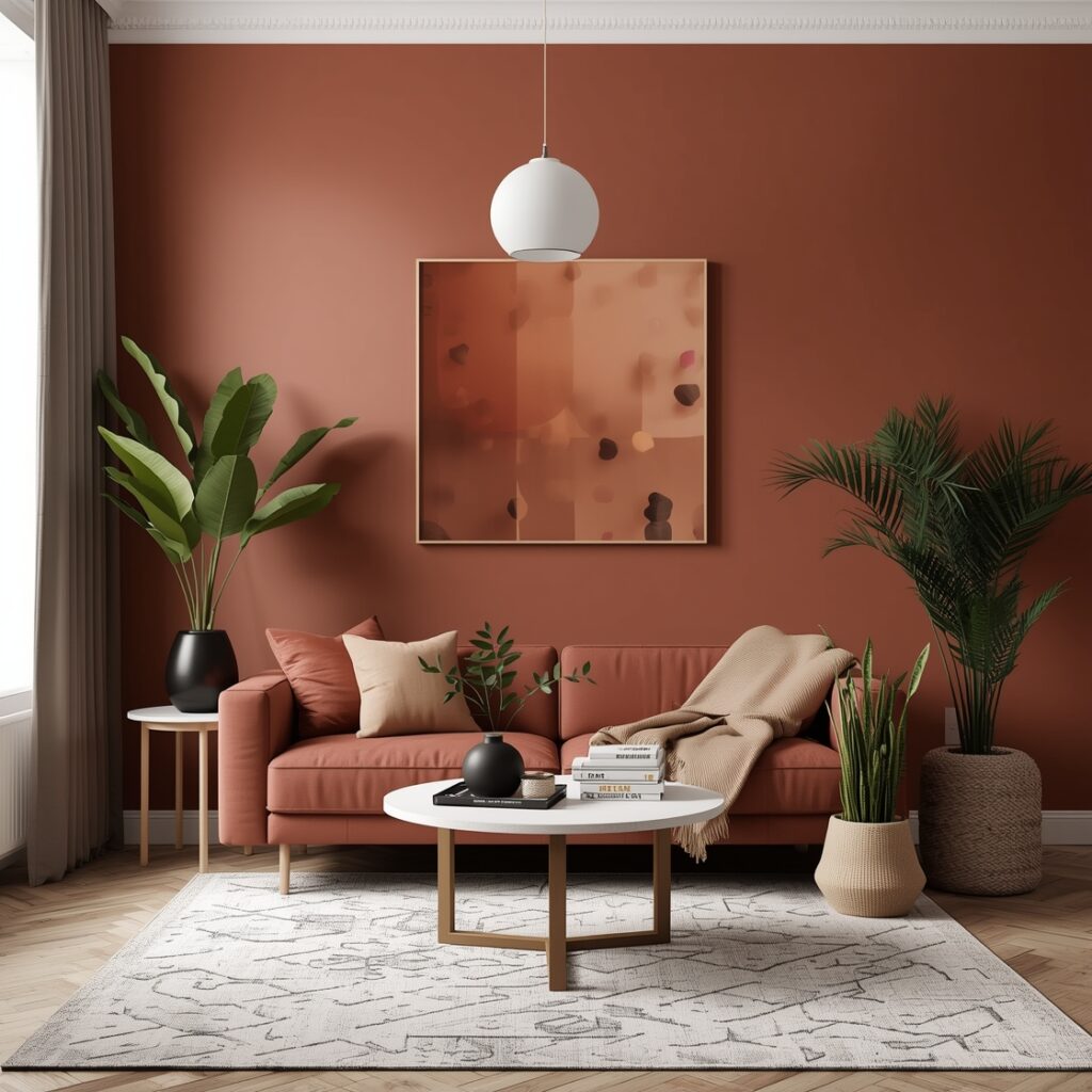
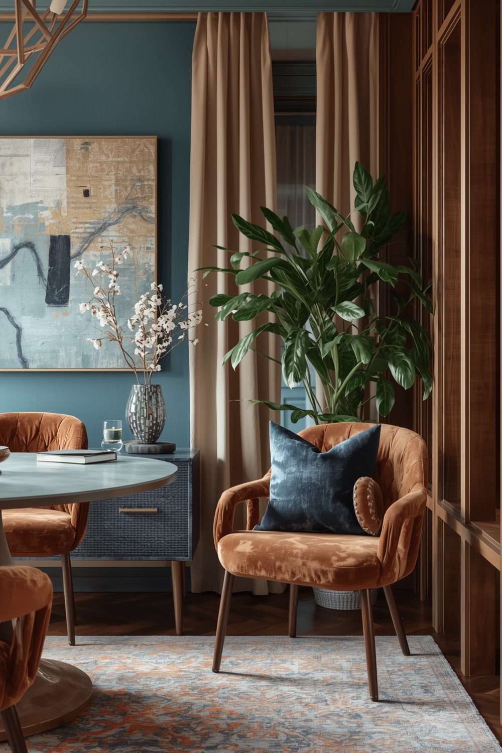
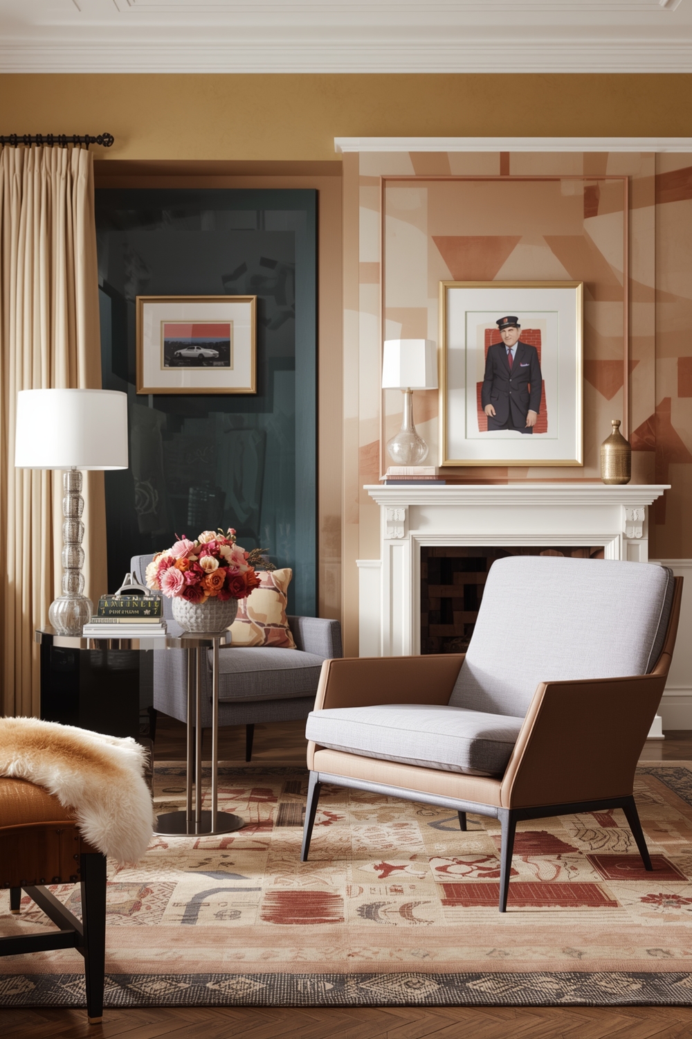
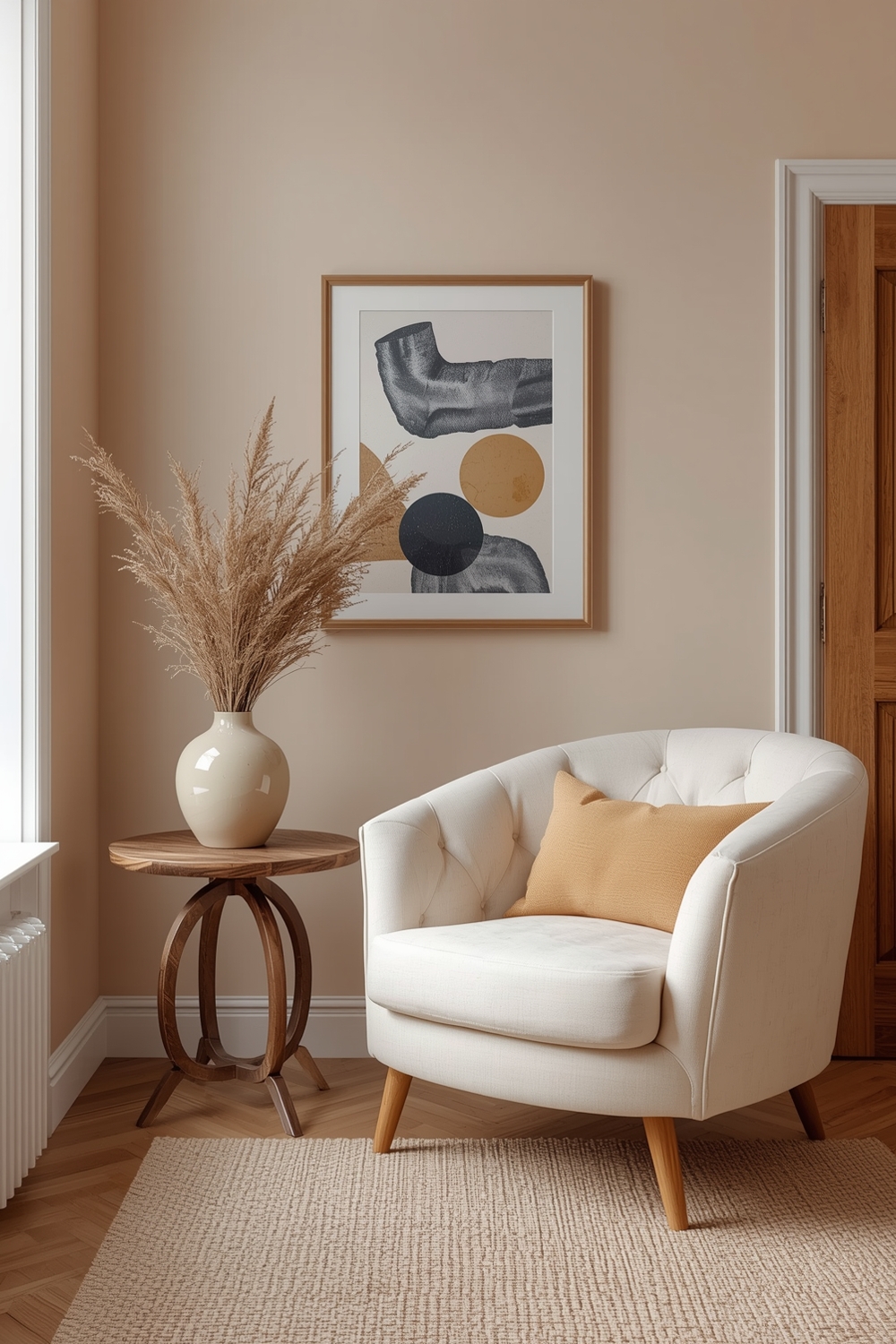
Today’s modern color pairings embrace both minimalism and bold expression. Contemporary Color Harmony Palettes often feature unexpected juxtapositions like sage green with terracotta, navy blue with mustard yellow, or charcoal gray with soft blush pink.
These modern combinations reflect current design trends while maintaining timeless appeal. The key to successful modern pairings lies in balancing warm and cool tones, ensuring one color dominates while others provide accent opportunities. Experimenting with different ratios and applications helps you find the perfect balance that makes your space feel cohesive and intentional.
Interior Color Matching Concepts
Interior color matching goes beyond simply choosing colors you like—it requires understanding how light, texture, and proportion affect perception. Strategic color matching creates visual flow throughout your home, connecting spaces while maintaining distinct character in each room.
Consider how natural and artificial lighting changes your chosen palette throughout the day. Testing color samples in different lighting conditions prevents costly mistakes and ensures your colors deliver the desired atmosphere from morning to evening.
Stylish Room Color Combination Ideas
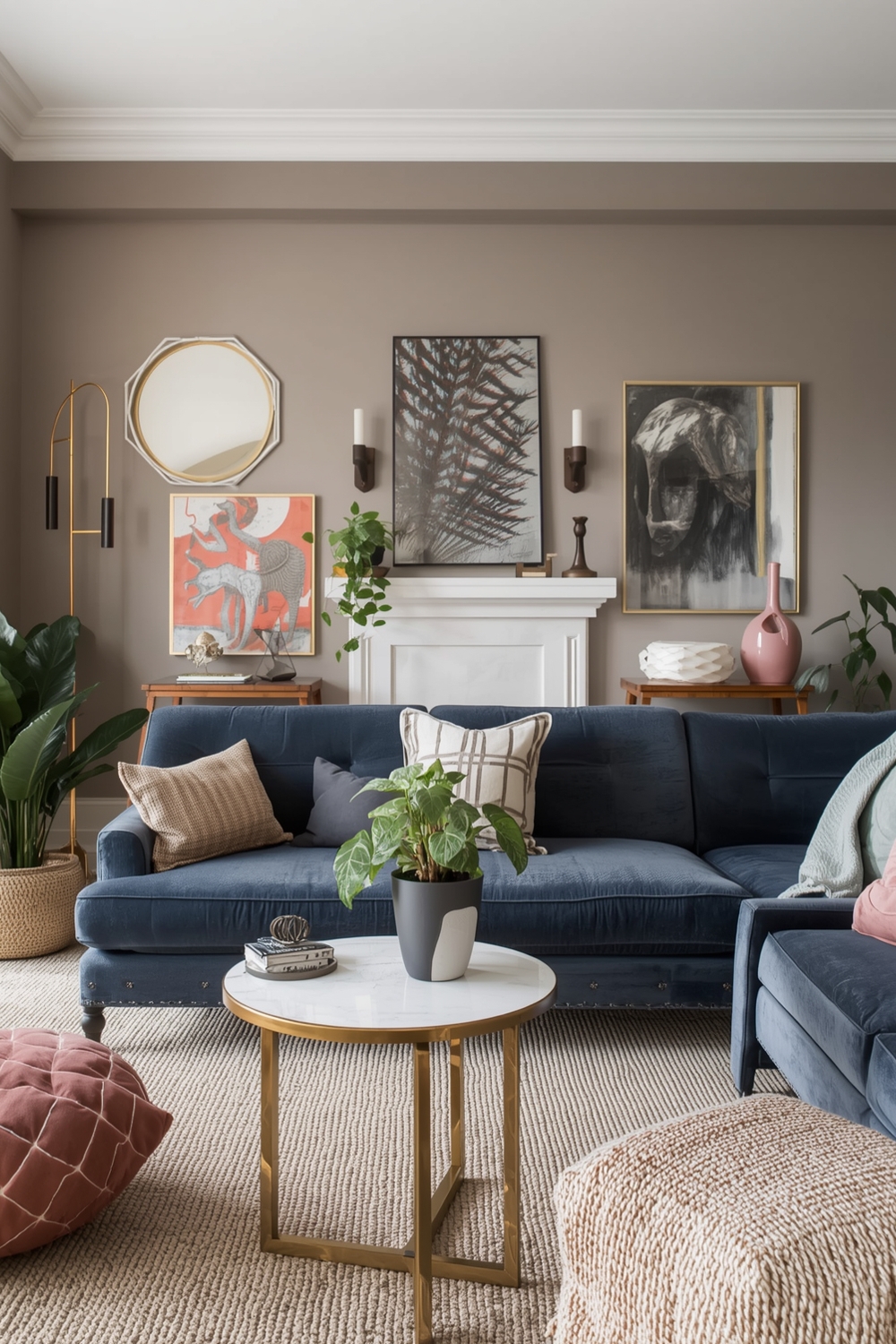
Stylish room combinations often draw inspiration from nature, art, and fashion. Classic pairings like navy and white create nautical elegance, while emerald green with gold accents brings luxurious sophistication. For those seeking warmth, combining burnt orange with cream and chocolate brown creates an inviting atmosphere.
Don’t be afraid to incorporate multiple Color Harmony Palettes throughout your home. Each room can feature its own unique scheme while maintaining connection through one or two recurring accent colors that tie the overall design together.
Neutral and Bright Color Inspirations
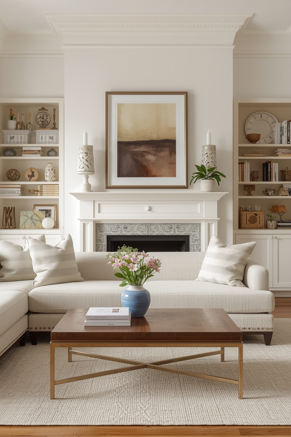
Neutral palettes provide versatile foundations that adapt to changing décor trends and seasonal updates. Combining whites, beiges, grays, and taupes creates serene environments that showcase furniture and artwork beautifully. These understated schemes work particularly well in smaller spaces where overwhelming color might feel claustrophobic.
Conversely, bright color inspirations inject energy and personality into your home. Vibrant yellows, electric blues, and coral pinks create focal points that demand attention. The secret to successfully using bold colors lies in strategic placement—feature walls, statement furniture pieces, or colorful accessories prevent overwhelm while delivering maximum impact.
Functional Color Harmony Layout Strategies
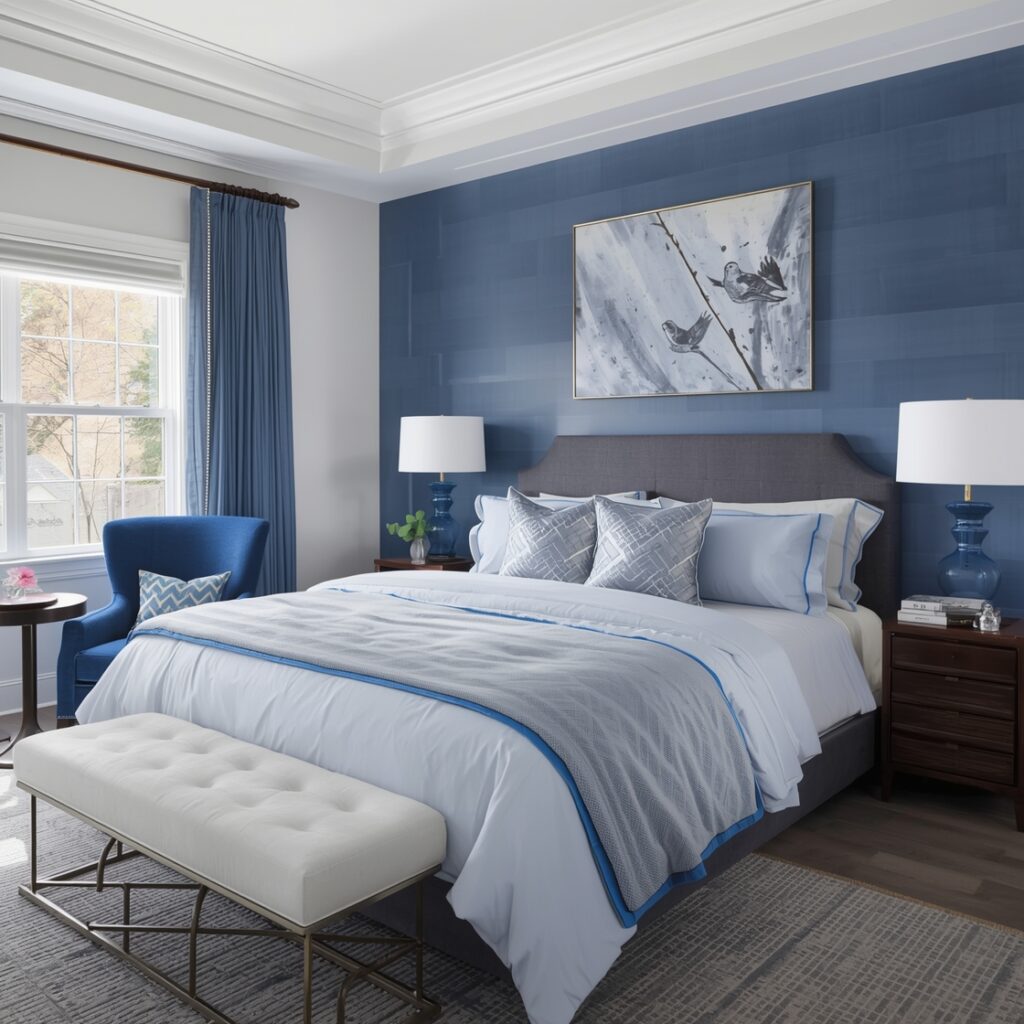
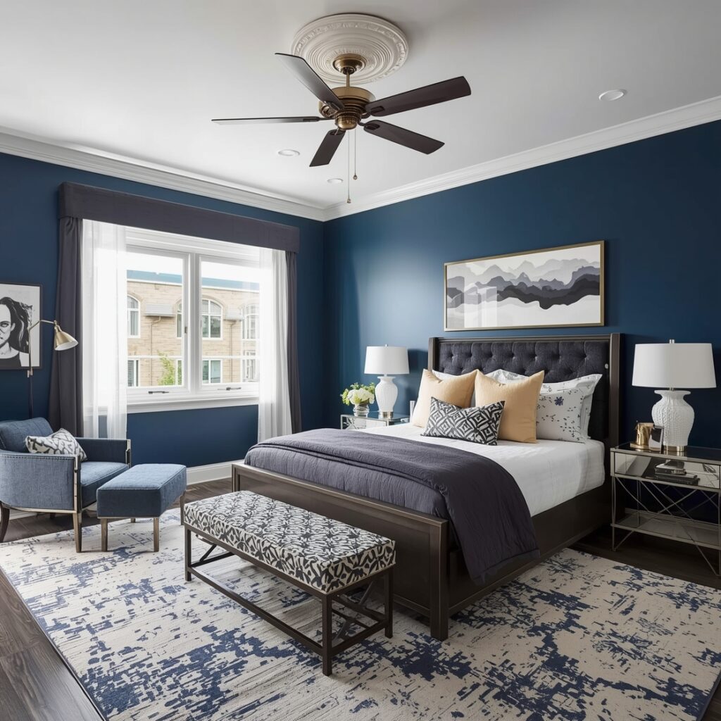
Functional color strategies consider both aesthetics and psychology. Blue tones in bedrooms promote relaxation and better sleep, while yellow and orange hues in kitchens stimulate appetite and conversation. Understanding color psychology helps you select palettes that support each room’s intended purpose.
Strategic layout planning ensures your color choices enhance rather than hinder functionality. High-traffic areas benefit from darker, more forgiving colors, while light, reflective tones make small spaces feel larger and more open.
Elegant Room Color Pairing Guides
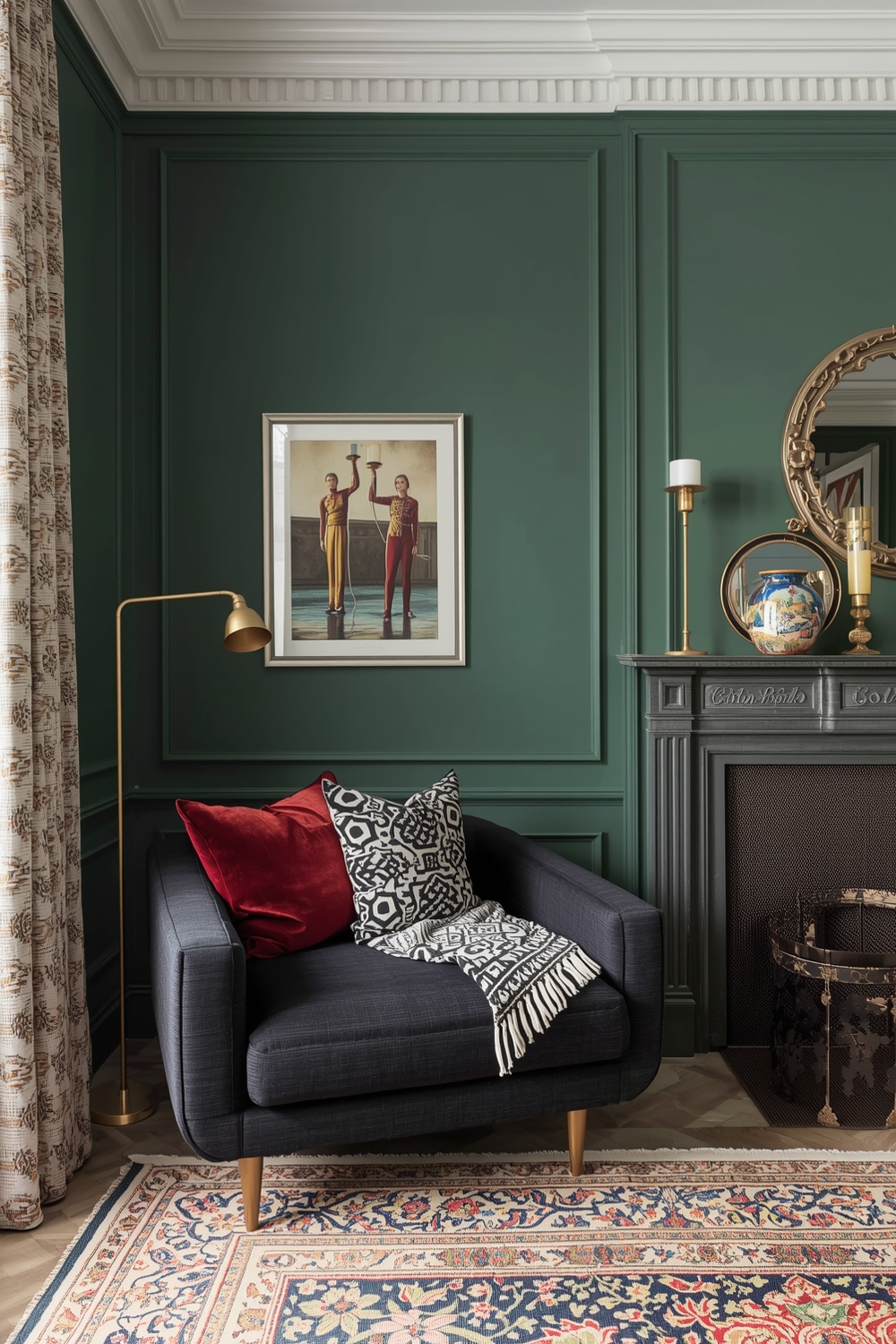
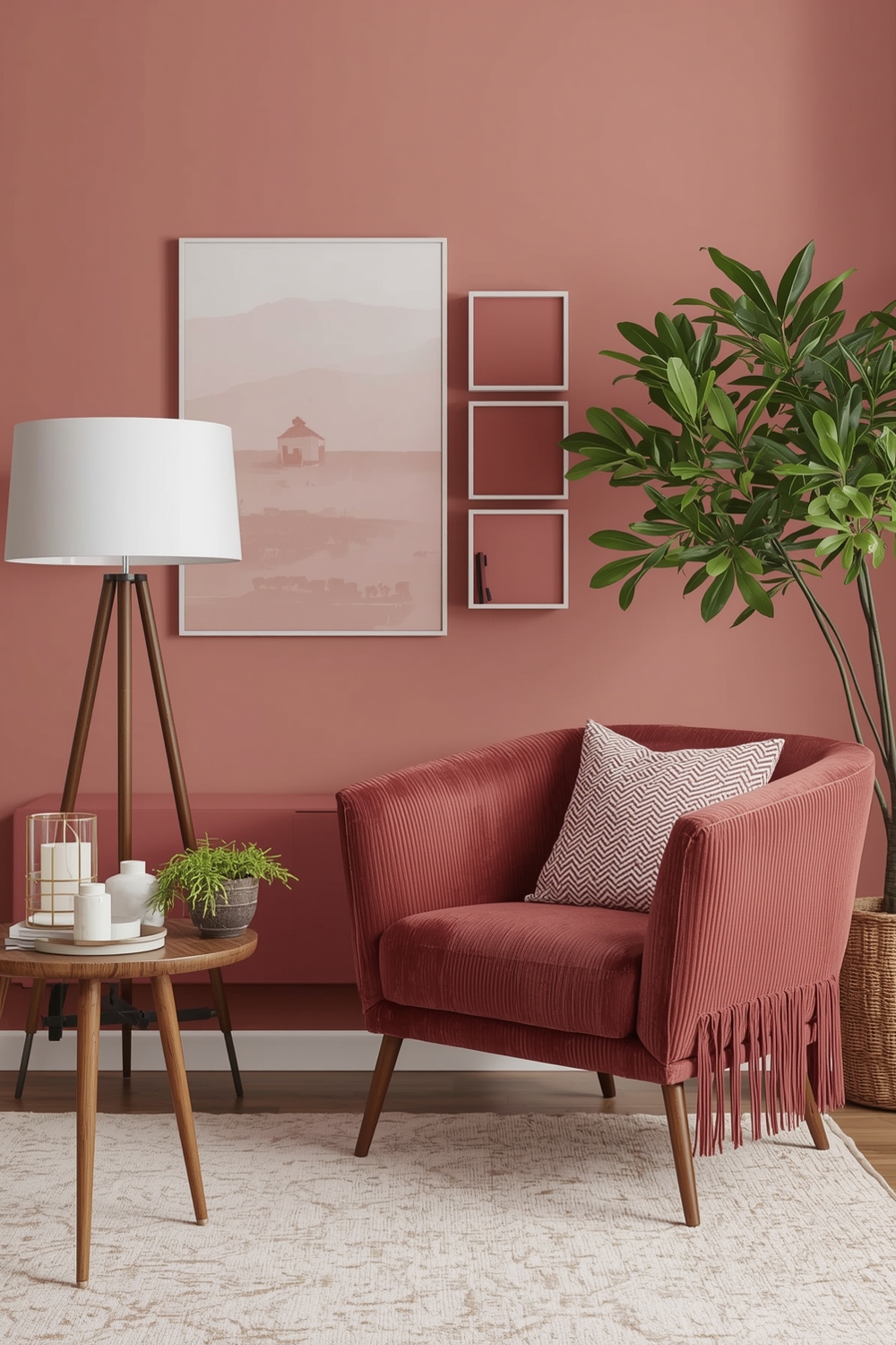
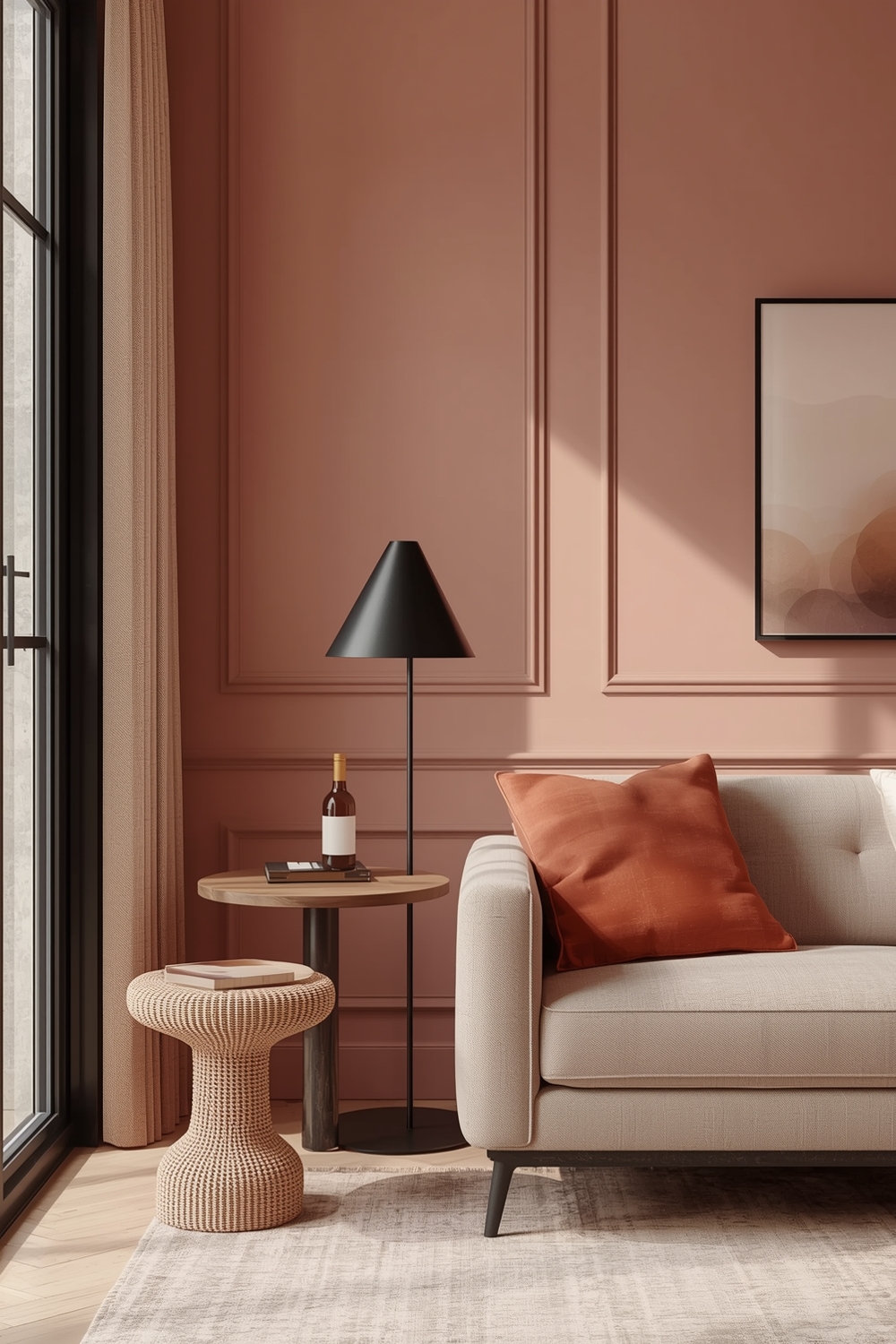
Elegance emerges from restraint and sophistication rather than complexity. Elegant color pairings typically feature muted tones, soft contrasts, and refined accents. Think dove gray with champagne gold, soft lavender with cream, or deep plum with silver metallics.
These combinations create upscale atmospheres without excessive ornamentation. The focus remains on quality materials, thoughtful color placement, and harmonious relationships between all design elements in the space.
Minimalist Room Color Combination Examples
Minimalist color schemes embrace the “less is more” philosophy through limited palettes and intentional restraint. Monochromatic schemes using varying shades of a single color create depth without complexity. White-on-white combinations with different textures add interest while maintaining serenity.
Minimalist Color Harmony Palettes often incorporate natural materials like wood, stone, and linen to provide visual interest without introducing multiple colors. This approach emphasizes form, function, and negative space, allowing each element to shine individually while contributing to the cohesive whole.
Strategic accent placement becomes crucial in minimalist designs—a single piece of artwork or one statement furniture item provides necessary visual interest without cluttering the aesthetic.
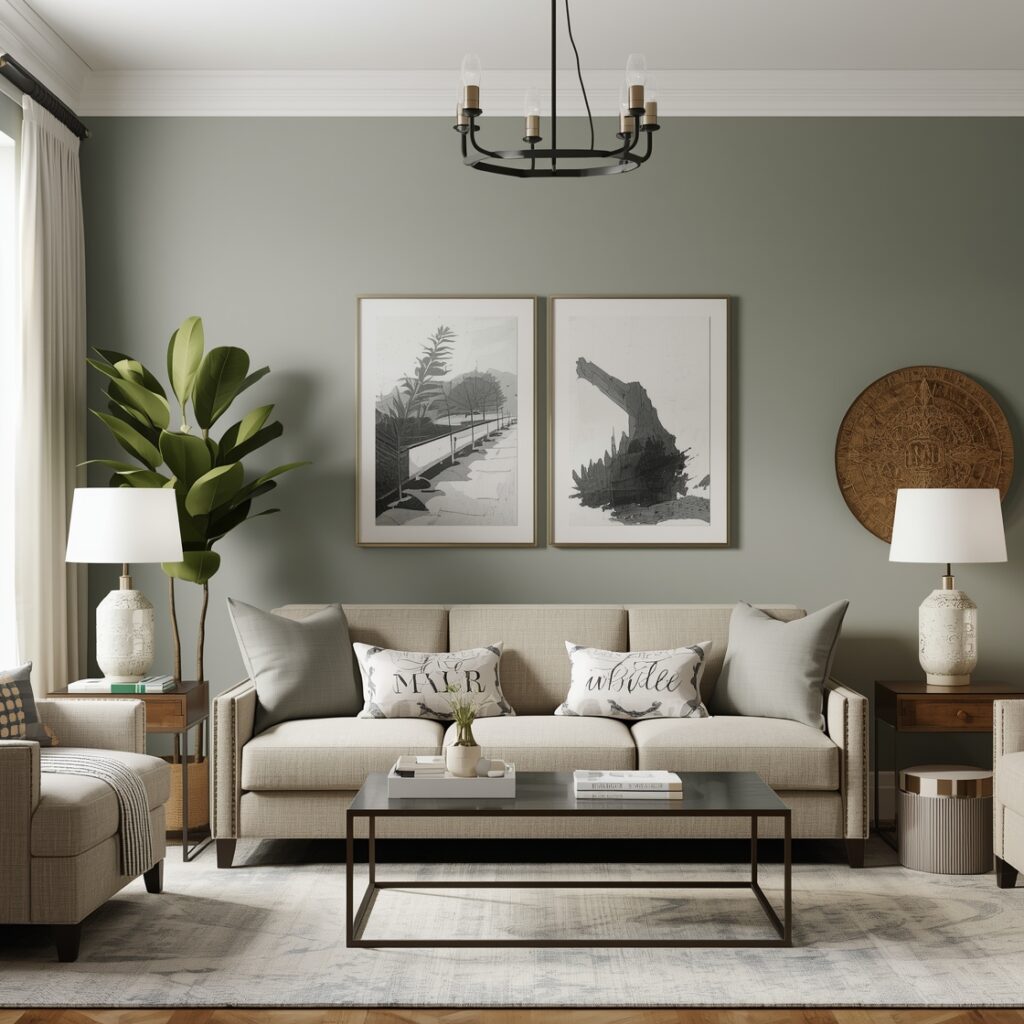
Contemporary Color Harmony Palette Selections
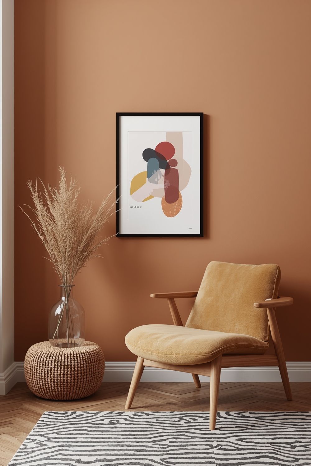
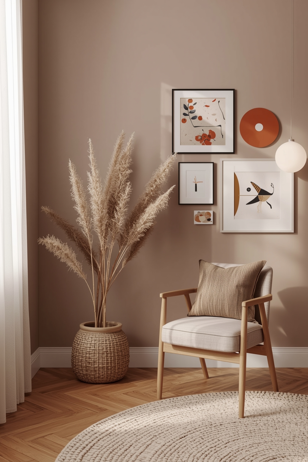
Contemporary palettes reflect current design movements while incorporating timeless principles. Today’s popular selections include earthy terracottas, muted sage greens, warm taupes, and sophisticated charcoals. These colors work individually or combine beautifully for layered, dimensional looks.
Contemporary design embraces both boldness and subtlety, allowing you to express personal style while maintaining broad appeal. These versatile palettes transition easily between seasons with simple accessory changes.
Room Color Balance Inspiration Ideas
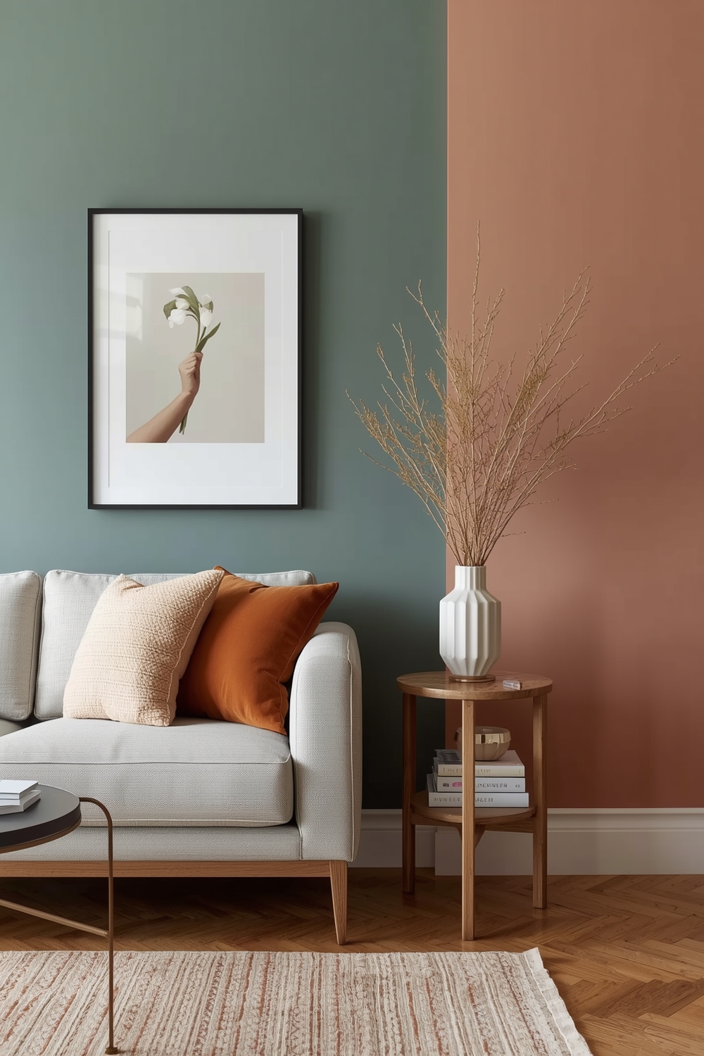
Achieving color balance requires understanding visual weight and proportion. The 60-30-10 rule provides an excellent framework: 60% dominant color, 30% secondary color, and 10% accent color. This proportion creates natural hierarchy that guides the eye without overwhelming the senses.
Balance also considers color temperature—pairing warm tones with cool ones prevents spaces from feeling too sterile or too cozy. Thoughtful distribution throughout the room ensures no single area dominates uncomfortably.
Cozy Color Harmony Layout Concepts
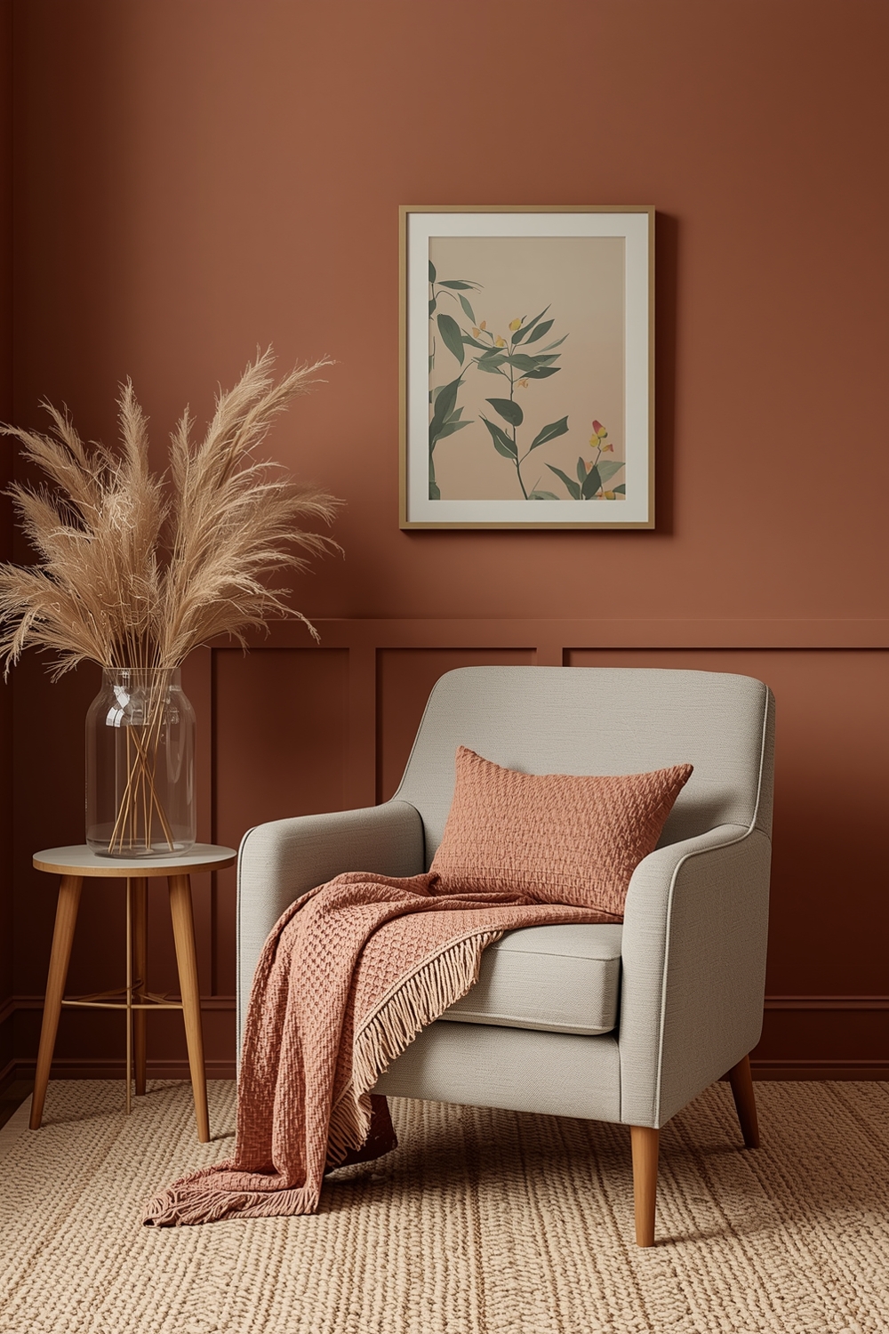
Cozy palettes embrace warmth and comfort through rich, enveloping colors. Deep burgundies, warm caramels, soft chocolates, and creamy ivories create intimate atmospheres perfect for relaxation. These combinations work beautifully in bedrooms, reading nooks, and family gathering spaces.
Layering different textures in similar color families enhances coziness without creating visual chaos. Velvet cushions, wool throws, and plush carpets in harmonious hues provide tactile comfort that reinforces the warm color message. Adding warm lighting further amplifies the inviting atmosphere these palettes naturally create.
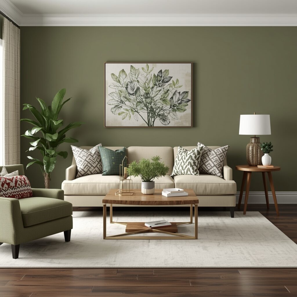
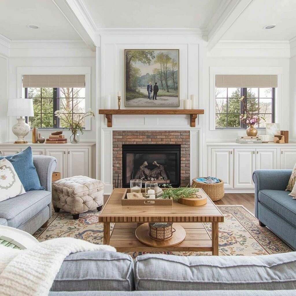
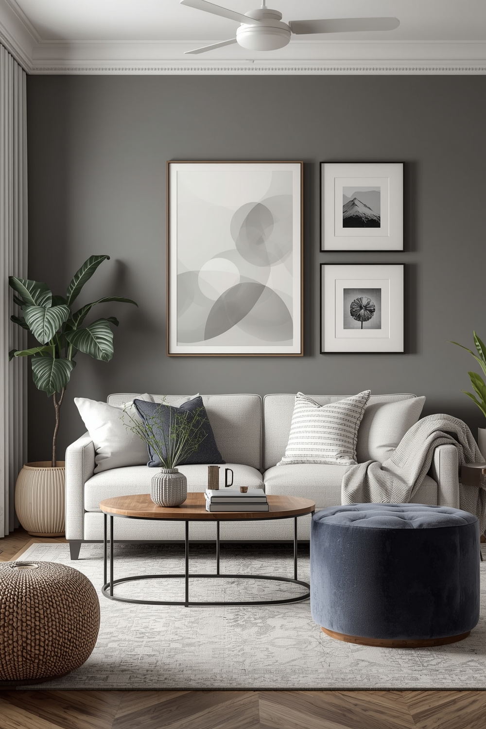
Color Harmony Ideas for Living Rooms
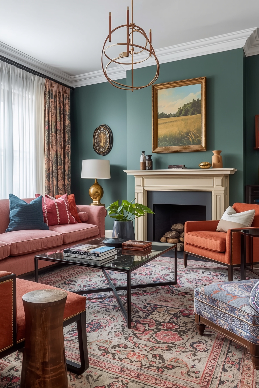
Living rooms demand versatile color schemes that accommodate various activities and moods. Successful living room palettes balance sophistication with comfort, formality with approachability. Classic combinations like gray and yellow create cheerful yet refined atmospheres, while navy and coral deliver contemporary elegance.
Consider your living room’s natural light exposure when selecting colors—south-facing rooms handle cool tones beautifully, while north-facing spaces benefit from warmer palettes that compensate for limited natural warmth.
Timeless Color Harmony Combination Galleries
Timeless combinations transcend fleeting trends, maintaining appeal across decades. White and navy, beige and brown, gray and white—these classic pairings never feel dated because they reflect natural color relationships found in landscapes and materials throughout history.
Building your design around timeless foundations allows you to experiment with trendy accents without commitment. When accent trends fade, your classic base remains relevant and beautiful.
Room Color Harmony Visualization Boards
Visualization boards bring abstract color concepts into tangible reality. These tools combine paint samples, fabric swatches, furniture images, and accessory examples to preview your complete design. Creating comprehensive boards prevents expensive mistakes and ensures all elements work harmoniously before purchase.
Professional designers often create multiple board versions to compare different approaches side-by-side. This method reveals subtle differences in mood and atmosphere that might not be apparent when considering colors individually. Digital visualization tools offer the advantage of easily swapping elements to test countless combinations quickly.
Physical boards provide tactile benefits that digital versions cannot replicate—seeing actual paint, fabric, and material samples together under your home’s lighting conditions offers the most accurate preview.
How This Idea Improves Your Space
Implementing thoughtful color harmony dramatically improves your space’s functionality, mood, and visual appeal. Well-chosen palettes create psychological comfort, making rooms feel more welcoming and purposeful. Strategic color use can make small rooms feel larger, dark spaces brighter, and bland areas more interesting.
Beyond aesthetics, color harmony increases your home’s value and marketability. Cohesive color schemes signal quality and care to potential buyers or guests.
Budget-Friendly Tips
Refreshing your color palette doesn’t require expensive renovations. Start with paint—the most cost-effective transformation tool available. Add affordable accessories like throw pillows, curtains, and artwork in your chosen palette. Shop secondhand stores for unique pieces in your color scheme, and repaint existing furniture for customized looks without major investment.
Conclusion
Mastering Color Harmony Palettes empowers you to create beautiful, cohesive spaces that reflect your personal style. Whether embracing bold contrasts or subtle neutrals, understanding how colors interact transforms your design approach. Experiment with these 15 modern combinations to discover palettes that make your house truly feel like home.
FAQs
Q: What is the 60-30-10 color rule?
A: This design principle suggests using 60% dominant color, 30% secondary color, and 10% accent color for balanced, harmonious spaces.
Q: How many colors should I use in one room?
A: Three to five colors typically work best—one dominant color, one or two supporting colors, and one or two accent colors for interest.
Q: Can I mix warm and cool colors?
A: Absolutely! Mixing warm and cool tones creates dynamic, balanced spaces. The key is maintaining intentional proportions and transitions between temperatures.
Q: How do I test colors before committing?
A: Purchase sample paints and apply large swatches on multiple walls. Observe them in different lighting conditions throughout the day before making final decisions.
Q: What’s the safest color palette for resale value?
A: Neutral palettes with gray, beige, white, and soft earth tones appeal to the broadest audience and typically support higher resale values.