Introduction
Choosing the perfect Interior Paint Palette can transform any room from ordinary to extraordinary. Whether you’re refreshing a single space or planning a whole-home makeover, the right color combination sets the mood and reflects your personal style.
From calming neutrals to bold statement hues, exploring diverse interior wall color ideas helps you discover what resonates with your vision. This guide presents 15 beautiful concepts that blend timeless elegance with contemporary trends, making your decorating journey both inspiring and achievable.
Interior Paint Color Palette Ideas
Creating a cohesive Interior Paint Palette requires understanding color theory and how different shades interact within your space. The key is balancing your primary wall color with complementary accent tones that enhance architectural features and furnishings.
Consider the room’s natural lighting, existing furniture, and intended atmosphere before finalizing your choices. Warm palettes with beiges, terracottas, and soft yellows create inviting environments, while cooler blues, greens, and grays promote tranquility. Testing paint samples on your walls at different times of day ensures you’re satisfied with how colors shift in changing light conditions.
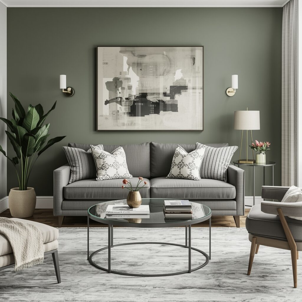
Modern Living Room Paint Colors
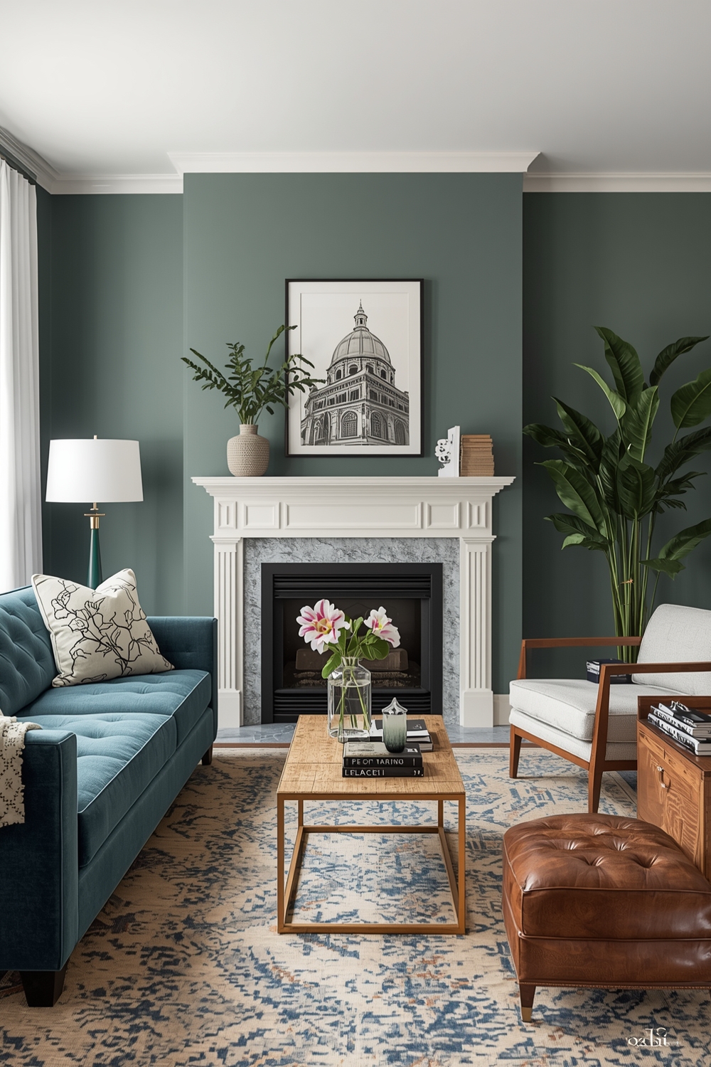
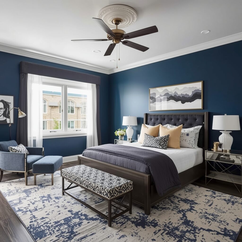
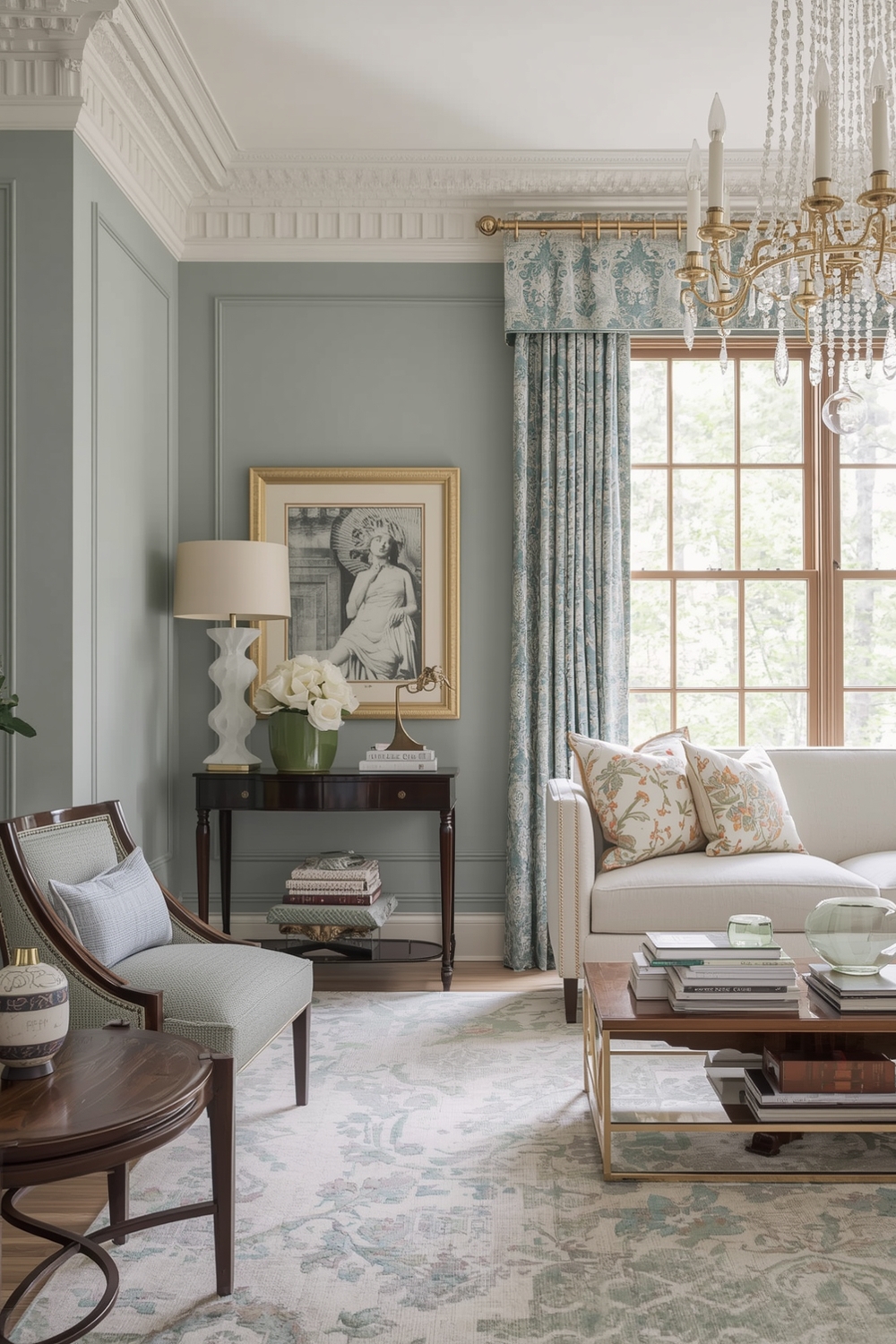
Modern living rooms benefit from sophisticated color schemes that promote relaxation while making style statements. A well-designed Interior Paint Palette for contemporary spaces often features neutral foundations like soft grays, warm taupes, or creamy whites paired with deeper accent walls in charcoal, navy, or forest green.
These combinations create visual interest without overwhelming the senses. Layer in metallic accents through fixtures and décor, and incorporate textured finishes to add depth. The beauty of modern palettes lies in their versatility—they complement both minimalist and eclectic furnishing styles while maintaining a cohesive, polished appearance throughout your living area.
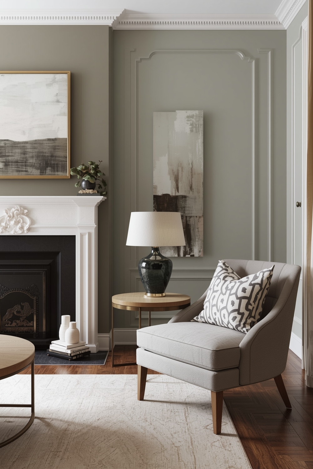
Neutral and Serene Paint Palettes
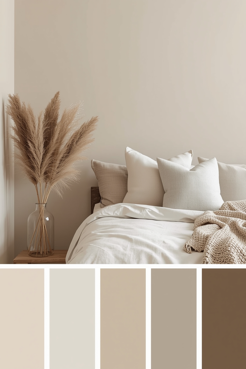
Neutral palettes remain timelessly popular for their calming effects and design flexibility. Shades like greige, sand, ivory, and soft gray create serene backdrops that allow furniture and artwork to shine.
These Interior Paint Palette options work beautifully throughout your home, providing visual continuity between rooms. The subtle variations in undertones—warm versus cool neutrals—can dramatically affect a space’s mood, so choose carefully based on your lighting and desired atmosphere.
Bright and Fashionable Room Hues
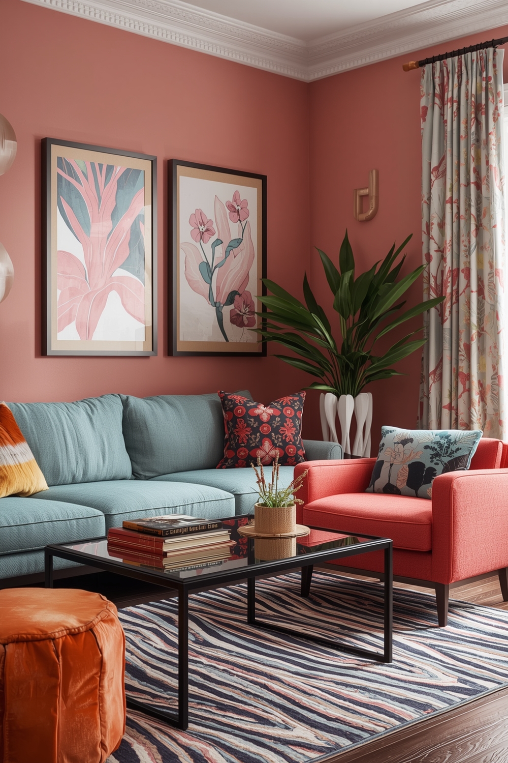
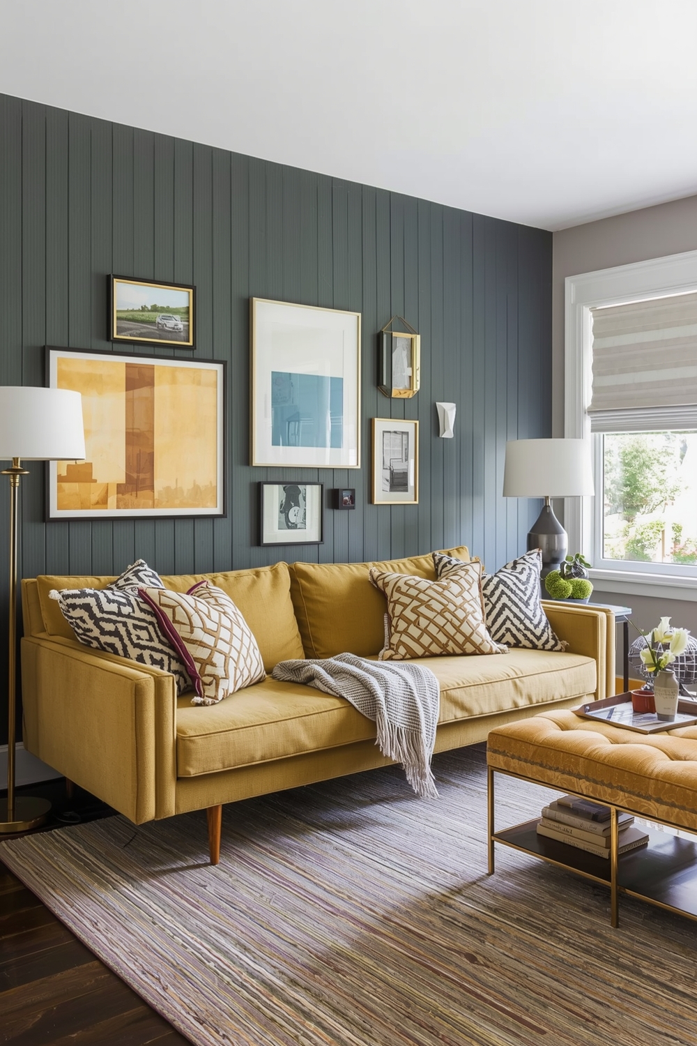
For those who embrace color confidently, bright palettes inject energy and personality into interiors. Consider pairing vibrant coral with soft peach, or combining sunny yellow with crisp white trim for an uplifting environment. Bold interior wall color ideas like emerald green, sapphire blue, or rich plum create dramatic focal points when used strategically.
Balance these intense hues with neutral furnishings and plenty of natural light. Fashion-forward combinations might include blush pink with navy blue or mustard yellow with charcoal gray—pairings that feel fresh and contemporary while remaining sophisticated enough for long-term enjoyment.
Minimalist Interior Color Concepts
Minimalist design thrives on simplicity, making the Interior Paint Palette crucial to achieving the aesthetic. Stick to monochromatic schemes with subtle variations—different shades of white, from pure snow to warm cream, create understated elegance.
Add visual interest through texture rather than color: matte finishes alongside eggshell sheens provide dimension without disrupting the calm atmosphere. Pale grays, soft taupes, and barely-there beiges also work wonderfully. The minimalist approach emphasizes quality over quantity, letting architectural details and carefully selected furnishings take center stage against your refined backdrop.
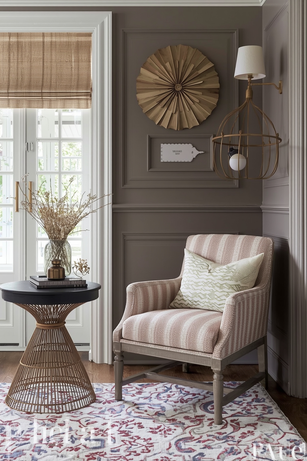
Elegant Room Color Pairings
Elegance emerges from sophisticated color relationships that exude refinement. Classic pairings like navy and gold, charcoal and blush, or sage green and cream deliver timeless appeal. These Interior Paint Palette combinations work particularly well in dining rooms, master bedrooms, and formal living spaces.
Consider using the darker shade on lower walls or as an accent, with lighter tones above to maintain airiness. Incorporate the colors through trim, ceiling details, or wainscoting for added architectural interest that elevates the entire space.
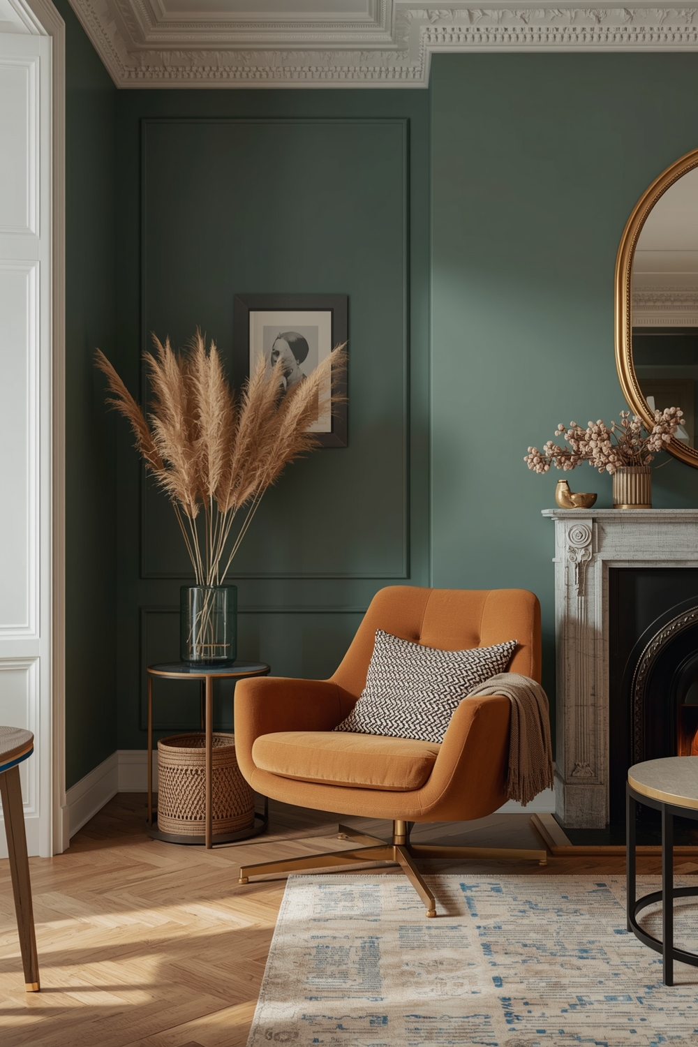
Contemporary Paint Color Collections
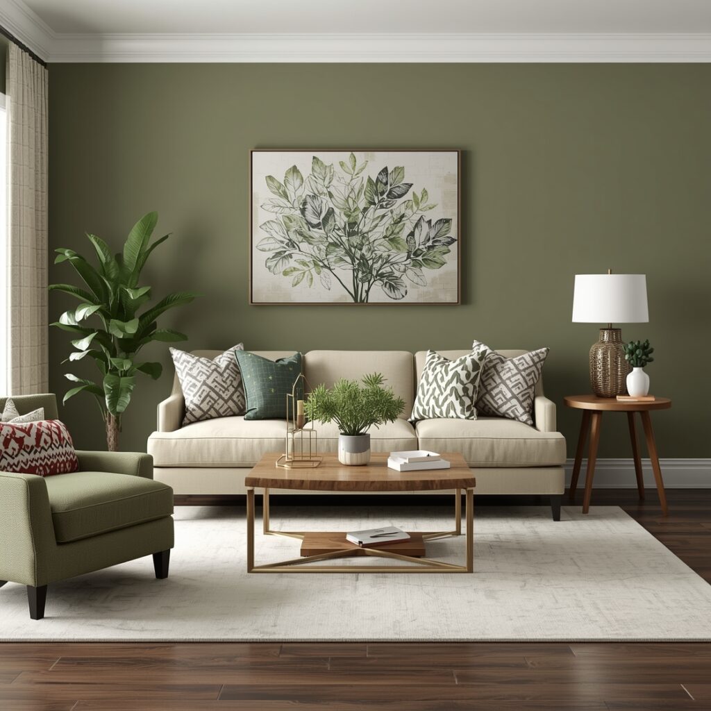
Contemporary palettes push boundaries while maintaining livability. Think unexpected combinations like terracotta with dusty blue, or olive green paired with warm gray. These forward-thinking interior wall color ideas reflect current design trends while possessing staying power.
Contemporary doesn’t mean cold—today’s collections emphasize warmth and texture alongside clean lines. Earthy tones, muted jewel tones, and organic hues create spaces that feel both current and comfortable, perfectly suited for modern lifestyles.
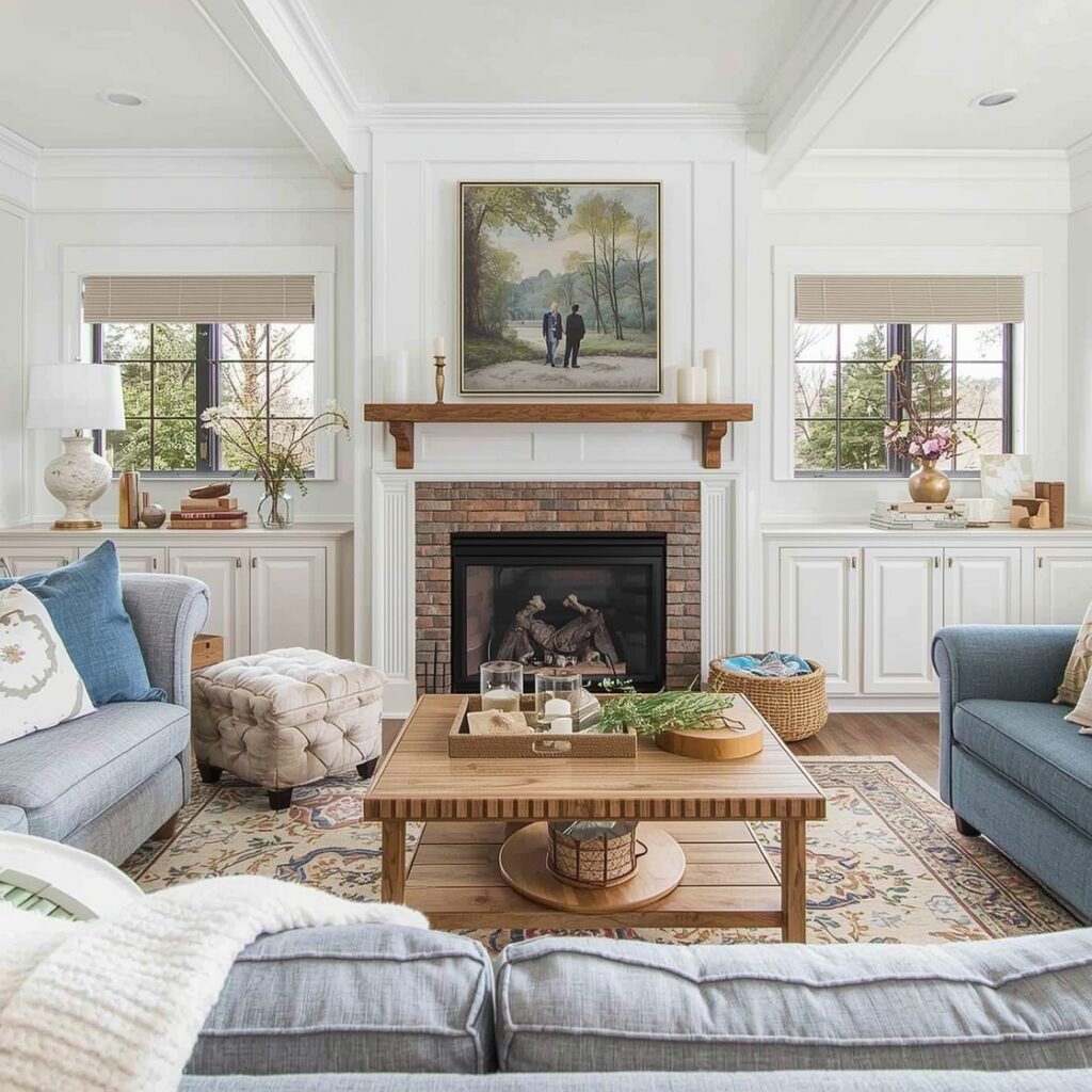
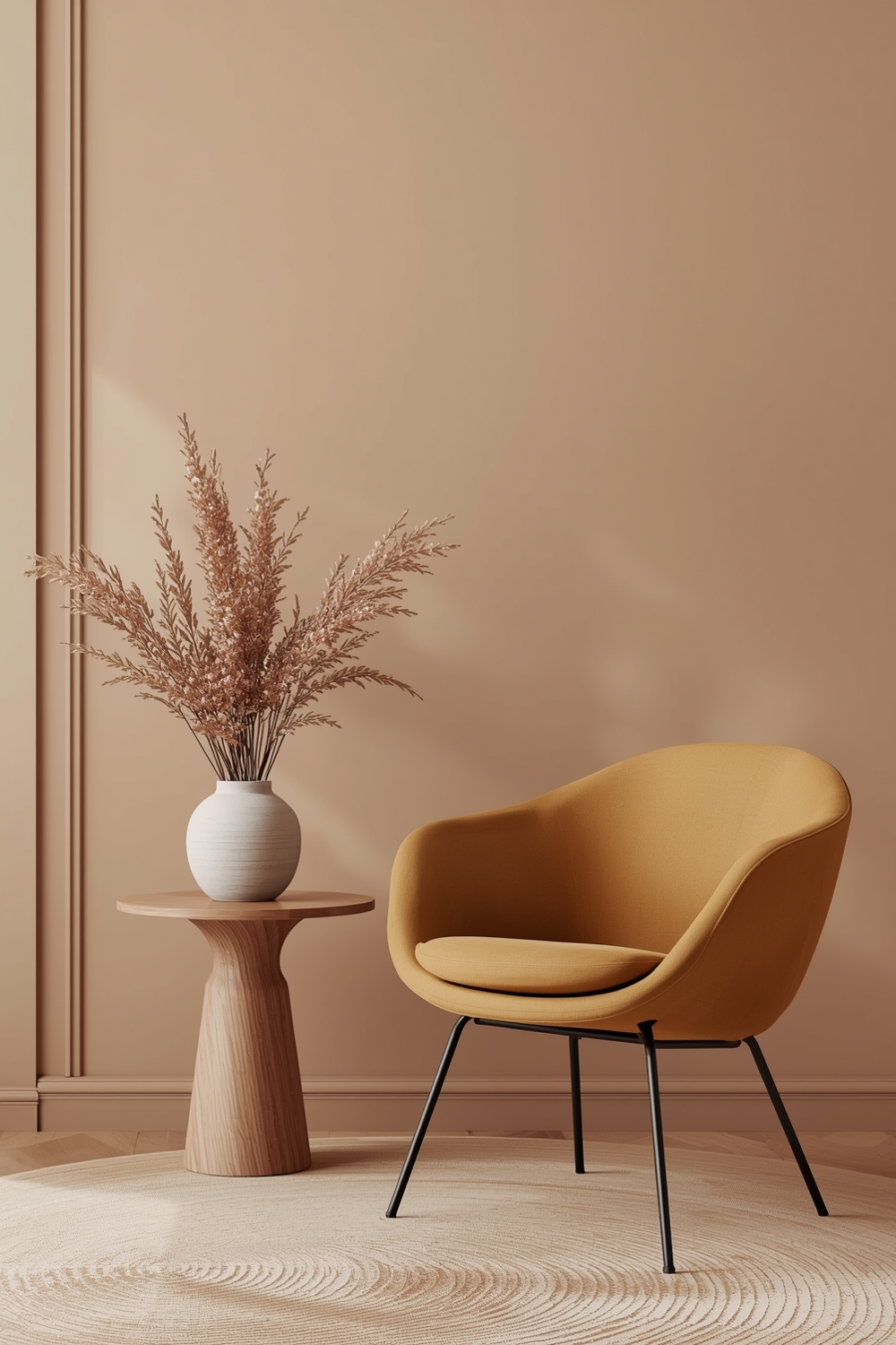
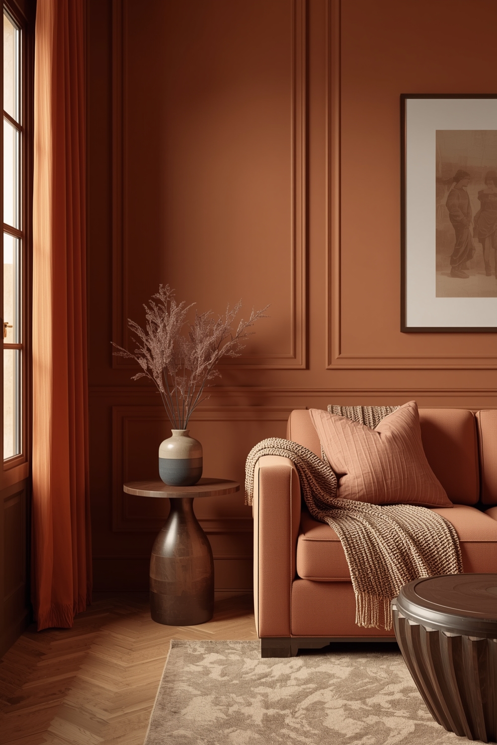
Cozy and Warm Room Paint Ideas
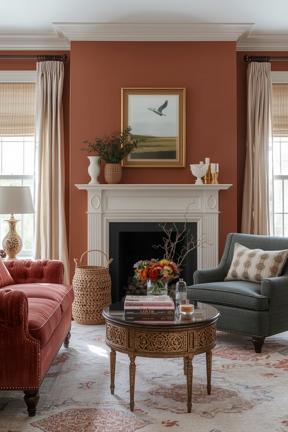
Creating warmth through paint transforms houses into homes. Rich Interior Paint Palette selections featuring caramel, rust, warm taupe, and honey tones envelop rooms in comfort. These shades work beautifully in spaces where you gather—family rooms, breakfast nooks, and reading corners.
Layer warm colors with soft lighting and natural materials like wood and stone to amplify the cozy effect. Don’t shy away from deeper shades; colors like burnt orange, chocolate brown, or warm burgundy on accent walls create intimate atmospheres perfect for relaxation. Balance these deeper tones with cream or ivory on remaining walls to prevent rooms from feeling too enclosed.
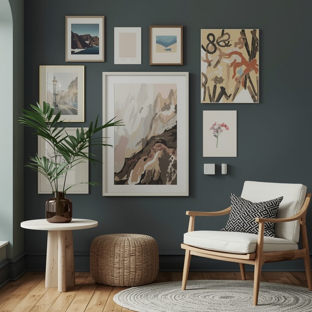
Accent Wall Color Inspiration
Accent walls offer opportunities to experiment boldly without committing entire rooms to dramatic colors. Choose one wall—typically the one behind your bed, sofa, or another focal point—and paint it in a contrasting shade from your main Interior Paint Palette. Deep teal against soft gray walls, or rich burgundy in an otherwise neutral room, creates striking visual interest.
Accent walls also work well with wallpaper, textured finishes, or even chalkboard paint in kitchens and children’s spaces. This approach lets you embrace trends without overwhelming your space or budget.
Interior Paint with Rich Warm Undertones
Understanding undertones prevents color disappointments. Paints with warm undertones—yellows, reds, and oranges beneath the surface—create inviting environments even in cooler color families. A gray with warm undertones feels completely different from one with cool blue undertones.
When selecting your Interior Paint Palette, examine samples against your flooring, cabinets, and fixed elements. Warm undertones complement wood tones beautifully and create cohesion with brass, gold, and copper fixtures throughout your home.
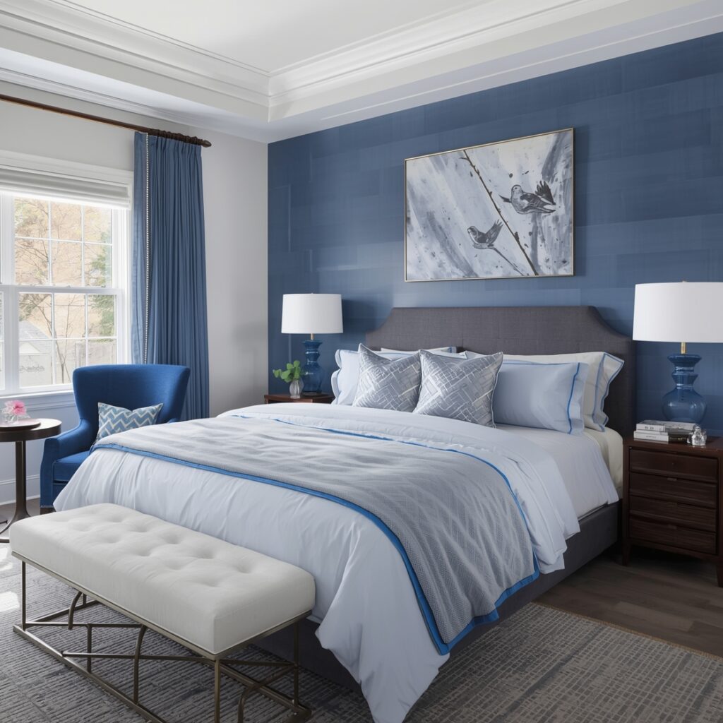
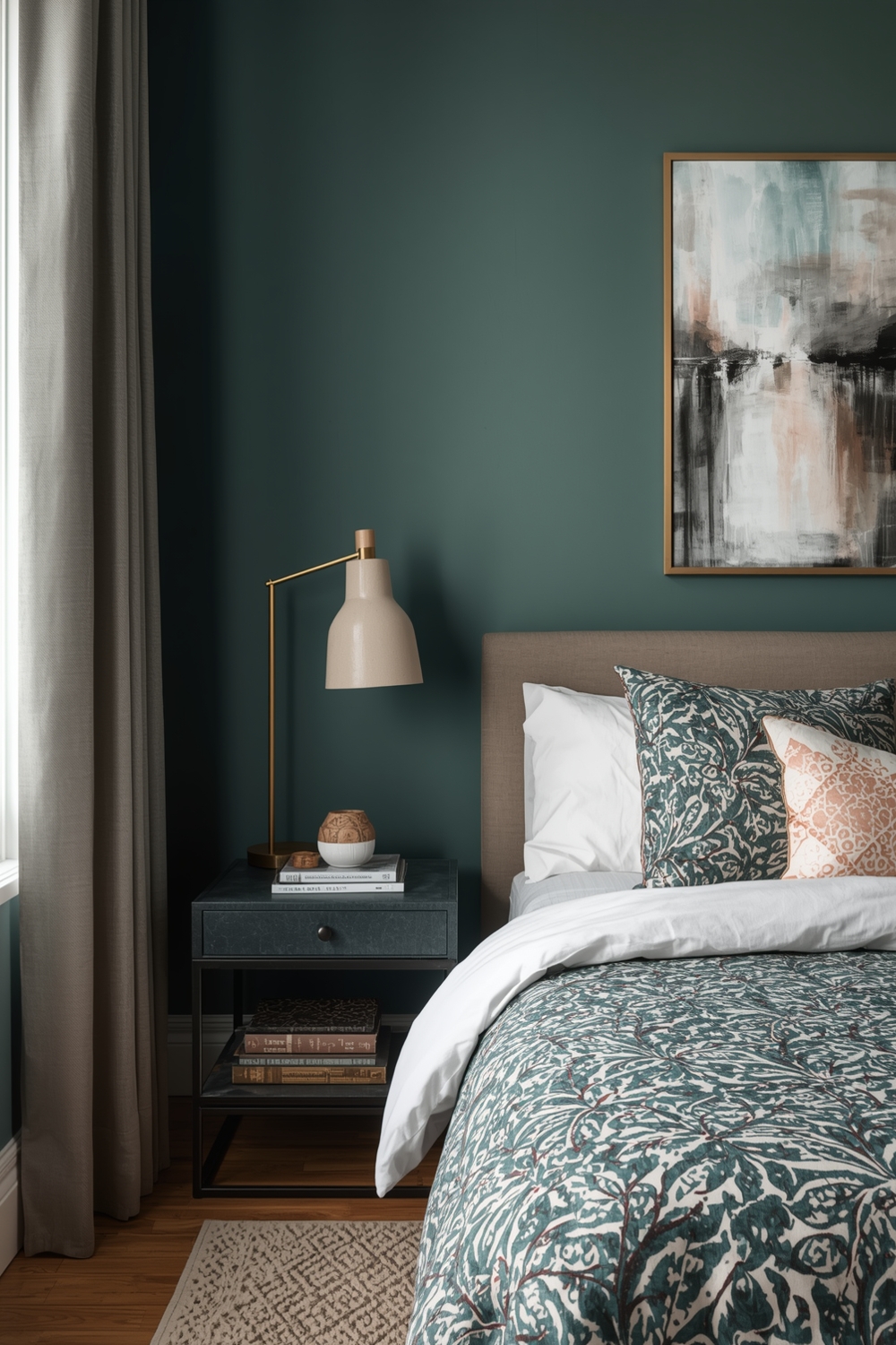
Cool and Calming Room Paint Palettes
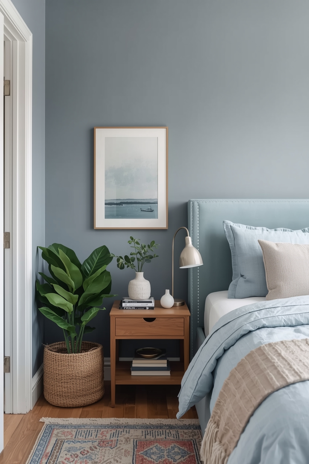
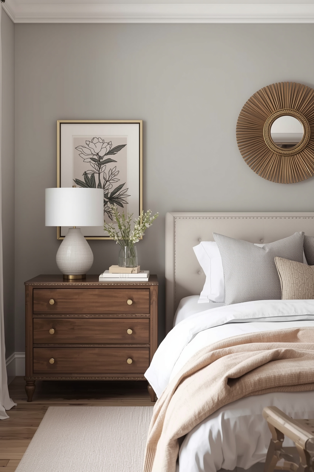
Spaces dedicated to rest and rejuvenation benefit from cool-toned palettes. Soft blues, sage greens, lavenders, and gray-blues with cool undertones promote tranquility and reduce visual stimulation. These Interior Paint Palette choices work exceptionally well in bedrooms, bathrooms, and meditation spaces.
Cool doesn’t mean sterile—layer in warm textiles, natural wood elements, and soft lighting to prevent spaces from feeling clinical. Pairing cool wall colors with warm accent pieces creates balance that’s both calming and inviting. Consider the psychological effects of color when designing spaces meant for relaxation and sleep.
Paint Schemes for Open-Plan Spaces
Open-concept layouts require thoughtful Interior Paint Palette planning to define zones without walls. Use color to delineate spaces: perhaps a deeper shade in the dining area transitions to a lighter tone in the living space, unified by complementary undertones. This creates visual boundaries while maintaining flow.
Alternatively, use a consistent wall color throughout and differentiate zones through accent walls, ceiling colors, or painted architectural details. The key is maintaining enough consistency for cohesion while providing enough variation to distinguish functional areas. Your palette should guide the eye naturally through the space.
Functional Interior Color Mixes
Functionality meets aesthetics when colors serve specific purposes. Darker, more forgiving shades work well in high-traffic areas like mudrooms and hallways where scuffs occur. Energizing yellows and oranges suit creative workspaces, while calming blues enhance focus in home offices.
Consider how each room functions when developing your Interior Paint Palette. Kitchens often benefit from clean whites or soft neutrals that feel fresh, while entertainment spaces can handle more adventurous choices that stimulate conversation and socializing.
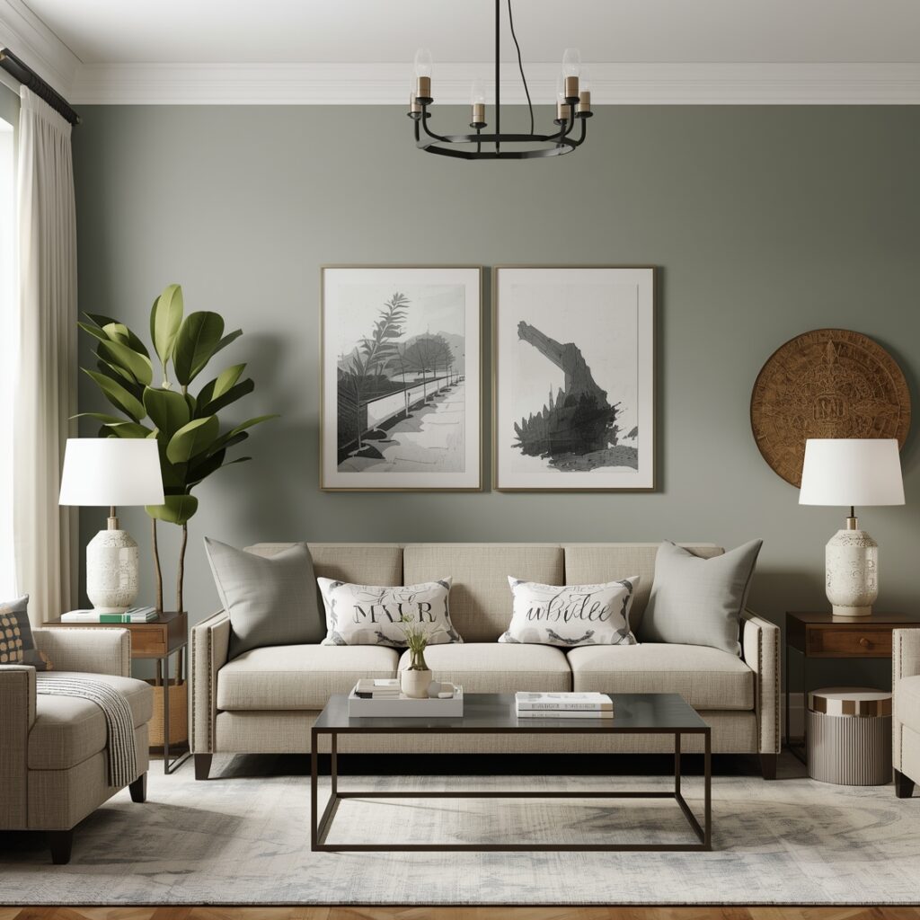
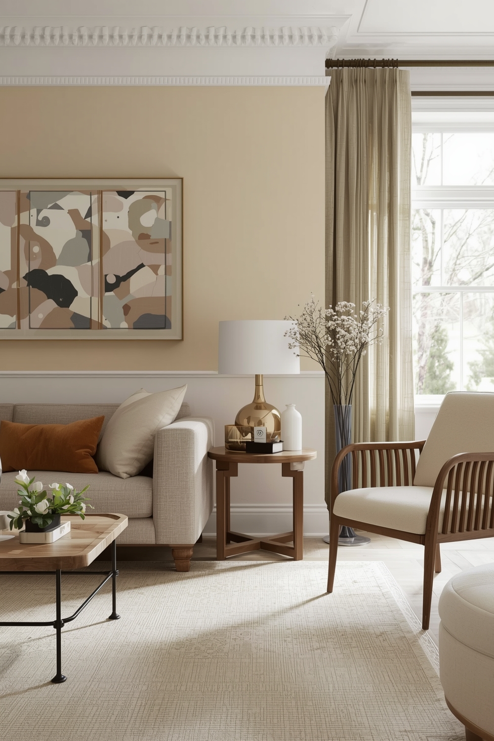
Stylish Paint Ideas for Living Areas
Living areas showcase your personality, making them perfect for expressing style through color. Whether you prefer Scandinavian-inspired whites and grays, bohemian terracottas and ochres, or traditional neutrals with pops of color, your Interior Paint Palette sets the foundation.
Current trends favor warm neutrals over stark whites, with greiges and taupes leading the way. These sophisticated bases accept virtually any décor style while feeling more approachable than cooler tones. Layer your chosen palette with complementary textiles and accessories.
Bedroom Paint Color Concept Boards
Bedrooms deserve special attention since they directly impact sleep quality and morning mood. Creating a concept board with paint swatches, fabric samples, and inspiration images helps visualize your complete interior wall color ideas before committing.
Soft, muted tones generally work best—think dusty blues, gentle greens, warm grays, or blush pinks. These colors reduce stimulation and promote rest. If you prefer darker, more dramatic bedroom walls, ensure adequate lighting and balance with lighter bedding and window treatments. Your bedroom palette should make you feel immediately relaxed upon entering.
How This Idea Improves Your Space
A thoughtfully chosen Interior Paint Palette fundamentally transforms how you experience your home. Color influences mood, perceived room size, and even temperature sensations. Light colors make small spaces feel larger and brighter, while darker shades create intimacy in oversized rooms.
Cohesive palettes throughout your home create visual harmony and flow, making spaces feel more intentional and professionally designed. The right colors complement your furnishings, enhance architectural features, and reflect your personal aesthetic, turning your house into a true representation of your style.
Budget-Friendly Tips
Paint remains one of the most cost-effective home improvements with dramatic impact. Focus on high-visibility spaces first, and consider doing the work yourself to save on labor costs. Many paint retailers offer sample sizes—invest in these to test colors before purchasing full gallons, preventing expensive mistakes and ensuring your Interior Paint Palette works perfectly in your specific lighting conditions.
Conclusion
Exploring these 15 beautiful Interior Paint Palette concepts provides inspiration for transforming your space with color. From serene neutrals to bold contemporary combinations, the perfect palette awaits your discovery. Consider your lifestyle, lighting, and personal preferences when making selections. With thoughtful planning and these interior wall color ideas, you’ll create a home that truly reflects your unique style and enhances daily living.
FAQs
What is the best Interior Paint Palette for small rooms?
Light, neutral colors like soft whites, pale grays, and warm creams make small rooms feel larger and brighter by reflecting natural light and creating visual expansion.
How do I choose complementary colors for my Interior Paint Palette?
Use the color wheel to identify complementary pairs (opposite colors), or select analogous colors (neighbors on the wheel) for harmonious combinations. Consider undertones to ensure cohesion.
Should I use the same Interior Paint Palette throughout my entire home?
While maintaining consistent undertones creates flow, varying shades room-by-room prevents monotony and allows each space to serve its unique function and mood.
What are trending interior wall color ideas for 2024?
Warm neutrals like greige and taupe, earthy terracottas, sage greens, and soft blues dominate current trends, reflecting a desire for comforting, nature-inspired spaces.
How can I test paint colors before committing?
Purchase sample sizes and paint large swatches (at least 2×2 feet) on multiple walls. Observe them in morning, afternoon, and evening light over several days before deciding.