Introduction
Creating a beautifully balanced home starts with choosing the right Color Harmony Palettes. These carefully curated combinations transform ordinary rooms into stunning living spaces that reflect your personal style.
Whether you’re refreshing a single room or redesigning your entire home, understanding Color Harmony Palettes is essential for achieving professional-looking results. This comprehensive guide explores 17 inspiring paint palette ideas that bring balance, sophistication, and warmth to any interior space.
Color Harmony Palette Concept Ideas
Understanding the fundamentals of Color Harmony Palettes begins with grasping basic color theory principles. The color wheel serves as your roadmap, showing complementary, analogous, and triadic relationships that naturally work together.
When selecting color palette combinations, consider the 60-30-10 rule: 60% dominant color, 30% secondary color, and 10% accent color. This formula creates visual balance without overwhelming your senses.
Start by identifying your room’s purpose and natural lighting conditions. North-facing rooms benefit from warmer tones, while south-facing spaces can handle cooler hues beautifully.
Room Color Harmony Inspiration Boards
Creating inspiration boards helps visualize how Color Harmony Palettes will work in your actual space. Digital platforms like Pinterest offer endless examples of successful color combinations.
Collect paint swatches, fabric samples, and furniture images that resonate with your vision. Arrange them together to see how different elements interact under various lighting conditions.
Physical mood boards allow you to test color palette combinations against your existing furniture and architectural features. This hands-on approach prevents costly mistakes and ensures satisfaction with your final choices.
Interior Color Balancing Techniques
Mastering color balance requires understanding visual weight and distribution throughout your space. Color Harmony Palettes should flow naturally from room to room, creating cohesive transitions.
Use lighter shades to make small rooms feel more spacious, while darker tones add intimacy to larger areas. Balance bold accent walls with neutral furnishings to prevent visual chaos.
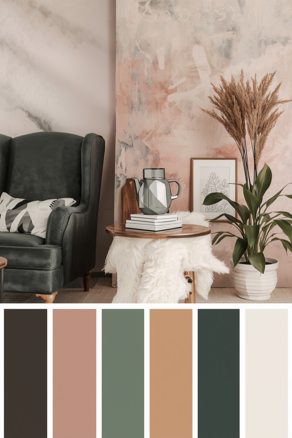
Layer different shades of the same color family for sophisticated depth. This monochromatic approach within your chosen palette creates elegant sophistication without requiring multiple contrasting colors.
Modern Color Harmony Scheme Examples
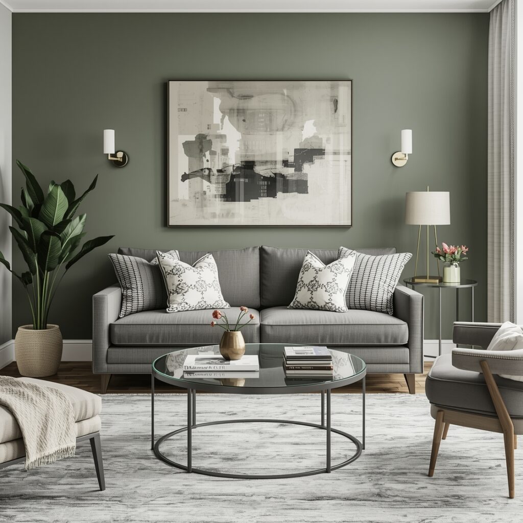
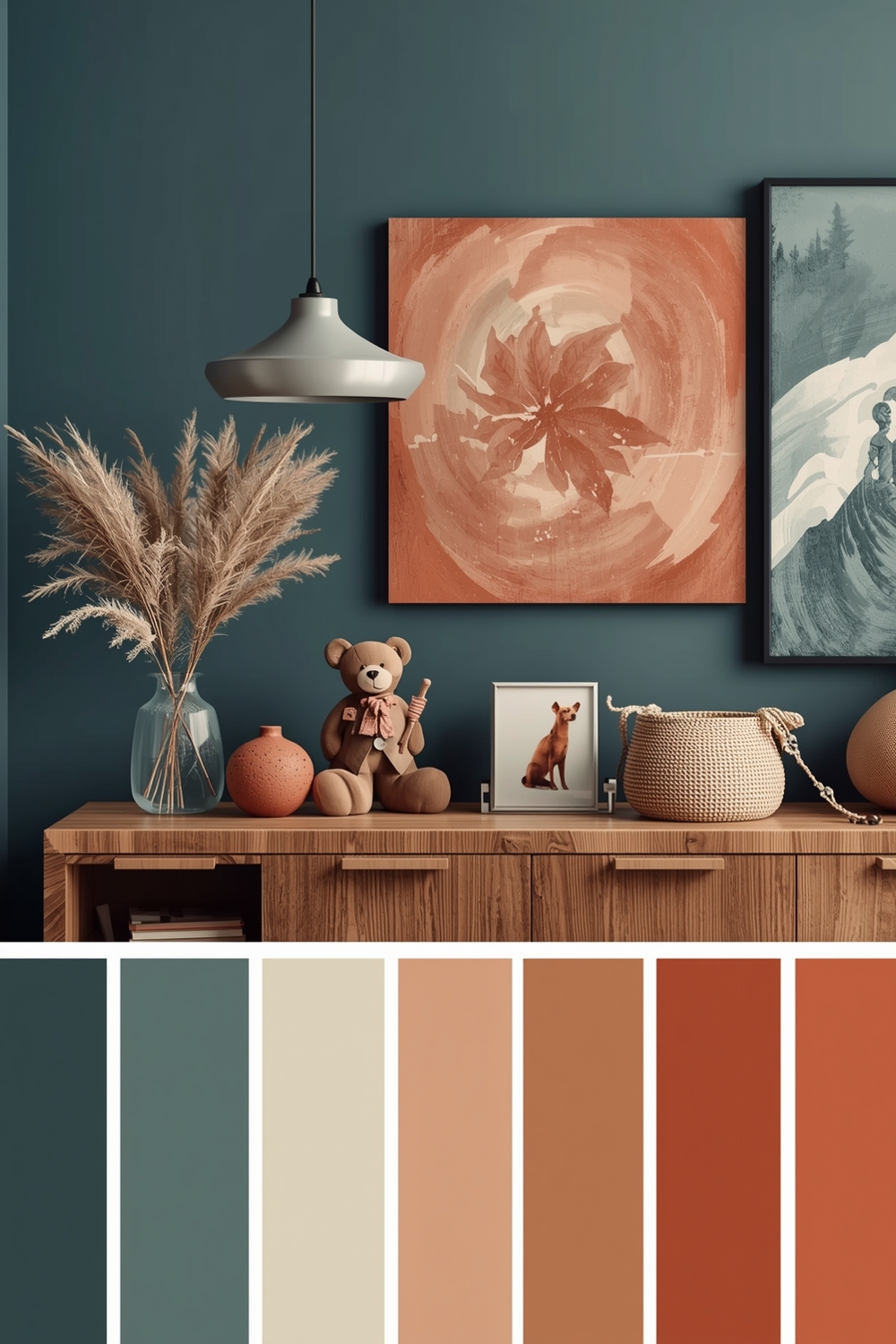
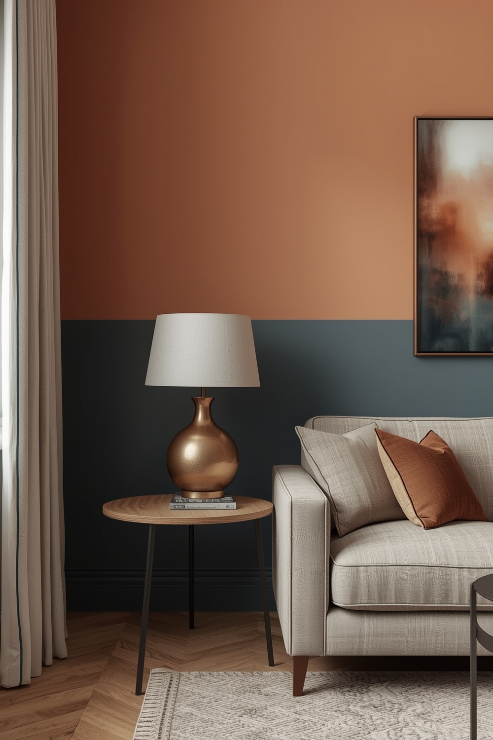
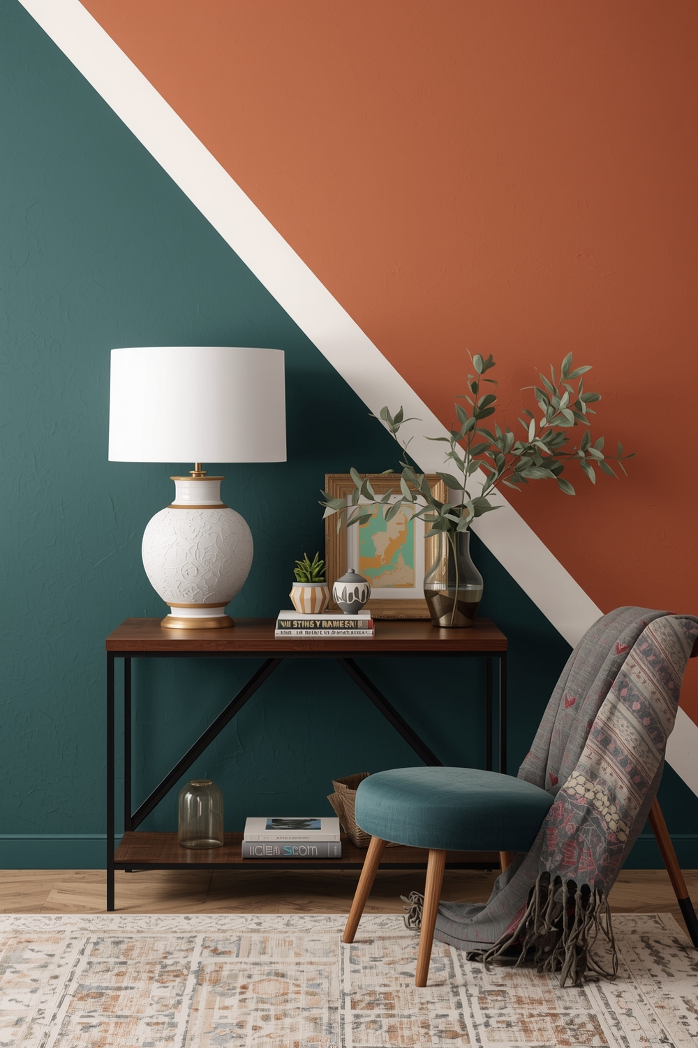
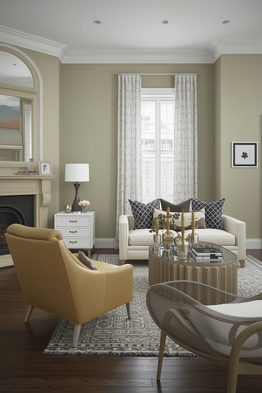
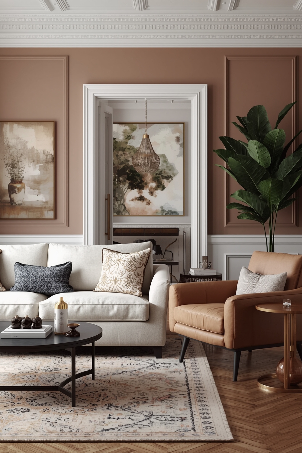
Contemporary Color Harmony Palettes embrace both minimalist neutrals and bold statement colors. Popular modern combinations include sage green with terracotta, navy blue with brass accents, and charcoal gray with blush pink.
These fresh color palette combinations reflect current design trends while maintaining timeless appeal. The key is selecting colors that feel authentic to your personal aesthetic rather than following trends blindly.
Experiment with unexpected pairings like dusty rose with forest green or warm gray with golden yellow for distinctive modern appeal.
Stylish Color Palette Combinations
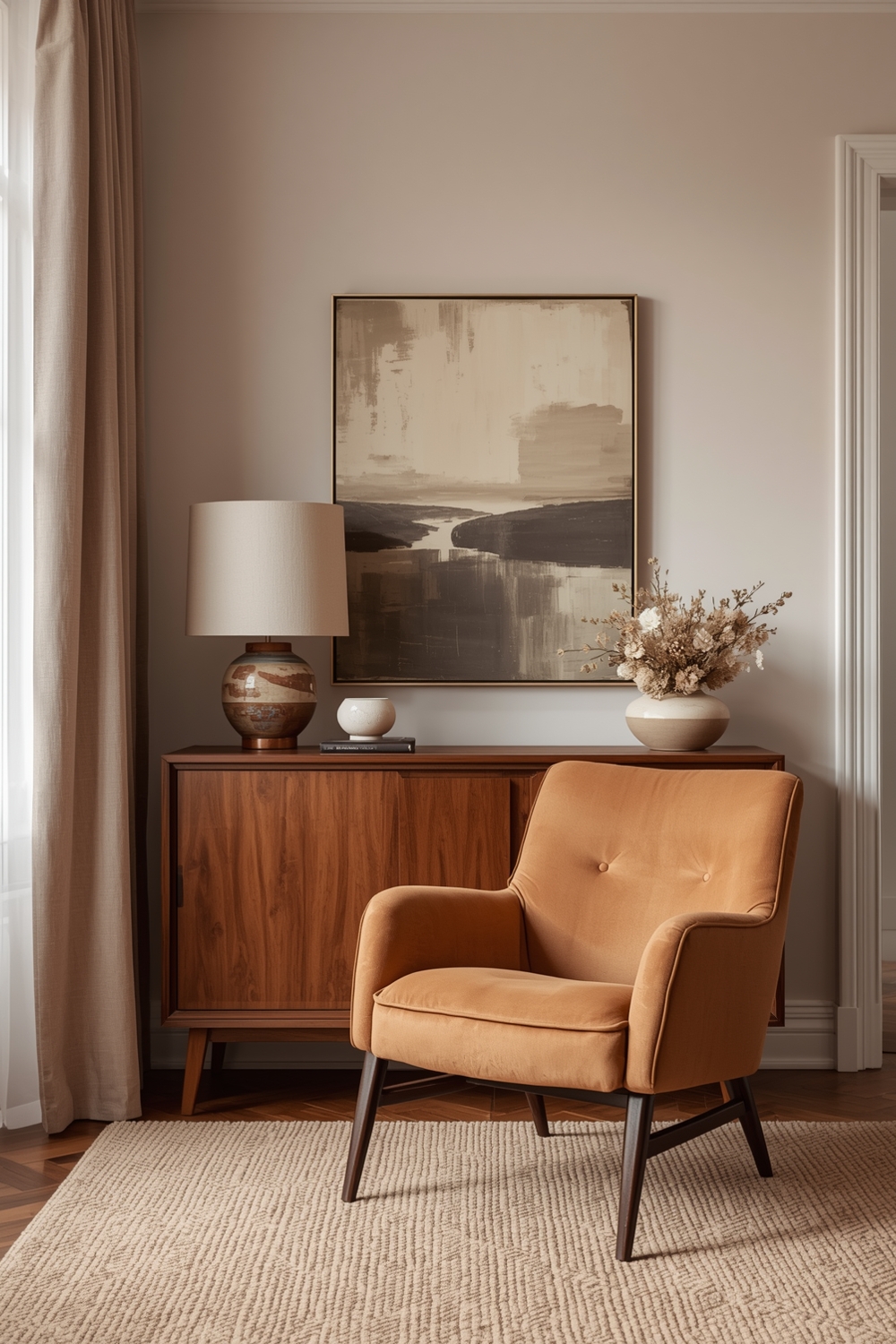
Sophisticated spaces feature Color Harmony Palettes that balance warmth and coolness perfectly. Classic combinations like cream, tan, and chocolate brown never go out of style, offering versatile foundations for any décor style.
For more adventurous homeowners, jewel tones paired with metallic accents create luxurious ambiance. Think emerald green walls with gold fixtures, or sapphire blue with copper details.
Pastel palettes combined with crisp whites deliver fresh, airy feelings perfect for bedrooms and bathrooms. Soft lavender, pale mint, and powder blue work beautifully together, creating serene retreats from daily stress.
Neutral and Vibrant Room Colors
Balanced Color Harmony Palettes often combine neutral bases with vibrant accent colors. This approach provides flexibility to update your décor seasonally without repainting entire rooms.
Greige (gray-beige) walls serve as perfect backdrops for colorful artwork, textiles, and accessories. Add personality through throw pillows, curtains, and decorative objects in your chosen accent colors.
White remains the ultimate neutral, amplifying natural light while allowing furniture and art to take center stage. Warm whites feel cozy, while cool whites create contemporary crispness.
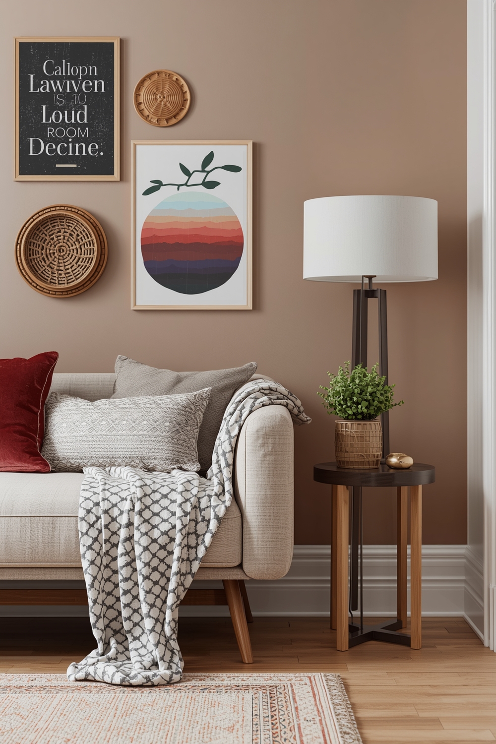
Color Harmony Palettes for Lounge Areas
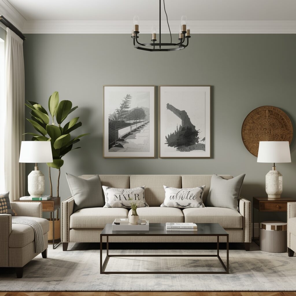
Living rooms demand versatile Color Harmony Palettes that accommodate various activities and moods. Earth tones create grounded, welcoming atmospheres perfect for family gatherings and relaxation.
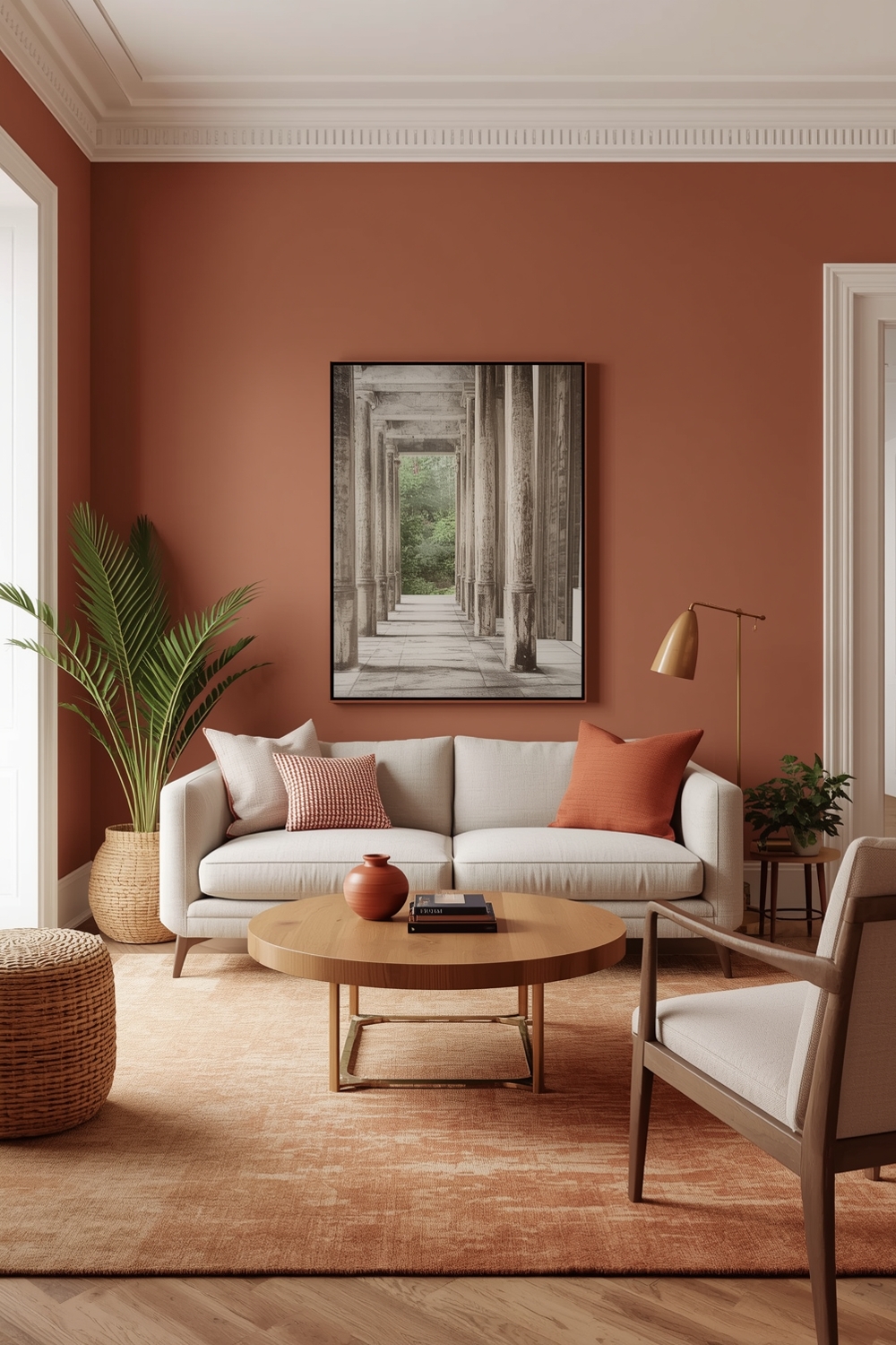
Consider warm terracotta, sandy beige, and olive green for naturally inviting spaces. These colors promote conversation and comfort while remaining visually interesting.
Layer textures within your chosen palette through velvet cushions, woven throws, and natural wood elements. This dimensional approach prevents flat, boring rooms even when using subtle color palette combinations.
Color Harmony Accent Wall Concepts
Strategic accent walls showcase Color Harmony Palettes dramatically without overwhelming entire rooms. Choose the wall behind your bed, sofa, or dining table for maximum impact.
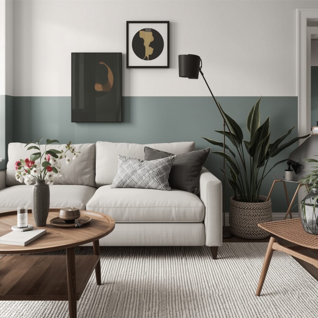
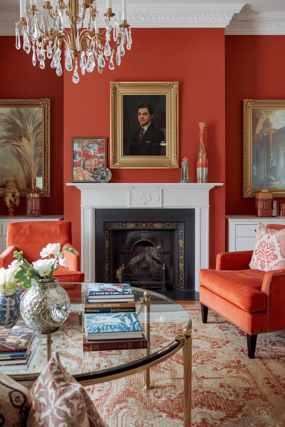
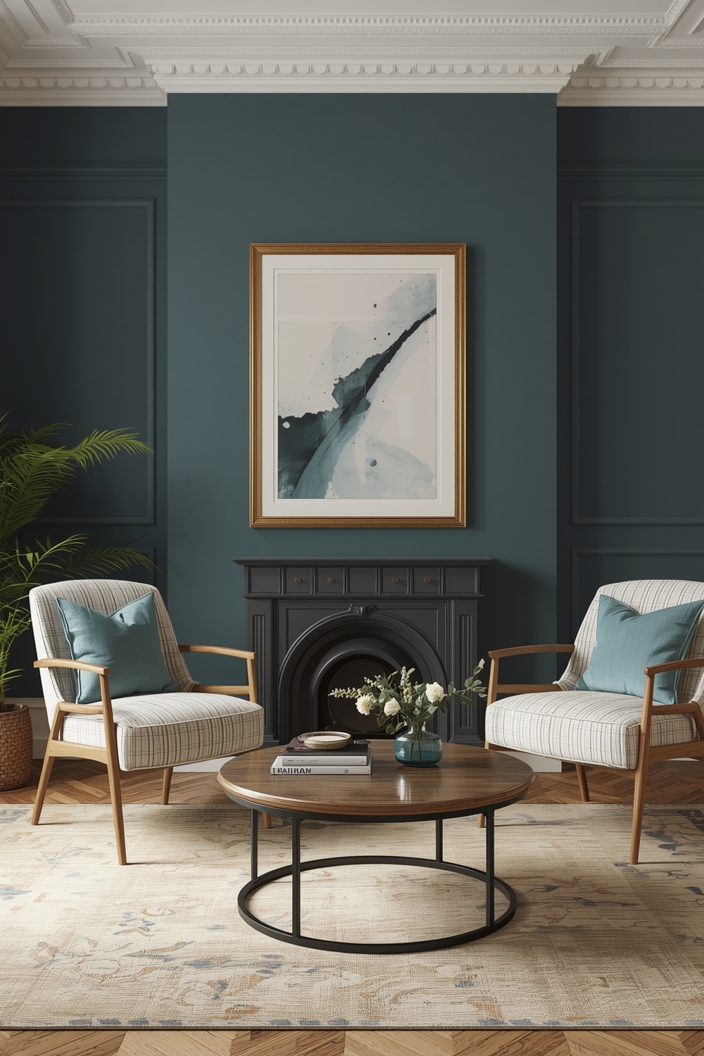
Deep, saturated colors work beautifully as accent walls, adding depth and character to neutral spaces. Navy, forest green, and burgundy create sophisticated focal points that anchor room designs.
Alternatively, use wallpaper with patterns incorporating your entire color palette. This technique unifies your color palette combinations while adding visual texture and interest to otherwise plain walls.
Functional Color Harmony Palette Mixes
Practical Color Harmony Palettes consider maintenance requirements alongside aesthetic appeal. High-traffic areas benefit from darker, more forgiving colors that hide scuffs and marks.
Kitchens and bathrooms require colors that feel clean and fresh. Soft blues, greens, and yellows evoke cleanliness while remaining warm and inviting for daily use.
Home offices need energizing yet focused colors. Combine soft gray walls with pops of yellow or orange to stimulate creativity without causing distraction.
Elegant Color Harmony Layout Plans
Sophisticated Color Harmony Palettes flow seamlessly throughout your home’s open floor plans. Maintain consistency by using the same dominant color in adjacent spaces with varying accent colors.
This approach creates visual continuity while allowing each area to maintain distinct personality. Use architectural features like columns or archways as natural color transition points.
Hallways serve as perfect neutral zones connecting rooms with different color schemes. Soft gray or warm white hallways allow bolder room colors without jarring transitions.
Minimalist Room Color Harmony Guides
Minimalist design celebrates restrained Color Harmony Palettes that emphasize quality over quantity. Stick to two or three colors maximum, letting negative space breathe between design elements.
Pure white paired with single accent colors creates striking minimalist impact. Black and white remains timelessly elegant, while white with soft gray adds warmth without complexity.
Natural wood tones count as neutral colors in minimalist palettes, bringing organic warmth without introducing additional color complexity. This approach works especially well in Scandinavian-inspired interiors prioritizing simplicity and functionality.
Contemporary Color Harmony Design Ideas
Current Color Harmony Palettes embrace nature-inspired hues reflecting growing environmental consciousness. Botanical greens, sky blues, and earthy terracottas dominate contemporary design magazines and showrooms.
Biophilic design principles encourage incorporating natural colors that reduce stress and improve wellbeing. These organic color palette combinations create calming environments that connect indoor spaces with outdoor nature.
Muted, complex colors replace stark primaries in contemporary schemes. Think dusty rose instead of hot pink, or sage instead of bright lime green.
Cozy and Balanced Color Palette Inspirations
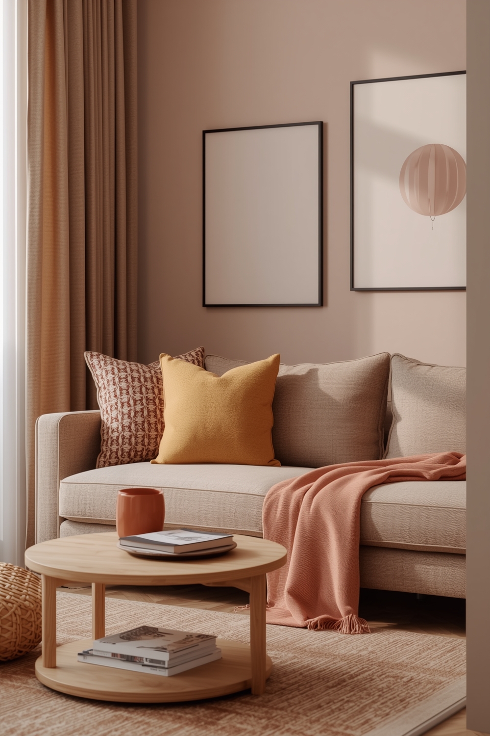
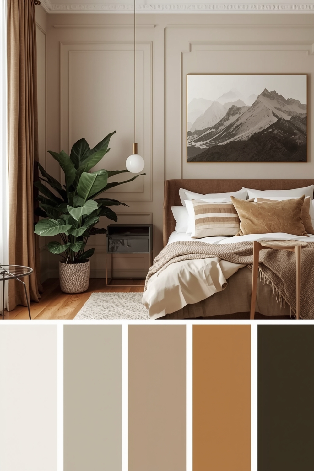
Warm, inviting Color Harmony Palettes make houses feel like homes. Embrace colors that literally feel warm—reds, oranges, yellows, and browns create psychologically cozy environments.
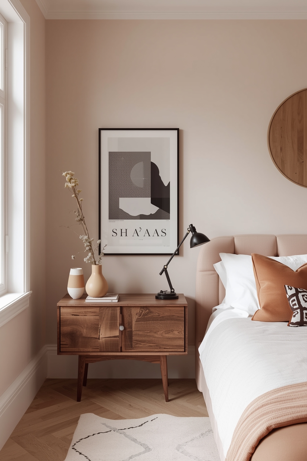
Layer different warm tones together for maximum comfort. Caramel walls with rust accents and cream trim deliver enveloping warmth perfect for bedrooms and family rooms.
Don’t fear darker colors in cozy spaces. Deep burgundy, chocolate brown, and forest green create intimate, cocoon-like atmospheres ideal for relaxation and unwinding after busy days.
Room Color Harmony for Modern Home Interiors
Today’s Color Harmony Palettes balance aesthetics with psychological impact. Color psychology research informs thoughtful paint choices that support room functions and occupant wellbeing.
Blues and greens promote calmness in bedrooms and bathrooms, while energizing yellows and oranges enhance kitchen and dining experiences. Understanding these effects helps create truly functional beautiful spaces.
Modern technology allows virtual paint testing, showing how colors appear under different lighting conditions before committing to purchases.
Timeless Color Harmony Palette Concepts
Classic Color Harmony Palettes transcend temporary trends, maintaining appeal across decades. Traditional combinations like navy and white, or black and cream, never truly go out of style.
Invest in timeless colors for permanent fixtures like cabinetry and tile, saving trend-driven colors for easily changed elements like paint and accessories. This strategic approach maximizes longevity while maintaining fresh appeal.
Natural neutrals—whites, creams, grays, and browns—form the foundation of enduring color palette combinations. These versatile shades adapt easily to changing décor preferences and life stages.
How This Idea Improves Your Space
Implementing thoughtful Color Harmony Palettes dramatically improves your home’s functionality and emotional impact. Well-chosen colors enhance natural light, create visual flow, and support room purposes effectively.
Balanced color schemes make rooms feel properly proportioned, correcting architectural challenges through optical illusion. They also increase home value by appealing to broader buyer preferences during resale.
Most importantly, harmonious colors improve daily wellbeing by creating environments that truly feel like personal sanctuaries.
Budget-Friendly Tips
Achieve professional Color Harmony Palettes affordably by starting with paint samples before committing to full gallons. Many retailers offer peel-and-stick paint samples that eliminate messy testing.
Focus your budget on high-impact areas like accent walls while keeping other surfaces neutral. This strategic approach maximizes visual impact while minimizing paint costs significantly.
Conclusion
Creating beautiful interiors through Color Harmony Palettes doesn’t require professional training, just thoughtful planning and experimentation. These 17 balanced palette ideas provide inspiration for transforming any space into your dream home.
Start small, test thoroughly, and trust your instincts about colors that feel right for your lifestyle and personality.
FAQs
What are Color Harmony Palettes?
Color harmony palettes are thoughtfully curated combinations of colors that work together aesthetically, creating balanced, visually pleasing interior spaces based on color theory principles.
How do I choose the right color palette for my room?
Consider room function, natural lighting, existing furniture, and personal preferences. Test paint samples in various lighting conditions before committing to final choices.
Can I mix warm and cool colors in one palette?
Absolutely! Balanced palettes often include both warm and cool tones, with one temperature dominating and the other providing accent contrast.
How many colors should be in a room palette?
The classic 60-30-10 rule recommends three colors: one dominant (60%), one secondary (30%), and one accent (10%) for balanced, professional-looking results.
What’s the easiest way to create color harmony?
Start with neutral base colors and add one or two accent colors from the same color family (analogous colors) for foolproof harmonious results.